Ecommerce Conversion Rate Optimisation Quick Wins
A guide to maximising ROI from your website visitors through improving your conversion rate
You’ve got the right visitors coming to your site, but how do you encourage them to finish their purchase and increase the rate of users convertion on your website?
Your conversion rate is the result of users trust in your brand, the usability of your site, the cost of your products and the relevance of your website visitors.
Depending on your industry, the average conversion rate of a website is about 2%. That means for every 100 people coming to your website, two of them will go on to purchase goods.
So how do you make the most out of your visitors?
We’ve put together a comprehensive guide to changes you can implement to increase your conversion rate.
Overall Site Design
Users like familiarity in web design.
According to Jakob’s Law:
“Users spend most of their time on other sites. This means that users prefer your site to work the same way as all the other sites they already know.”
What does that mean for your website? Follow conventions. People have a fixed idea of what an ecommerce site should look like. If you go for innovative, unconventional layouts, people are less likely to like them – and less likely to convert.
Feature your policies on important pages (not just on your policies pages!)
Users have subconscious questions when browsing a site. Especially around returns and shipping. Questions like:
- Do they accept returns
- What is the returns timeframe?
- How much is shipping
- How fast is shipping?
- Do they ship to my location?
Having detailed pages answering these questions is great, but what’s even better is mentioning this information on product pages, your homepage, and any other important landing pages.
Answer these questions AS the user is thinking them when browsing your products and you streamline the decision making process.
There is less leaving the product page to search for shipping and returns information and more add to cart.
Feature your policies on the homepage:
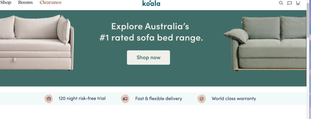
Source: Koala
And on your product page:
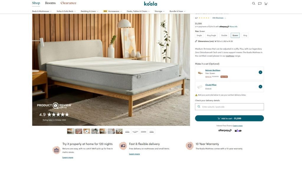
Source: Koala
Website Navigation Menu - Desktop
Desktop Header Menu
Make Category Labels Simple
Navigating an ecommerce store should be just as easy, or easier than going in-store to find what you’re looking for. There should be no confusion about what could be in each category.
Think about it, as a shopper, would you know what you’re going to find in a miscellaneous or other category?
Label your categories as plainly as possible.
For example, if you offer a wide clothing range, this:
Womens | Mens | Kids | Shoes | Accessories | Sale
Is a lot more streamlined than this:
Womens Clothing | Menswear | Shop The Kids Clothing Range | Misc | Other | Sales and Discounts | More
Not only does this help users find what they want as fast as possible, it also helps to build trust.
Trust = increased willingness to buy from your store.
Make the Transaction Menu and Informational Menu Different
Returns Policies, Shipping Policies, Contact Us and About Us pages are all important, but they should live in a separate menu to your main shopping pages.
Transaction pages and informational pages should be treated as two separate navigation types.
Instead of lumping them into one long menu, separate them into two. Make sure they stand out from the rest of your website by using a different colour to your main website body colour.

Here are some examples of this in action from other stores:

Source: ASOS

Source: BCF

Source: Woolworths
Desktop Footer Menus
Make your footer stand out. It should be a different colour to the rest of your website.
The following information should be should be in your footer menu to build trust, and help users navigate your site:
- Phone number
- Address
- Social Icons
- Contact Page Link
- About Us Page Link
- Returns Policy Page Link
- Shipping Policy Page Link
- Terms & Conditions Page Link
Having a contact phone number and address shows that behind the website there are real people that a user can talk to if they have questions. This is an important trust signal.
Links to your top categories won’t go astray too, plus they’re a bonus for SEO. Usually users will find themselves at the footer if they cant find what they’re looking for, or are deep into your website and want a quick link to a top level page.
Providing handy links to important pages along with your contact details makes a user’s life easier.
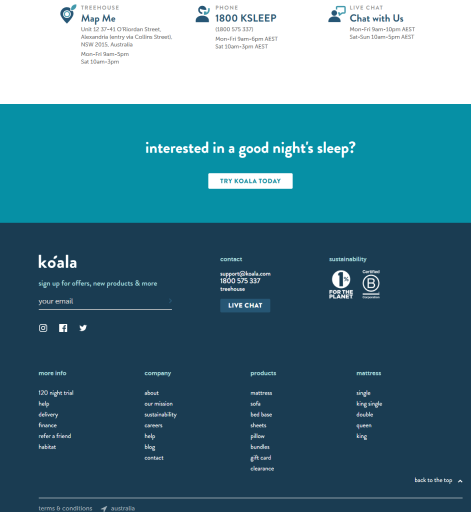
Source: Koala

Source: Ecrotek
Website Navigation Menu - Mobile
Main Mobile Menus
Mobile menus are more compact but should be just as clear and easy to navigate as desktop menus. Smartphone screens are much smaller than desktops, so its crucial to simplify menus for easy thumb sliding navigation.
Here are some tips for effective mobile ecommerce navigation:
- Use the tried and tested “hamburger” menu
- Limit your mobile menus to 4-8 main categories
- Keep category names short (no more than two-three words)
- List menu items in order of importance: product categories first, then promotions and sales, followed by informational pages
- Limit multi-level navigation. While it can help to reduce clutter, multi-level navigation can be a little irritating for users. Keep it to only 1-2 sub-levels.
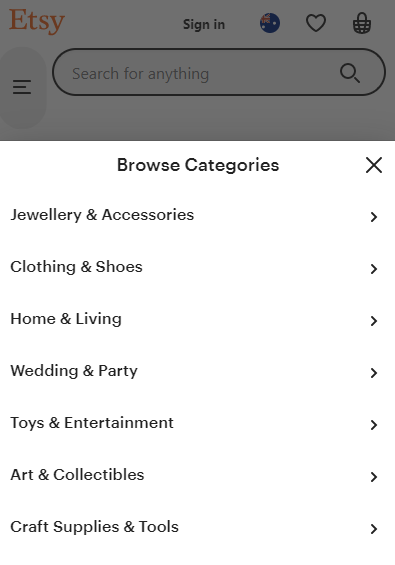
Source: Etsy
Homepage
If users can’t immediately tell what your site has to offer, they have a high chance of leaving.
“It takes about 50 milliseconds (ms) (that’s 0.05 seconds) for users to form an opinion about your website that determines whether they’ll stay or leave.” – CXL Peep Laja
Once users decide to stay, it then only takes about 2.6 seconds for their eyes to land on the section of the page that influenced their first impressions most.
That isn’t a lot of time to make a first impression.
According to CXL, the six website sections that drew the most interest from viewers were:
- The logo. Users spent 6.48 seconds focused on this area before moving on.
- The main navigation menu. Almost as popular as the logo, users spent an average of 6.44 seconds viewing the menu.
- The search box. Users focused for just over 6 seconds.
- The site’s main image. Users’ eyes fixated for an average of 5.94 seconds.
- The site’s written content. Users spent about 5.59 seconds.
- The bottom of a website. Users spent about 5.25 seconds.
| Website Section | Time Spent On Website Section |
|---|---|
| Logo | 6.48 seconds |
| Main Navigation Menu | 6.44 seconds |
| Search Box | 6.00 seconds |
| Website's Main Image | 5.94 seconds |
| Website's Written Content | 5.59 seconds |
| Bottom of Website | 5.25 seconds |
Do you want your first impression to be confusion? No! You want users to know exactly who you are, what you stand for and most importantly what you offer.
The easiest place to start is your homepage hero image and content, where users spend about 5.94 seconds when evaluating your site.
It’s one of the first things users see when they land on your homepage, and your best chance at making an impactful first impression.
Add a value proposition to this space. It should provide clarity on what you stand for and why a user will benefit from purchasing your products or services.
Below are a couple of examples of this in action:
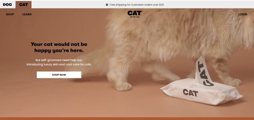
Source: Dog by Dr Lisa
Cat By Lisa has a simple message on their Cat Product homepage. At a glance they offer a visual of one of their core products and a statement about luxury skin and coat care for cats.
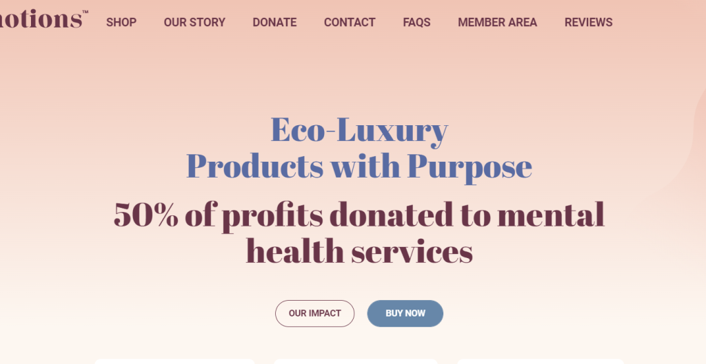
Source: Emotions
Luxury brand Emotions offers a clear message: you can purchase Luxury eco-friendly products and their business model means you’re also donating to a good cause. A great example of showing both what products are on offer and what the business stands for.
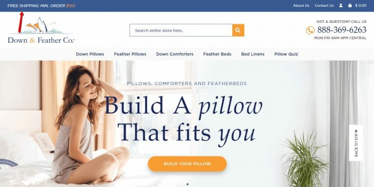
Source: Down & Feather Co.
Down & Feather Co. offer pillows tailored to your sleep along with comforters and featherbeds. Thanks to the hero image and message you instantly know this brand is all about giving you the right tools for good sleep.
Product Page
Use Product Images to Help Replace “touch and feel”
The advantage of a brick and mortar store is the ability for customers to touch products. Products are tangible, they can get a sense of the size, shape, colour and weight of a product before deciding to purchase.
eCommerce stores don’t have that advantage. So what can you do about it?
Images. Lots of images.
Images of the product:
- At multiple angles to show depth
- With another object to show size
- In use
- Up close to show texture
- In and out of packaging (if it has any)
- Any attributes that might be hidden such as interiors and details
- A “what’s in the box” flatlay (if appropriate)
- High quality, zoomable photographs
Your goal with these images is to make up for a customer’s inability to touch and feel the product as much as possible.
Back up your product images with a clear description of the product and its features
Every piece of information on your website, from product images to shipping policies, impacts your conversion rate. Including your product copy.
You might think “who even reads copy on product pages anyway?” but a study conducted by Nielsen Norman Group found that 20% of unsuccessful purchases are because there wasn’t enough relevant information in the product description.
Your product page is a salesman. If there’s no information about the product, how would users be sold on buying it?
Product descriptions should answer the FUDs.
The FUDs?
A user’s Fears, Uncertainties and Doubts about the product.
Think about the questions a user might have about the product and answer them in the product description copy.
A great place to start is looking at product reviews to see what users like and dislike about the product. Talk to your sales team and find out what the most common questions are about a product and ANSWER THEM in the product copy.
Kin Fertility is a great example of answering FUDS on their prenatal supplement page.
One of the biggest issues for a lot of users is nausea or reflux from taking multivitamins. Kin addresses this in their product description.
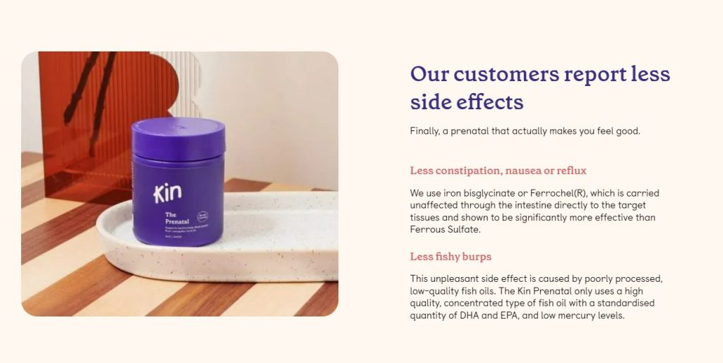
Source: Kin Fertility
Social Proof - Product Pages and Sitewide
People are social creatures. Monkey see what monkey do.
Have you ever bought something because you heard off a friend it was good? You’ve been influenced by social proof.
The appeal of “following the wisdom of the crowd” can work in your favour and persuade users to buy. People love to see what other people are doing. We are social creatures after all.
How does a product look in everyday life? How many people have liked the product? What’s the fit like on other people?
You can leverage this curiosity. How?
- Reviews
- Testimonials
- Social Media
- Trust Icons
- Data/Numbers
- Case Studies
Using a mix of these types of social proof throughout the site will give users more incentive to buy from you and join the crowd.
What does social proof look like in action?
Reviews
Reviews are a powerful form of social proof. A mix of honest reviews can go a long way to influencing users to purchase the product for themselves.
Cider
They offer users reviews and back them up with actual images from real people.
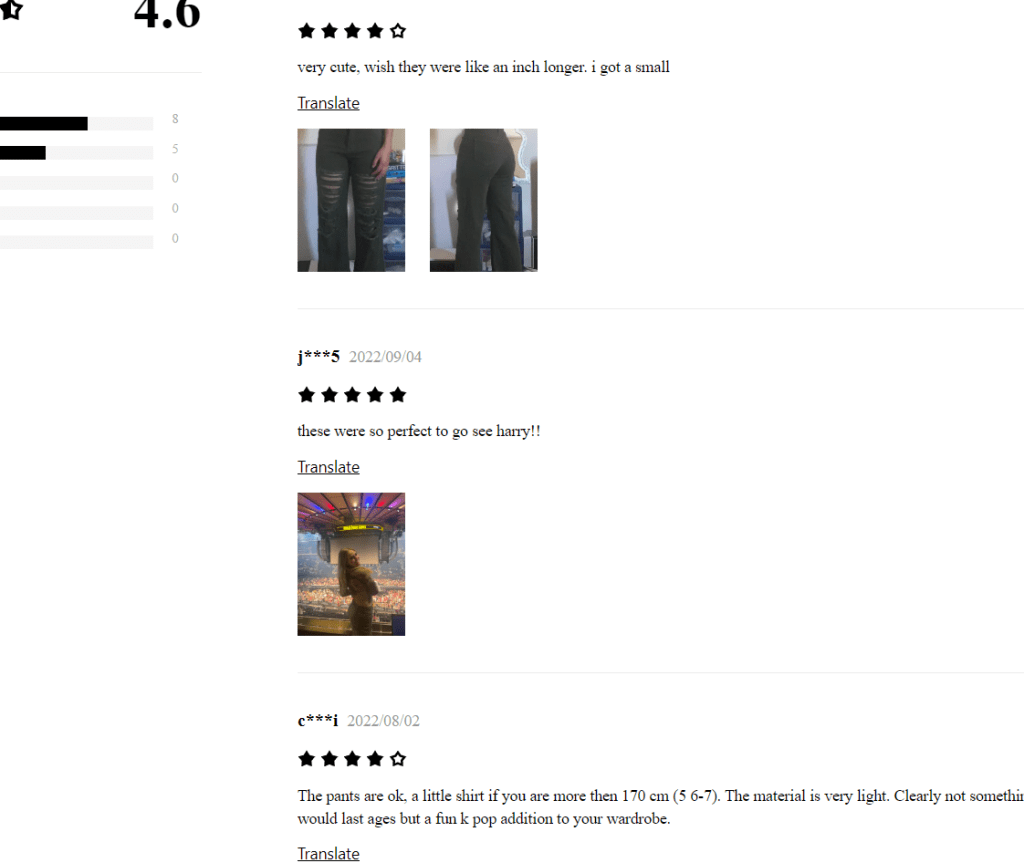
Source: Cider
Kmart
They offer text reviews.
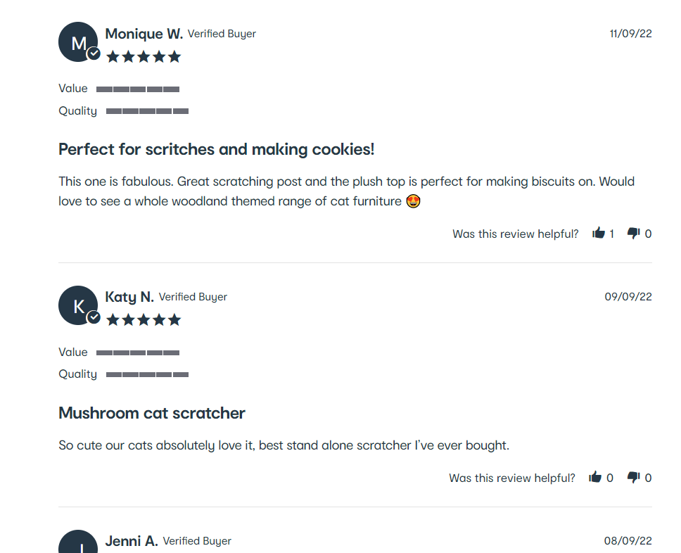
Source: Kmart
Scratch
They use image + text reviews on individual product pages.
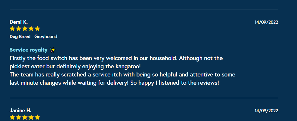
Source: Scratch
Poke Pet Shop
They feature images sent of happy pets and their owner and along with review feedback.
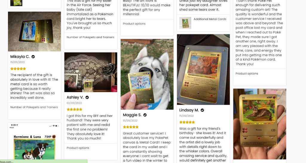
Source: Poke Pet Shop
Testimonials
For websites with less products, testimonials can be a great way of providing social proof.
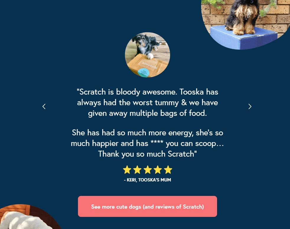
Scratch
Scratch use testimonials from Dog parents to show social proof on their homepage.
Source: Scratch
Social Media
Leverage your social media to highlight how users are using your products. This works to also get users engaging with the brand.
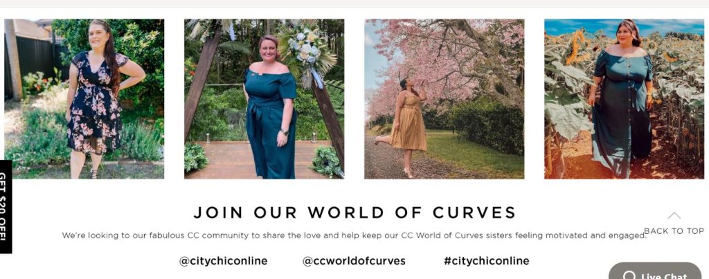
City Chic
City Chic encourages customers to post photos and tag their handles. It also serves as great content for the team to use in their promotional emails.
Source: City Chic
Trust Icons
Trust symbols act as short hand signals to users. A trust symbol is a logo, icon, or symbol that gives consumers a sense of confidence
Lonely Kids Club
Lonely Kids Club feature their overall Google rating and Judge.me rating in their footer. Using external review icons/aggregate ratings can be a great way of using trust icons.


Source: Lonely Kids Club
Another great example from LKC. They lay out their Unique selling points in quick to digest icon format. It allows the brand to get their core message across to the user.
Pupnaps
Has your product or business been featured anywhere? Show it off! Pupnaps uses the trust icons of large news websites they have been featured on.

Source: Pupnaps
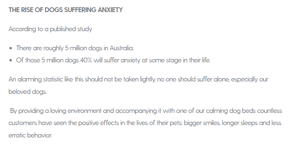
Data/Numbers
Do you have the data or numbers to back up your claims? Data can go a long way in helping get customers across the line
Pupnaps
Pupnaps dives into the figures and shows how their dog beds help to solve the problem.
Source: Pupnaps
Case Studies
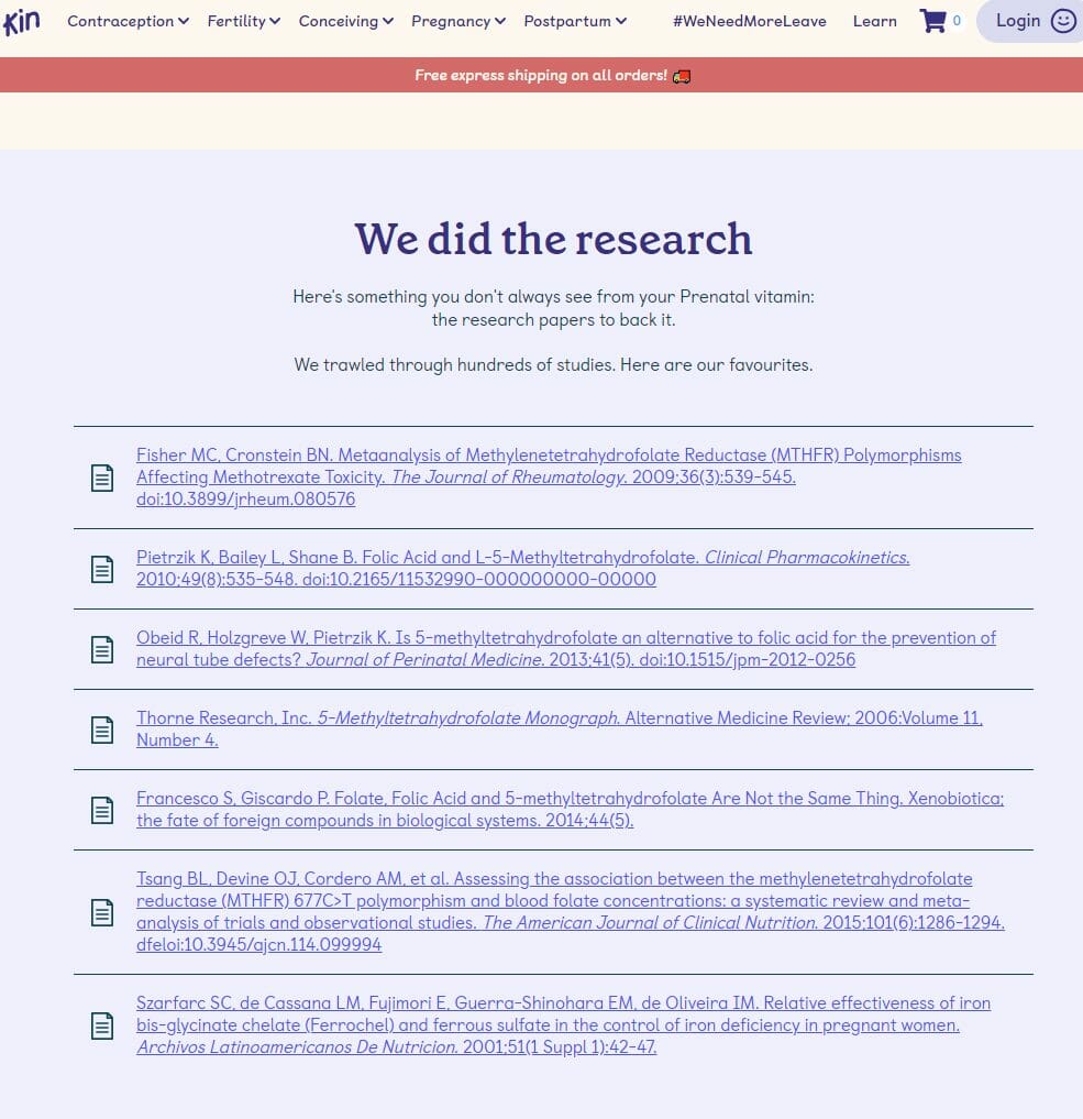
Case studies are a great way to show any scientific claims about a products benefits, or deep dive into how they solved a problem that other users might also have.
Kin Fertility
They back up their product through direct links to scientific case studies.
Source: Kin Fertility
Search Functionality
While some users browse, others get straight to the point by using your search bar to find what they’re looking for on your website.
Of the 3500 ecommerce websites reviewed by the Baymard Institute, 42% of sites failed to fully support 8 key ways users performed searches when shopping online with even some of the largest ecommerce sites offering mediocre search support for users.
8 Ways Users Search eCommerce Websites
- “Exact” search queries – These users know what they want and will use a product code or the exact name of the product Eg.”Nike SB Dunk High Dog Walker Size 9”
- “Product Type” search queries – They know they want a sofa, but they dont know what style/colour/size they want. – Eg. “sofas”
- “Symptom” search queries – They know they have a problem to solve, but they don’t know what the product solution is. Eg. “stain on carpet”
- “Non-Product” search queries – They are looking for informational pages like your shipping and returns policies. Eg “shipping costs”
- “Feature” search queries – They know they want a leather jacket, but they dont know what kind, colour or style. Eg “leather jacket”
- “Thematic” search queries – A little difficult to define, thematic searches are for themed products (think event/location/use/promotion type searches) Eg. “wedding gift”, “sale lipsticks”
- “Compatibility” search queries – These users are looking for accessories for a product they might already own. Eg “Samsung Galaxy S21 Phone Case”
- “Slang, Abbreviation, and Symbol” search queries – These users search for abbreviations, alternate slang names or use symbols to find a product Eg. “-5c sleeping bag”,”13in laptop sleeve”, “Air Jordans”
That’s a lot of ways to search!
If you want to quickly improve your search capabilities, Baymard Institute recommends starting with the 4 essentials from this list:
- Exact
- Product Type
- Feature
- Thematic
These are the non-negotiable search types. Users can get by with basic ecommerce searches when these 4 query types are supported.
Users will abandon search if these core options aren’t supported which leads to less conversions for your website.
Investing in search logic, and populating product data will go a long way to improving search experience on the site.
Store Policies
If a user can’t answer the question of “can I return an item” or “do they ship to my address” you’re at high risk of losing them.
Why should you have store policies on your site?
Users want to know where you ship, how much it costs and how fast it is. They also want to know that if the product doesnt suit them or they change their minds, that they can return it.
If they can’t find this information on your site, its a red flag. Making sure you have detailed shipping and returns policy pages will put users minds at ease when purchasing from you.
Standard Returns Policy template
The policy will vary based on your own business policies and the products you sell, but Shopify offer a great basic layout of what basic questions you should cover within your returns policy page:
- What items can be returned
- What items can be exchanged
- What products are “final sale” (i.e., non-returnable, non-exchangeable)
- When things can be returned or exchanged (i.e. 30, 60, or 90 days past purchase date)
- In what condition can items be returned (i.e., lightly worn, with tags still on, original packaging, original condition, etc.)
- What products can be returned for (i.e., store credit, refund, a product of equal value, etc.)
- How to initiate a return or exchange (i.e., an email address to contact or a web page to visit)
Standard Shipping Policy template
Your shipping policy will vary depending on what your business can offer, but again Shopify have put together a great example of the basic questions you should answer as part of your shipping policy:
- Clarify that your order processing times are different from your shipping times. Does it take 3 days to process an order, but once in the mail it’ll arrive within 24 hours? Clarify it.
- Include any information about potential delays. Do you have a high volume of orders? Are there issues with shipping outside of your control? Mention it up front.
- Do you offer calculated shipping rates or a flat rate? Explain what you offer and list the countries it applies to.
- Do you offer free shipping? Emphasise the thresholds this applies to, e.g. free shipping over $99.
- Do you offer local delivery or in store pickup? If the process is different for this delivery type, explain how it works and which areas qualify for this option.
- Do you offer international shipping? If it’s different to your domestic delivery, explain how international shipping works and what shipping options are available to the countries in this group.
- Do you offer tracking? Explain how users can check in on the status of their order.
- Do you deliver to P.O. boxes? Explain if this is or isn’t available.
- Mention your returns policy. Summarise how users can arrange return shipping and link out to your returns page for more detail.
Cart & Checkout
Your user is ready to buy your product, they’ve reachedthe finish line: The checkout.
But how do you reduce their chances of being one of the 70% of users who abandon their cart?
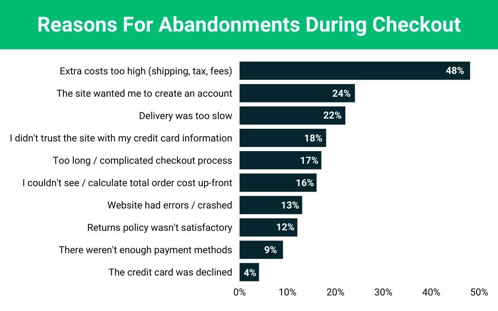
According to the Baymard Institue, a large percentage of cart abandoners are simplywindow shopping. But, there are also plenty of factors within your control which might be turning shoppers away. The remaining reasons for cart abandonment are listed below:
Source: Baynard
So how do you solve these problems?
Reduce Shipping costs
48% of users will drop off if “extra costs are too high” (things like shipping, tax, and fees).
Reducing the friction for these buyers is simple. Offer free shipping or lower the cost of shipping.
Ask yourself these questions:
- Can you increase all of your product prices to absorb the cost of shipping completely?
- Can you negotiate a better courier rate with your delivery contractor?
- Could you offer a free shipping threshold?
Offering free shipping all the time, over a certain limit, or reducing your shipping fees are all options to help to reduce the number of users leaving without buying.
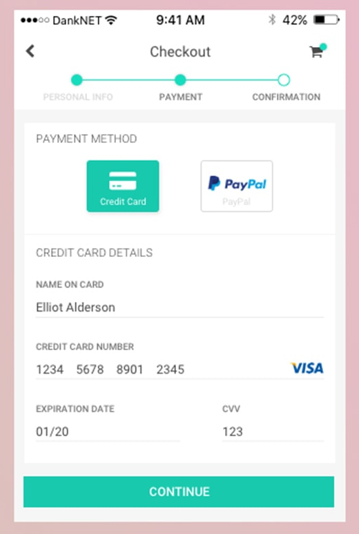
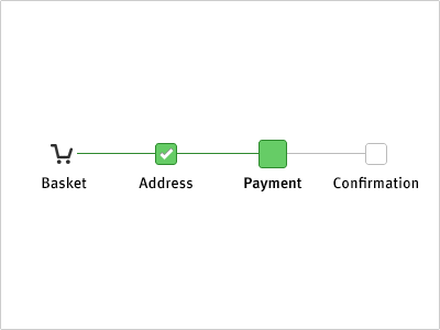
Add progress indicators to your checkout
By showing the steps required, you reduce the chance of users finding the checkout progress “too long/complicated” which makes up 17% of why users abandon a purchase.
Most ecommerce platforms offer this as a standard, but if yours doesn’t, talk to your developers about adding it in.
Offer Guest Checkout and a logical checkout order
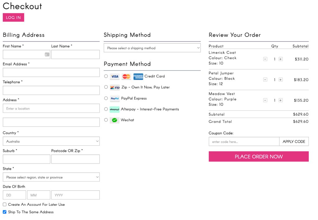
24% of shoppers will abandon ship if “The site wanted me to create an account”. This, coupled with an overcomplicated checkout process,equals a lot of goods left behind.
The solution?
Offer guest checkout and ask the easy questions up front.
A good checkout process should start with name and address, followed by how they would like to pay.
THEN you can suggest they create an account once the order is confirmed.
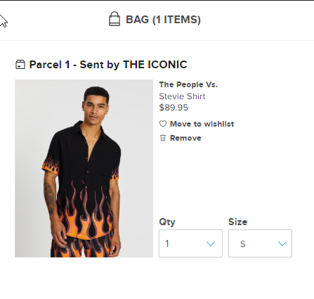
Ensure your cart shows the right product in the correct variation
Users want to confirm at a glance that everything in their cart is correct.
Don’t make them second guess if they did put the right colour or variation in their cart. If you offer variations on a product (eg. different coloured shirts) show the right one in the cart.
Use clear micro copy on forms
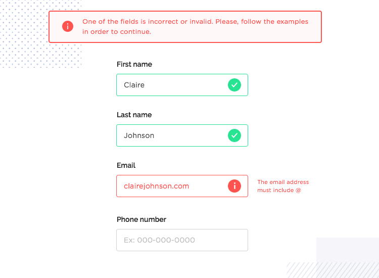
There is nothing more frustrating than trying to submit a form only to be rejected and not know why.
All fields in your checkout process should make it clear when a user inputs incorrect information or misses a field.
This should be followed by informative micro copy about what is expected for that field.
User didn’t enter a correct email address?
Instead of:
“Invalid Input”
Try:
“The email address must include @”
Source: Justinmind
Add trust/credibility symbols to your checkout page
18% of users will abandon a purchase if they “dont trust the site with my credit card”.
So how do you solve this problem? Trust symbols.
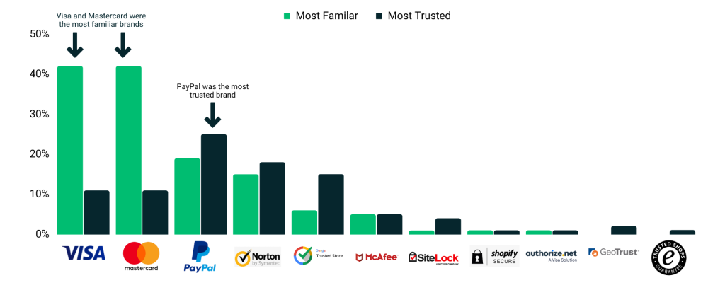
A study by CXL asked over 1,000 people which payment badges they recognised most, and which badge they trusted the most.
The key take away was “The most familiar brands like Visa-Mastercard, PayPal, Norton, and Google were also the most trusted when paying online.”
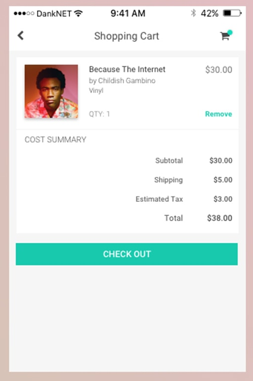
Itemise the total price in your checkout – e.g. break down the cost by subtotal, taxes, shipping and discounts.
16% of users who “couldn’t see/calculate the total order cost up-front” will leave.
Itemising the total price at checkout will remove this friction.
It should be clear how much a customer needs to pay for the goods, shipping, and taxes and this should be summarised as a total amount.
Bonus - Increasing your AOV
Upselling and Cross Selling to increase your AOV
Now that you have more visitors converting on your website, the next step is to increase your Average Order Value (AOV).
When timed right, adding personalised cross sell and upsell opportunities to your site can increase your AOV without much effort at all.
In a Shopify study, almost half (40%) of consumers say they’ve purchased something more expensive than they originally planned because their customer experience was personalised.
Do you have products that work well together? Products that users will often return to purchase? Premium versions of a product that you can offer?
Then you are in prime position to add personalised upsells and cross sells to your user experience.
Everyone loves a deal, it makes users feel good and you profit from the extra items being purchased. It’s a win win!
Below are some ways to introduce cross selling and upselling to your customers.
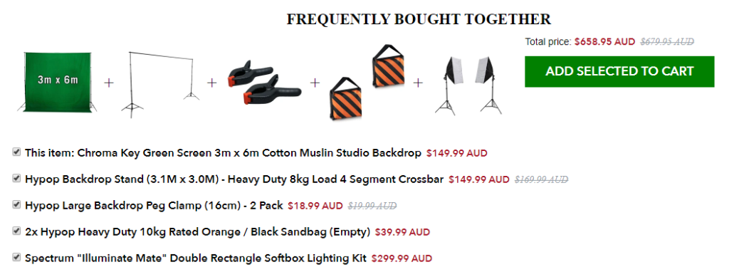
Frequently Bought together
If you have products that work together, this is a great way to encourage users to add extra goodies to their cart they might not have thought about. The examples below show two ways of adding this to your site – with and without a “bundle discount”.
Source: Hypop
Platform: Shopify

Source: Young Blood Mineral Cosmetics
Platform: Shopify
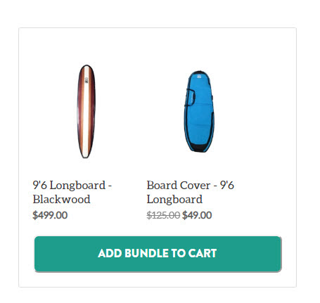
Bundling Product Accessories
Does your product have accessories? Bundle them! This example offers a discount off a board cover with the incentive of a discount if you buy together now.
It creates urgency by only offering the discount if they buy the cover now with the board.
Source: Honu
Platform: Shopify
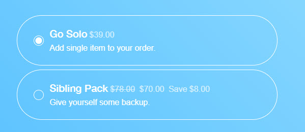
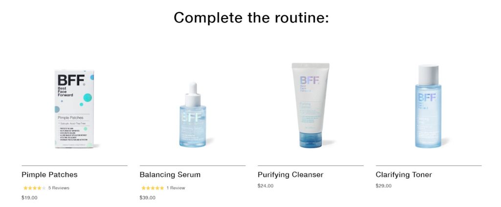
Encourage backstock of consumables
This is a great one for consumables like skincare and dog wipes that need to be replaced frequently. Offering discounts for bulk orders is a great way to increase AOV and encourage users to return to your store to purchase again, since they get a great deal.
Source: BFF Skincare
Platform: Shopify
Source: BFF Skincare
Platform: Shopify
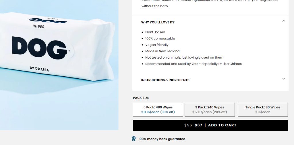
Source: Dog by Dr Lisa
Cross Sells & Upsells At Checkout Offers
There’s a reason the likes of Domino’s and big brands love a cross sell and upsell. They work! Adding either to the checkout process can help you get that little bit extra into a users cart.
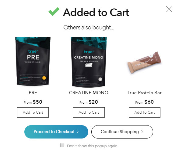
Source: True Protein
Platform: Neto
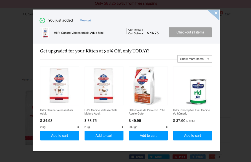
Source: Beeketing Blog
Increasing the number of users converting on your website can seem daunting. At the end of the day, your goal is to make your site easy for customers to connect with.
Conversion rate changes won’t happen overnight, but by using the tips above and continuing to tweak and improve your site over time will have a lasting impact on your bottom line.
Want to increase the number of customers coming to your site? We offer a range of services to help your website be the best it can be, from copywriting to Facebook Ads and SEO inbetween. Drop us a line!
