How do you maximise the growth of your online store?
The answer is not an easy one.
But I can tell you there are only four ways to grow your ecommerce business.
#1. Increase your online store traffic
#2. Increase your conversion rates
#3. Increase your customer’s average order value
#4. Increase your store’s repeat sales
If you can find a way to maximise all four with the budget and resources you have available, you can maximise the profit of your business.
This is the second Ecommerce Growth Guide in our four-part series, and it’s dedicated to helping you achieve number two on this list. Increasing conversion rates might just be the most important of the four growth levers. It should certainly be number one on the priority list for any new ecommerce brand.
If you missed our first guide, you can catch up on 39 ways to attract new customers to your online store right now.
Remember to subscribe for our Ecommerce Jungle Gym updates to receive guides three and four over the next few months to complete your ecommerce growth playbook.
We’ll help you grow up nice and fast.
We’ve optimised our CRO growth guide to increase our own conversion rates
We know some catchy clickbait headline isn’t all that matters.
It’s the quality behind the click that makes you want to subscribe and come back for more.
At almost 20,000 words, our conversion rate optimisation growth guide gives you good value for money, but we don’t just want to attract you to our guide – we want to convert you into a loyal subscriber too!
It’s time to get meta.
In the interests of optimising our CRO guide for conversions, we’ve tried to make things easy for your to filter, skim and browse.
You don’t have to read all 18,000 words in one sitting. We’ve split the guide out into 7 different categories, with one little bonus piece of CRO advice left for you at the very end. Cycle through our little table of contents below and click on the conversion growth tactics that interest you, and you’ll be parachuted right in to the relevant section.
Of course, you’re more than welcome to take on the challenge and go through the list one-by-one.
Whichever route you choose, we hope you’ll pick up at least one new idea to use on your own online store – you’ll be turbocharging those conversion rates in no time.
Short On Time? Your Skim-Read Summary:
Too busy to read the whole thing? We get it: logistics, synergies, KPI’s – all that stuff. Here’s the skim read version. You really should read the whole article though…
You can click on any of the sections or tactics that take your fancy to skim straight through directly.
Oh, and one more reminder to subscribe for our Ecommerce Jungle Gym updates to receive our next two growth guides over the next two months (and a whole bunch of other helpful ecommerce insights and advice.
- Remove your conversion-killing sliding carousel
- Optimise your calls-to-action
- Add a most popular/trending products widget
- Provide a ‘Live Chat’ option
- Reduce your load speed times
- Develop a custom 404 page with a CTA to keep browsing the store
- Develop helpful buying guides
- Repurpose seasonal buying guides
- Develop dedicated research hub pages
- Create events-specific landing pages
- Create gift-shopping landing pages
- Reduce uncertainty with detailed size guides
- Add call-to-action buttons to helpful content at the end of your pages
- Optimise your platform’s ecommerce site search functionality
- Create a more prominent search box
- Create a needs-based search option
- Create new categories based on your site search analytics
- Treat each product page as a landing page
- Explain how best to use your product
- Create detailed, original product descriptions
- Create a virtual try on experience
- Incorporate demonstrations to prove your product works
- Create urgency to turn browsers into buyers
- Add clear shipping info onto your product pages
- Add trust signals to all store pages
- Display total order costs before, during and after purchase
- Remove the nav bar on checkout
- Add a visual progress indicator to your checkout process
- Add simple payment options
- Give customers the option to use a simple third party login
- Simplify your checkout forms
- Consider a single page checkout
- Spice up your abandoned cart email
- Prepare a delivery options landing page
- Use returns and guarantees info to reduce uncertainty
- Offer free shipping and free returns
- Add a freight-forwarding option for customers in countries you can’t service
Remove your conversion-killing sliding carousel
Don’t use carousels/scrolling banners/image sliders/whatever else you like to call these conversion rate murderers!
Retailers have a tendency to squeeze as much information (usually product related) into one page at the expense of one clear call to action.
Peep Laja is the founder of respected industry leading CRO publication Conversion XL, and he is vocal in debunking the myth of the sliding carousel:
“I’m sure you’ve come across dozens, if not hundreds of image sliders or carousels (also called ‘rotating offers’). You might even like them. But the truth is that they’re conversion killers.”
Why?
Peep explains the three simple reasons why sliding carousels cripple conversion:
#1. Human Eye Reacts To Movement – we’re drawn in by movement, which makes us focus on the banner and miss the important stuff the banner is trying to communicate
#2: Too Many Messages – CRO best practice dictates one clear call-to-action works best
#3: Banner Blindness – we’ve been trained to treat all banner-looking things like annoying advertising
The alternative is simple.
If you want to remove your sliding carousel and increase conversions, replace it with clear primary call-to-actions to guide the browser into their next action.
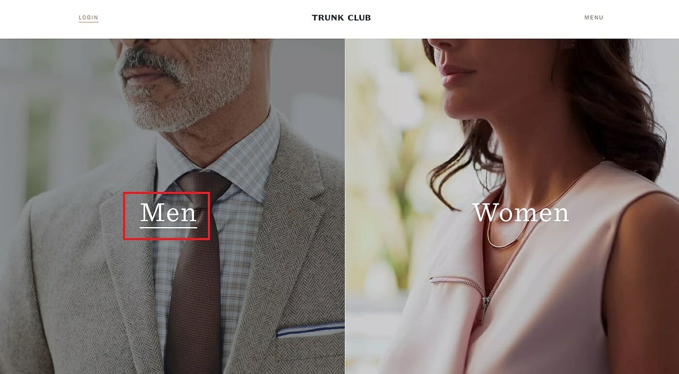
Trunk Club manage to simplify their online store homepage beautifully, funnelling the user one step closer to purchase without confusing or cluttering the experience.
If you’re a newer brand, shoppers will have lower awareness levels. You need to take your chance to explain what your brand stands for as soon as your new shoppers enter your online store.
Add a clear value proposition and communicate your brand’s core belief on your store homepage to establish authority, trust and interest from new visitors unaware of your brand.
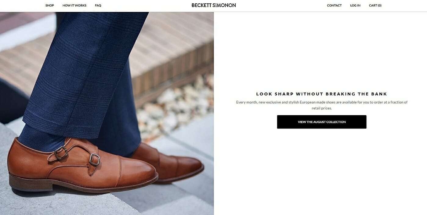
Colombian/US shoe online retailer Beckett Simonon are a new brand with an innovative business model. Each month these guys manufacture and sell between two and four new products, voted on by their existing customers and subscribers. They are able to communicate this compelling value proposition with a simple, beautiful and persuasive homepage call-to-action.
Helpful Resources
- 8 UX Requirements for Designing a User-Friendly Homepage Carousel – Jamie Appleseed for The Baymard Institute (if you absolutely must use scrolling banners, read this research first)
- 7 Ways to Design Home Pages Without Rotating Banners – Linda Bustos for Get Elastic
Optimise your calls-to-action
Use a clear colour contrast for your primary CTA buttons
You want to make your most important call-to-action button jump out at the user. Remember, the whole point of a call-to-action is wrapped up in the name. You want someone to do something – so make your prompt the focal point of your page.
One blanket rule that research suggests should be universal is explained by Oli Gardner from the landing page experts Unbounce:
“Some say that button color is irrelevant, but this a falsehood. Color contrast is the real problem. Yes, red might not perform better than green under normal circumstances, but if the page is dominantly green, then a red button will naturally attract more attention than a green one. Use a single color (with a variety of tones) for your entire landing page – except for the CTA. Make it jump off the page.”
There’s no given colour, size or font you need to use to maximise your conversions.
You just need to find the options that fit your brand, work with your design and cause your CTA to pop off the page.
Use shading, typeface and font size variations to maintain brand and user experience consistency
Things can get complicated, especially on ecommerce product pages. There’s a whole lot of info you need to provide for shoppers, browsers and gift givers alike. You want to encourage an immediate buy first, but give uncertain users the clarification they need without compromising the buyer’s experience.
It’s not all about an outrageously loud and bright buy buttons, and vastly different typefaces and font sizes.
Mr Porter provides the perfect example. A luxury brand needs restrained design. Maintaining sophistication is important, but so is making the sale. The brand manages to stick to their monochrome colour palette, using shading, icons and textual variations to guide and direct all types of shoppers with aplomb.
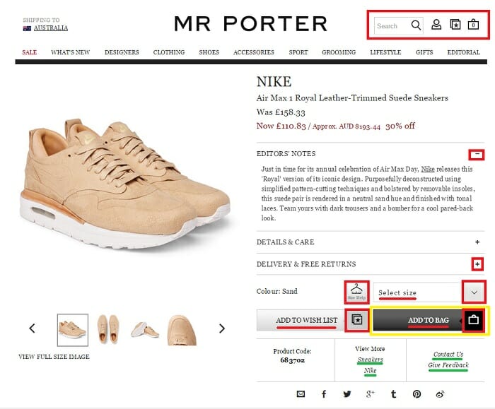
In the yellow box, we see a simple block shaded background used to make the primary CTA stand out, drawing the shopper’s eye immediately.
The red underlines show the use of larger all caps text to make the ‘add to bag’ and ‘add to wish list’ copy stand out.
The green underlines show the secondary calls-to-actions designed to provide extra information for browsing shoppers looking for different options. Instead of adding another colour, font size or typeface, Mr Porter maintains their consistent style and denotes the call-to-action by using italics.
The red boxes also illustrate the brand’s smart use of icon graphics to support the action-oriented copy, communicates a clear expectation of what lies beyond the click, and prompts the user into taking action.
Use action-oriented call-to-action copy
There’s no simple guide to which button, style, copy or size that works best tom improve conversion rates. You’ll have to be content with continual A/B testing and analysis to give you the right answers.
Incorporate scarcity, urgency and exclusivity techniques into your call-to-action copy to encourage an immediate purchase.
Use action-oriented words. Verbs work on buy buttons, That’s why they’re called ‘buy buttons’. Explain exactly what you want the user to do, and what they will receive in return.
This generic ‘more info’ call-to-action copy does not encourage users to click through.
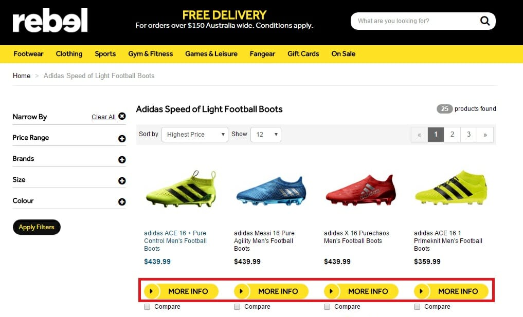
There is no clear indication of what to expect, and no impetus to entice the click. The information could be about product specifications, sizing info, styling advice or shipping details. There is also no clear option urging ready-to-purchase shoppers to ‘buy now’ to avoid the extra click and reduce potential friction.
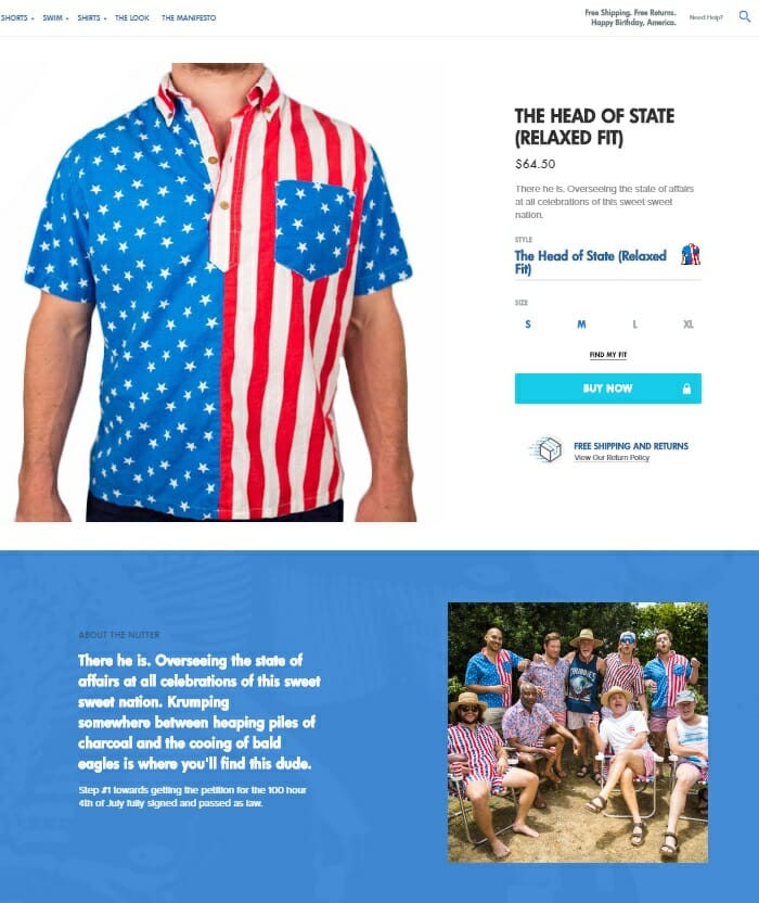
In contrast, the Gorilla Ecommerce Award Winners, Chubbies show e-retailers exactly how call-to-action copy should be done.
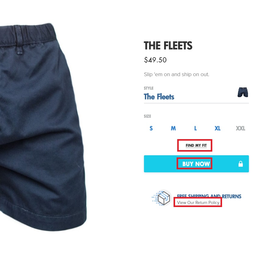
The primary call-to-action stands out clearly, with a contrast colour background, huge block font, and simple action-oriented copy.
The specificity of the copy helps to give users a clear indication of what they will find and the verbs used encourage the user to take action.
“View Our Return Policy” is much more effective than a simple “Returns” CTA.
Similarly, “Find My Fit” is much more compelling than a button reading “Sizing Information”.
Use hover functionality to load CTAs based on user intent
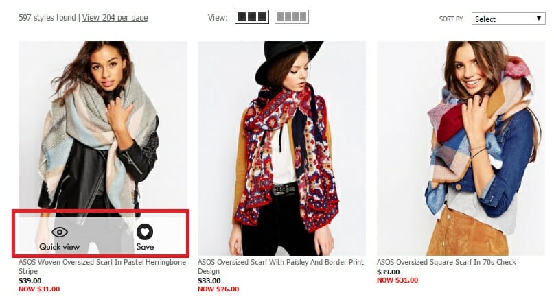
Hover CTA’s can also help you minimise clutter and help give shoppers more specific options. Many online retailers add a ‘quick look’ or ‘zoom in’ overlay to their product images, triggered only when the users scrolls the cursor over the image. Loading the CTA based on user intent allows you to keep your page cleaner, while improving the online shopping experience at the same time.
This example from Asos gives users the option or a ‘quick view’, or to save the product to a wish list for later access. These options don’t prohibit users from adding to cart immediately, nor do they clutter the page design.
Helpful Resources
- 7 Inspiring Ecommerce Call to Action Examples and Why They Work – Tucker Schreiber for Shopify
- Call to Action Buttons: The Ultimate Guide on Which Ones Convert and Why – Smriti Chawla for VWO blog
- How to create an effective call to action for your ecommerce website – Leighton Taylor for Envision
- What’s the best color for high conversions? – Derek Halpern for Social Triggers
- A/B Test Ideas for E-Commerce Call to Action Buttons – Cara Harshman for Optimizely
Add a most popular/trending products widget
Social proof is a powerful purchase-inducing elixir.
For new visitors with no affinity to your brand, a first online purchase can be plagued with uncertainty. You need to do your best to ease that anxiety.
Remember, your prospects don’t want to be a guinea pig for a here-one-day-gone-the-next ecommerce site. Prove that other people love your work. Communicate the value of your products with the help of your previous customers.
You can give anxious shoppers some welcome direction by integrating a ‘popular’ or ‘trending’ products selection in a prominent position throughout your online store.
Adding ‘selling fast’ or ‘last few’ to popular products similarly helps to encourage purchases and increase urgency for browsers (I’ll get into some more detail on this one a little later in the piece).
Apart from providing social proof, a trending products selection also adds convenience for your customers. The option provides a quick and direct way for gift givers and browsers to shop your best work, and it allows you to promote your highest value products.
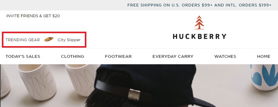
2015 Gorilla Ecommerce Award winners Huckberry, incorporate a simple little trending products widget into the header navigation menu as a constant anchor to encourage browsing shoppers or gift-givers.
Womenswear e-retailer Net-a-Porter place even more emphasis on social proof on their online store, with a significant portion of their homepage dedicated to their ‘Net-a-Porter Live’ widget. The visual scrolling carousel displays a live feed of the products being purchased by other women around the world, along with a total tally of the number of shoppers online at any given time.
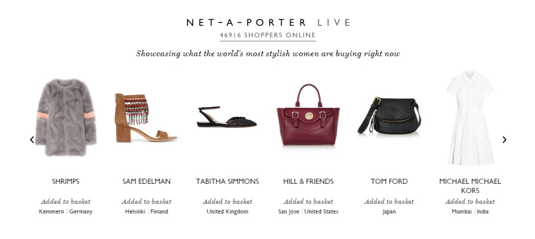
This is a powerful display of legitimacy for a pureplay brand like Net-a-Porter with no physical presence. Shoppers are more comfortable spending hundreds of dollars on a new pair of shoes from an online store when they know 50,000 other women are doing the same thing, at the same time.
While you may not have tens of thousands of shoppers (or the money to afford a custom made development like this), you can incorporate social proof into your site by adding a ‘trending’ or ‘popular’ products section to your online store.
Helpful Resources
- 7 ecommerce product page design ideas to convert browsers into shoppers – from the Gorillas
- Social Proof: What It Is, Why It Works, and How to Use It – Shanelle Mullin for CXL
Provide a ‘Live Chat’ option
We online retailers have it tougher than our in-store contemporaries when it comes to customer support. There’s no friendly staff member wandering around our customer’s living room to help them with their online purchase, and online shoppers don’t have the time or patience to call or email, then wait for a response. We want answers now.
But, rather than watching confused visitors click through to a competitor, why not offer a virtual version of that store assistant.
Offer live chat, a dedicated social media account or a direct phone number to handle customer enquiries or issues.
An ATG Global Consumer Trend study found 90% of customers consider live chat helpful, and emarketer.com research suggests 63% were more likely to return to a website that offers live chat. It’s quick, convenient and helpful.
You can resolve random enquiries straight away, reducing customer frustration and your support staff’s time.
Sports apparel online retailer BLK also offers a customer support popover that allows shoppers to quickly leave a service request message at any time – even if their live chat functionality is not manned.
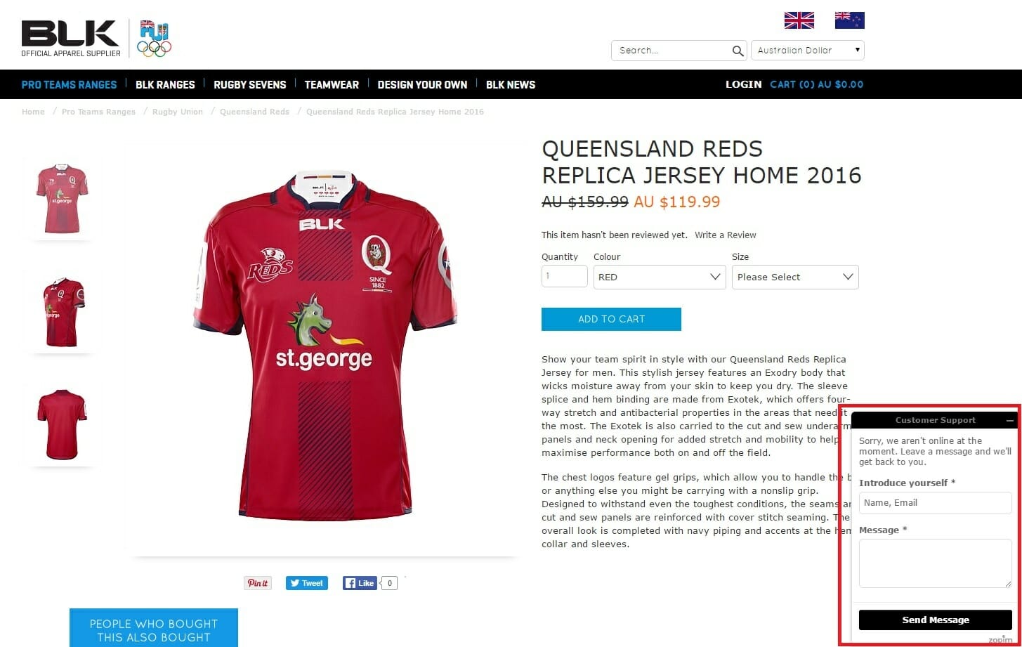
With most systems, you can gather important data on the enquiry, allowing you to personalise future communications and shopping experience for your customers. If you have a well-trained team operating around the clock, live chat can be a huge customer service advantage for your brand.
Helpful Resources
- Live Chat App: Which is the Best for Your Ecommerce Business? – Catalin Zorzini for Ecommerce Platforms
- 5 Reasons Why Live Chat is The Untapped Potential for Your Business – Lior Levin for Kissmetrics
- 15 Stats To Convince You Live Chat Is The Key To Success – Daryl George for Happy Fox
Reduce your load speed times
Convenience is your advantage as an online retailer. We all hate braving the crowds at the mall. The queues, the car parking, the traffic…
There are no queues online.
Don’t let your biggest advantage over your brick-and-mortar counterparts go to waste.
Load speed is critical.
You need to make your online shopping experience smooth.
If a customer can’t make a purchase in the time it takes for them to knock out a couple of pushups, you’re doing it wrong.
Use a tool like Pingdom or Google Page Speed Insights to measure your current performance. According to the learned folks at Kissmetrics, every one second of delay in site load time can reduce your ecommerce conversion rate by 7%. This infographic from Kissmetrics outlines a visual array of other conversion-rate-killers borne out of a spluttering load speed.
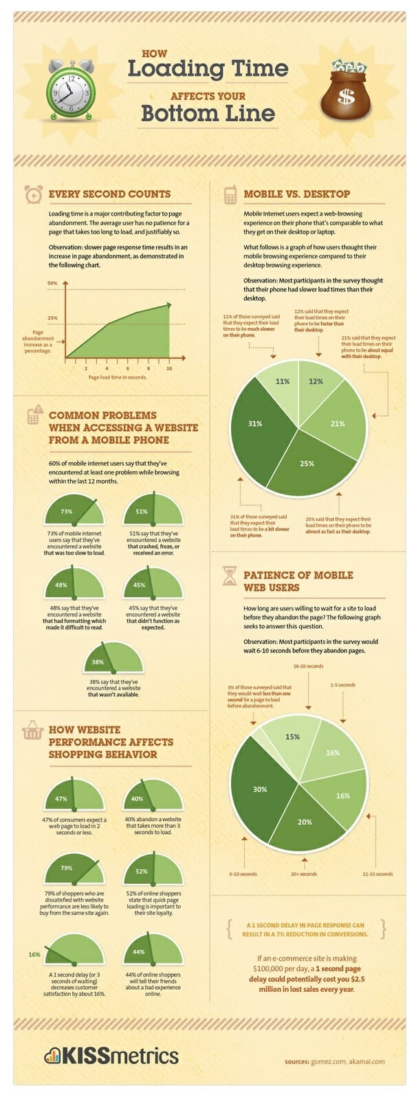 Little changes can make a huge difference. Get your development team into clean-up mode and strip out any unnecessary code. Resize any large image files to speed up your site’s load time. These two hacks will get your store a nice little turbo-boost.
Helpful Resources
- Why Decreasing Page Load Time Can Drastically Increase Conversions – Sherice Jacob for Kissmetrics
- 10 Ways to Increase Ecommerce Site Speed – Gagan Mehra for Practical Ecommerce
- 11 Low-Hanging Fruits for Increasing Website Speed (and Conversions) – Peep Laja for Conversion XL
Develop a custom 404 page with CTA to keep browsing the store
Broken links, site errors, expired pages – it happens. Whether you’ve retired old content, deleted an old product page or your customer has got their wires crossed; 404 pages are an ecommerce necessity. You’re going to need one, and it had better be good.
You need to place yourself behind the customer’s click. If you’re navigating through a site and expecting a certain page, only to be greeted by a 404 error, you’ll be a little miffed, to say the least. It’s our online store’s job to ease the frustration.
First and foremost – you need to solve the user’s problem. Don’t leave a generic dead end. That’s a certain conversion fail. Instead, offer a prominent search box, and a clear call-to-action to your homepage to allow the user to find an alternate route to the information they want.
You might also want to offer some helpful or educational information to pique a new visitor’s interest – visual links to your most popular blog articles or buying guides might be a welcome addition for a browsing shopper.
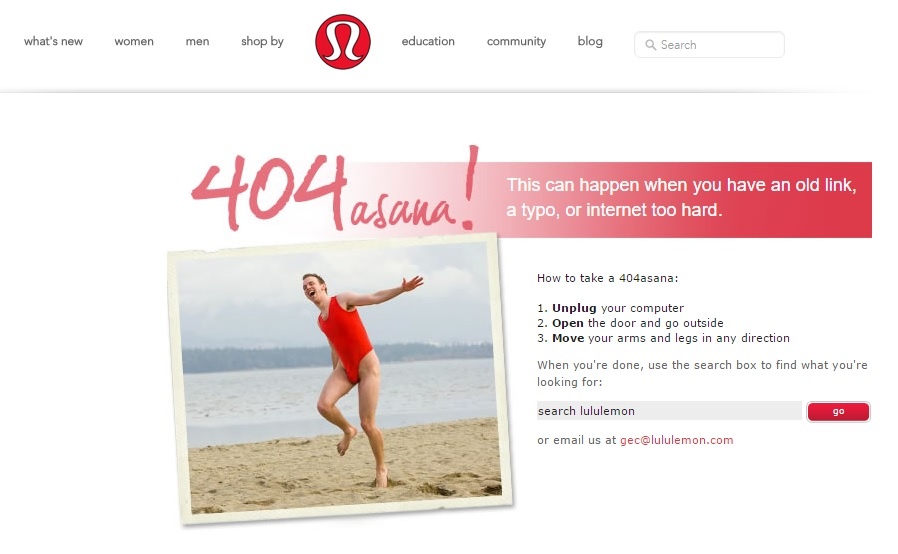
Now’s a good time to lighten the mood a little. Try and give your customer a chuckle. Some self-deprecating humour related to your brand or industry will turn your mistake into a delightful bumble. There are a plethora of hilarious 404 page examples out there to fuel your creativity, but athleisurewear innovators Lululemon blend helpfulness and humour with aplomb.
Helpful Resources
- How to Create a Spectacular 404 Error Page (with 12 Examples) – Neil Patel for Neil Patel Consulting
- Best practices to design a 404 error page – UX Stack Exchange thread
- Best 404 page examples in e-commerce – Ksenia Dobreva for Amasty

Develop helpful buying guides
Develop detailed buyer’s guides with all the research information a customer could possibly need to establish their trust in your brand as an authority source and assure their purchase.
Focus your information on the category in general, as well as comparing, contrasting and analysing specific products. Explain why some options are better than others, and give users information on the different usage occasions, budgets, sizes, materials etc.
REI are the best in the business, and we’ve written in detail about their content marketing genius before.
You can check out their Rock Climbing Shoe Guide, which includes an instructional video (below), a pros and cons comparison between categories, a features guide, and helpful sizing tips and tricks.
Helpful Resources:
- Best practice for using Buyer’s Guides for Ecommerce SEO – Mel Henson for Smart Insights
- Camera Buying Guide example – Currys
- Car Speakers Buying Guide example – Crutchfield
Repurpose seasonal buying guides
Most ecommerce brands and their potential customers are impacted by changes in seasons.
Research triggers are impacted by upcoming events, and weather conditions play with the popularity of different products and categories.
Most retailers understand this consumer behaviour reality. The response is too often driven by batch and blast sales promotions.
Winter’s here – purchase a new coat!
It’s 38 degrees this weekend – impulse buy an air conditioner!
Back to school sale – get your stationary now!
Easter is around the corner – book a weekend getaway!
Stop treating your customer’s inbox like a billboard.
Instead, why not create helpful, research-based content to nurture interested subscribers into a full-price purchase (and avoid bullying less interested subscribers with merciless selling).
I’ve listed four online retail powerhouses using specific landing pages to allow users to search for products for the upcoming season.
You can take the customer helpfulness one step further.
Don’t focus on products – focus on the interests of your readers.
Help solve your customer’s specific seasonal problems and show your readers how relevant products will improve their experience.
Don’t create a promotional email with 25% off decking materials.
Put together a step-by-step DIY guide to building a new deck in time for summer, complete with instructions, specifications, tools and materials required, styling recommendations and supporting explainer videos. You can infuse calls-to-actions to shop related products in context throughout the guide.
Helpful seasonal guides are rarer than an Indian summer, so my example list for this tactic is looking barren. I have to go back to our 2015 Ecommerce Award winner, Huckberry, to show you how it’s done.
Read their different Guides on Winter Camping, and this tactic will make a whole bunch more sense.
Huckberry manage to slide relevant products into the context of a different helpful winter guides, establishing the trust of their readers in the process.
If the customer is inspired to buy – why not buy from the proven experts who just provided a whole stack of free, helpful, interesting info?
The best part – your seasonal guides only need one big creation effort. Once you’ve developed the landing page, you only need an hour or two to refresh and update each guide the next year, incorporate any new products, and schedule in fresh email and social media shares.
If possible, infuse influencers into your content. Create a list of partners with similar interests and brand values. Select those with large social media followings made up of people similar to your target audience. Interview these influencers. Get them to review your product. Ask for their tips, advice and expert perspectives. Share their story in your seasonal guides.
There are not many online retailers using this simple content marketing tactic to improve their customer experience. All the more opportunity for you to delight your shoppers.
Surprisingly, food retailers are the cream of the crop.
UK supermarket chain Waitrose and US retail oligarch Walmart, both have helpful seasonal guides, complete with carefully curated, relevant products.
But the best-in-class example comes from another Gorilla favourite. We’ve written at length about the US grocer Wholefoods’ content marketing recipe for success, and their seasonal guides are suitably sumptuous.

Wholefoods’ seasonal landing pages are a delectable dish full of recipes, cooking advice, step-by-step instructions, and food-porn imagery. Customers can keep referring back to the landing page for inspiration and direction. The KPI-obsessed executives will be appeased by product ingredient lists that are seamlessly integrated into the experience – compelling browsers to shop with Wholefoods, and converting the content helpfulness into sales.
Resources
- How to create a useful holiday gift guide – Nicole Kohler for Woothemes has the definitive guide to planning, creating and promoting your seasonal gift guide
- How to Use Gift Guides to Boost Your Holiday Sales – Corey Ferreira for Shopify
Develop dedicated research hub pages
For prominent categories and products/brands, create a dedicated landing page targeting a broad match keyword, then go to town with every possible scenic of information a buyer might need to research or consider a purchase.
You want to make sure Google absolutely has no choice but to rank this information hub on page one for this search term.
Use Brian Dean’s famed ‘Skyscraper technique’ to give you some guidance (okay, maybe it’s only famous for online marketing nerds). You want to find the most helpful and valuable content ranking for your target search term and beat it out of the park. Make your page longer, more helpful, easier to use, better designed and more entertaining.
Mr Porter gives you the template. The menswear E-retailers ‘Shoe Guide’ is one of the most helpful ecommerce resources you can find.
Their landing page targets the ultra competitive keyphrase ‘shoe-guide’, and opposed to most competitor offerings, Mr Porter’s content is a haven of helpful research.
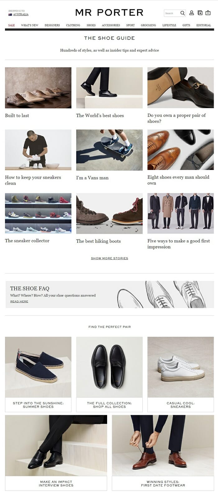
Create your own browsing research library, with visual tiles linking to product, brand, category or needs-based buyer’s guides. Incorporate any relevant blog articles, FAQs, UGC reviews, testimonials, expert interviews, or influencer advice you’ve previously published on the keyword topic.
You’ll start dominating organic search rankings for critical research terms, and you’ll establish the trust you need from your newfound browsers to turn them into customers.
Helpful Resources
- Why internal links and hub pages are a major factor in SEO success – Graham Charlton for Econsultancy
- The Definitive Guide To Ecommerce Search Engine Optimization – Neil Patel for neilpatel.com
- Internal Linking: the most underrated way to dominate ecommerce SEO – Scott Evans for the Gorillas!
Create events-specific landing pages
Don’t miss out on the key events for you target audience.
Be it sporting, musical, cultural, seasonal, political or economic – if your customer cares about and event, you can curate a specific landing page with products and information designed to help potential customers before, during or after the event.
Take the 2016 Euro Football Championships.
It’s a huge event. Lots of people care about it.
The tactics are simple for a sports apparel retailer – set up a ‘Euro 2016 shop page’ and optimise it for key purchase-ready search terms.
Kitbag.com has it nailed, complete with a timely discount for the event:
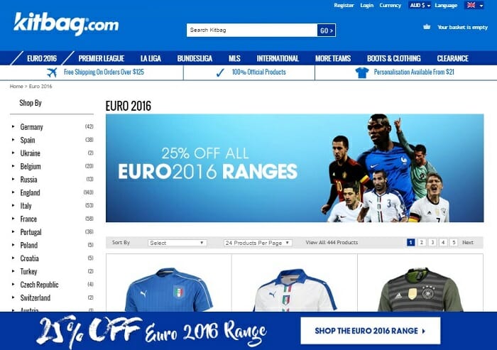
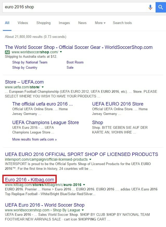
As a result, this page is dominating page one for the search term ‘euro 2016 shop’, coming in just below the official UEFA store of the tournament’s organising body.
You can expand this tactic to include everyday events your customers will enjoy throughout their life. Milestone birthdays, graduations, anniversaries and weddings are constant opportunities for your online store on each and every day throughout the year.
With a little extra effort, you can construct dedicated content hubs to help gift givers and event organisers easily find, research and purchase.
Ice is an innovative online retailer with a business model unique to the industry. These guys don’t hold any inventory. In essence, the brand is an online marketplace, curating the best products for their audience and stripping out the margins added by the traditional bricks and mortar retail process.
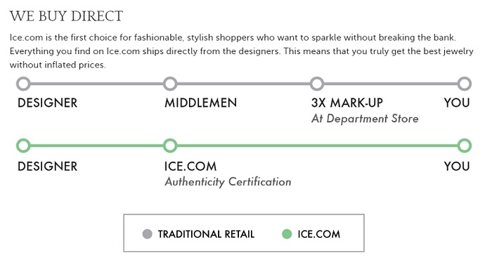
Ice has built a business on creating a superior online shopping experience. Education, convenience and expertise is what they sell. So Ice understands the importance of providing helpful content designed around their audience’s needs.
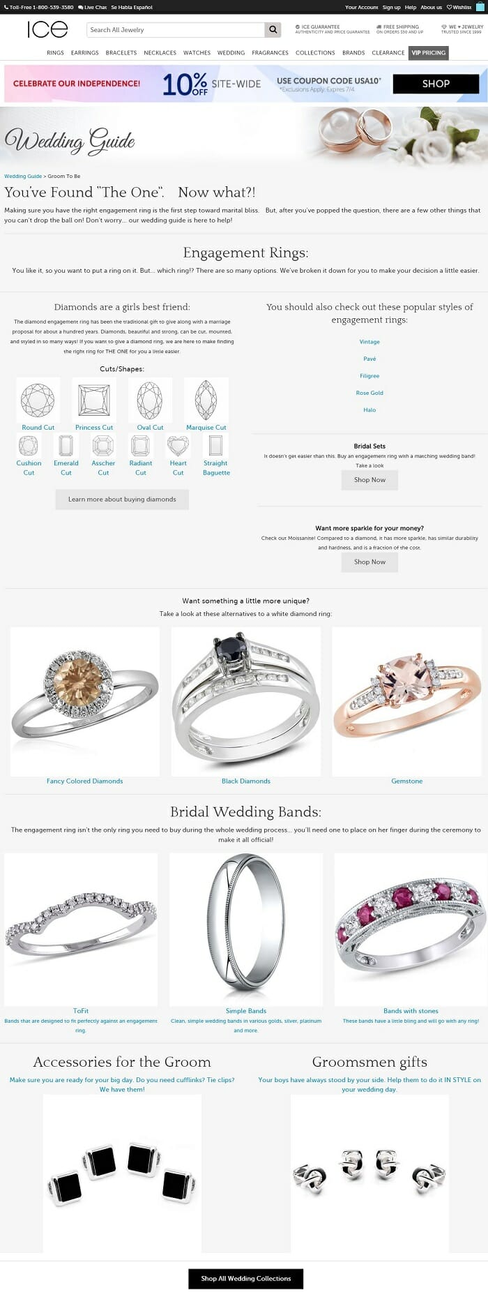
Their wedding guide is a perfect example of the power of an events-specific landing page. Ice allows wedding guests to access a personalised shopping experience, crafted for their specific needs, using basic guided selling techniques.
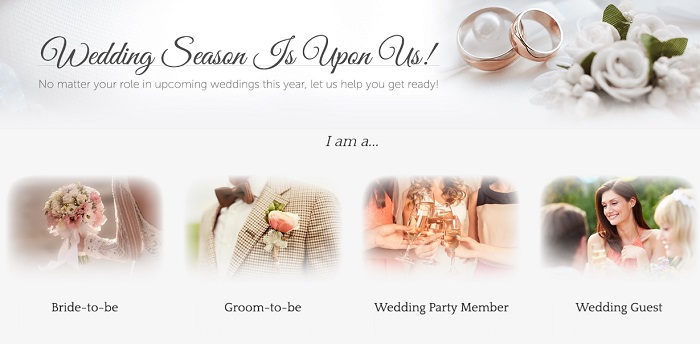
Each particular customer type can click through to their own carefully created content hub, complete with educational, research-based content, and relevant product offers. The personalised content signals a couple of key factors to the customer:
- Authority – your specific guide proves you know what you’re talking about
- Trust – you’ve proved you want to help, not just to sell
- Care – your brand is going above and beyond competitors to help the customer
If you’re a groom-to-be, and you click through to Ice.com’s customised guide – there’s a good chance you’re more likely to convert on a purchase here, than on a competitor’s generic jewellery store.
One-off events can be important, but annual, recurring retail holidays and key dates warrant the extra landing page efforts.
Christmas, Easter, Father’s Day, Mother’s Day and Valentine’s Day are retail extravaganzas. Most ecommerce stores will benefit from a dedicated landing page for one or all of these dates. A combination of helpful content and carefully selected products will give gift-givers a better shopping experience.
The one initial effort needed to create a dedicated landing page gives compounding returns each year. Your organic search rankings stick with the page, and a few quick updates each year will have you increasing conversions once again.
Resources
- Innovators: 3 Sites that Benefit from Seasonal Events – Harley Finkelstein for Practical eCommerce
- 12 step guide to international e-commerce events – Collaboration from Open to Export and Webretailer.com
- How to Capitalize on Valentine’s Day Commerce – Douglas Karr for Marketing Tech Blog
- Your 2016/17 FY Online Retail Calendar – From the Gorillas
Create gift-shopping landing pages
Imagine walking into a suit store where the store manager couldn’t recommend a shirt and tie combo for your upcoming wedding. Would you feel confident buying an outfit there? What about a cosmetics counter at a department store where the assistant couldn’t match your foundation to your skin tone?
Immediately you lose trust, and respect, for the store and the brand.
Online shoppers still want expert assistance. Your online store’s experience needs to make up for the lack of a team of customer service staff.
Sure, product types and categories might make sense to you, but for a gift shopper with not much idea of what to buy, there’s no in-store assistant to help out with suggestions.
Your store needs to double as an expert gift-suggester.
If you can create an experience designed specifically for a gift giver’s needs and wants, you’ll pump up your conversion rates and delight your new customers.
Reebok is an underdog in the sports apparel heavyweight cage fight between Nike, Adidas, and US upstart Under Armour.
But – Reebok’s ecommerce game is real strong.
We Gorillas are big fans of their online store strategy, and from our seats in the bleachers, their decision to focus on the fitness niche seems to be a smart one. Instead of fighting the Goliaths at their own basketball/football/baseball game – Reebok is positioning itself as the specialist provider for crossfitters, dancers, boxers, kickboxers, MMA fighters and yogis (I think that’s what yoga people are called).
It’s much harder to find niche sports apparel in offline stores, so fans of these sports scour the online world to find the best gear for their pursuits. Reebok’s store navigation is crafted accordingly:
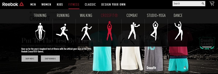
If we zero in on the finer details of the Reebok ecommerce playbook, it’s easy to see the brand is focusing on the needs and wants of their shoppers (as opposed to the product/features-focused competition).
Reebok’s Mother’s Day gift landing page is a perfect example.
The brand knows gift givers search online for Mother’s Day gifts, and fitness apparel always makes a great gift. Instead of leaving these sons, daughters, partners and husbands to muddle their way through their own site search – Reebok is thinking like a gift-giver by creating a dedicated online gift shop for the event.

A specific gift ideas landing page is all you need to make the shopping experience a whole lot easier. For such a small amount of effort and cost, you can achieve a significant return.
Separate out the page into different bunches of curated products collected under specific gift-recipient types.
Use historical purchase data to determine the type of stuff that typical customer types would want. If you’re a menswear e-retailer, it’s an easy exercise.
Split your gift idea sections into categories based on the receiver’s personality or style. This makes it so much easier for the gift buyer to search and choose. Categories like “Outdoorsy”, “Preppy”, “Executive”, “Surfer”, “Sporty” and “Muso” will help gift givers much more than your traditional brand or product based differentiators.
Helpful Resources
- How to Create Effective E-Commerce Holiday Promotions – Ruth Hawk for WEBii
- 5 Ways eCommerce Sites Update Their UX to Get You Buying Gifts – Christine Austin for Impact BND
-
How to Boost Sales on Gift-giving Pages – Pamela Hazelton for Practical Ecommerce
- 7 Ways Ecommerce Websites Can Drive Gift Purchases – James Gurd for PCA Predict
-
6 Christmas ecommerce promotional ideas your customers will actually want – From the Gorillas!
Reduce uncertainty with detailed size guides
Uncertainty is the enemy of conversion.
Anything you can do to reduce doubt will help you win more customers.
Shoppers can’t touch, feel, test or try your products online. Bricks and mortar retailers hold a significant advantage over their ecommerce competitors, and online store managers need to confront this issue to win back these lost sales.
How do you reduce the uncertainty of online shopping?
You need to provide an alternative.
Use your digital tool kit to create a virtual try-on experience.
For apparel retailers, detailed product specifications are table stakes. Model heights, sizes and images are a requirement to give shoppers a visual indicator.
In the example below, Aussie e-retailer The Critical Slide Society (TCSS) provides some helpful sizing qualifiers in their product description copy, assuring buyers that the jacket in picture “comes halfway down the thigh on most guys… tried and tested across the globe and gets a big thumbs up”.
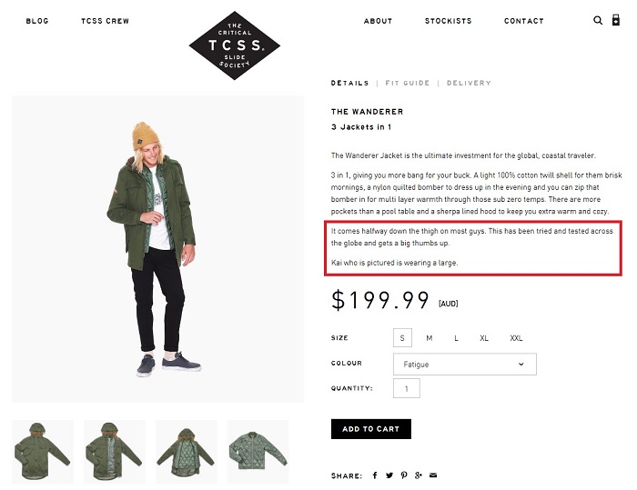
It’s also good practice to tell the shopper the size worn by the model (in this case a large). In this case, TCSS could have added one more little simple detail to further reduce unsure browsers’ anxieties. The height of the model (6ft/180cm) adds perspective and allows the browser to make a visual comparison between the model and their own body shape.
It’s not just helpful copy that makes a difference.
Simple personalisation tools can act as super valuable conversion rate boosters.
A short clickable sizing questionnaire allows your customer to filter their product search results based on their individual characteristics and preferences.
Victoria’s Secret Bra Size Guide is a great example, but you don’t need expensive technological bells and whistles to make this tactic work.
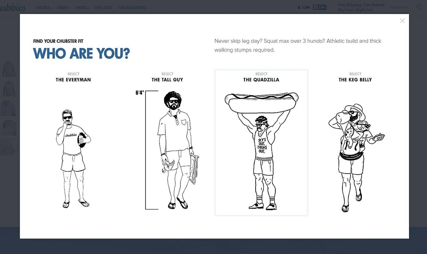
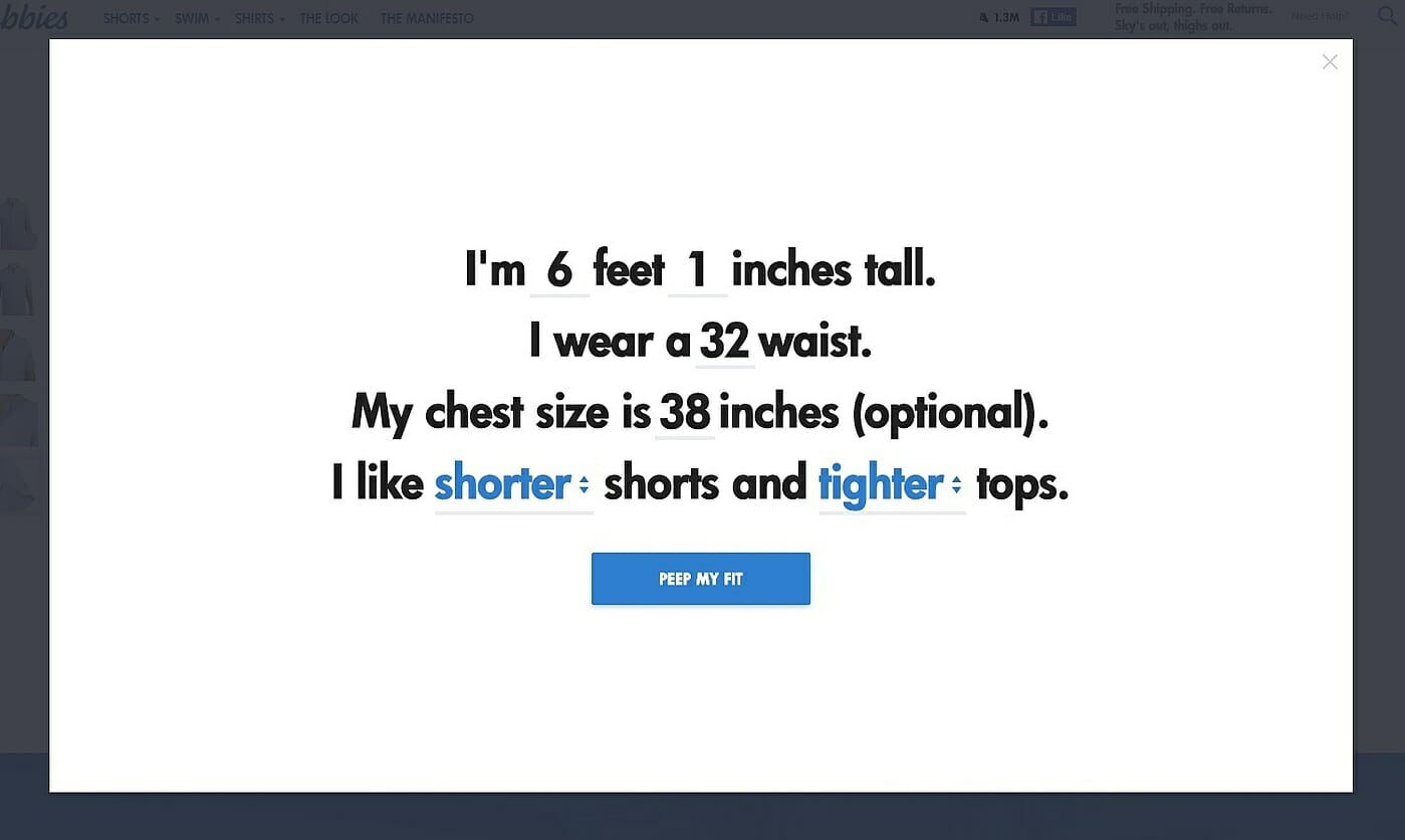
Our 2015 Gorilla Ecommerce Awards Winner, Chubbies, show you how to combine informational and entertaining copy with a personalised shopping experience to make sure customers can easily find their ideal fit.
Their Chubbies Shorts Finder quiz is a work of conversion rate optimising perfection:
Part 1- pick your body type
Part 2 – customise your measurements and filter products based on your style preferences
Part 3 – find your size and shop a curated, personalised collection
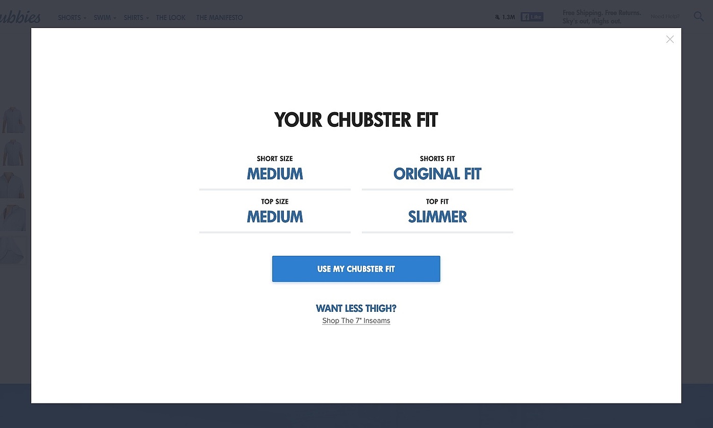
Clothing e-retailers can also add little qualifiers to help reduce anxiety and minimise returns. More detail always helps turn browsers into buyers – particularly for high ticket items requiring a close fit.
Skins are setting the helpfulness benchmark for their performance sportswear shoppers, with their fantastic sizing guide information.
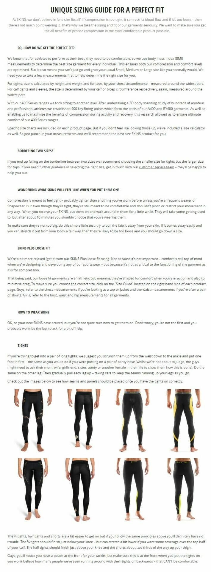
Skins also incorporate a sizing guide and size calculator on every product page to help customers reduce uncertainty.
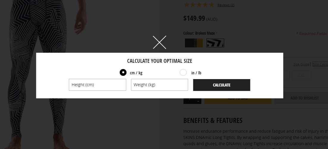
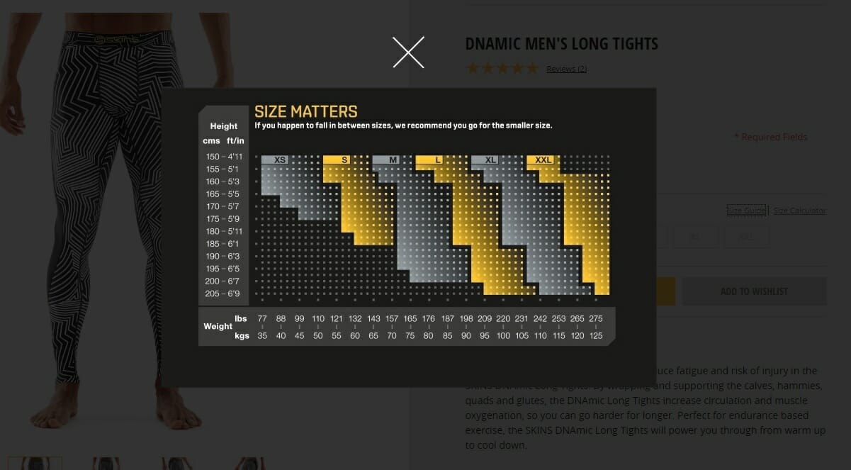
Almost any product online retailer can incorporate these type of elements. Verticals like electronics, appliances, fashion, homewares and jewellery can find their own visual indicators to help assure their customers.
Rhode Island startup Greycork knows the critical value to online furniture shopping – customers want to see, touch and trial before they make such an expensive purchase.
To alleviate this uncertainty, Greycork has developed a small, innovative gamechanger. Their ‘Home Try-Out’ package is conversion rate genius. Customers can order the kit to see how Greycork looks in their your home before making their purchase decision. The kit is delivered for free, and super simple to use:
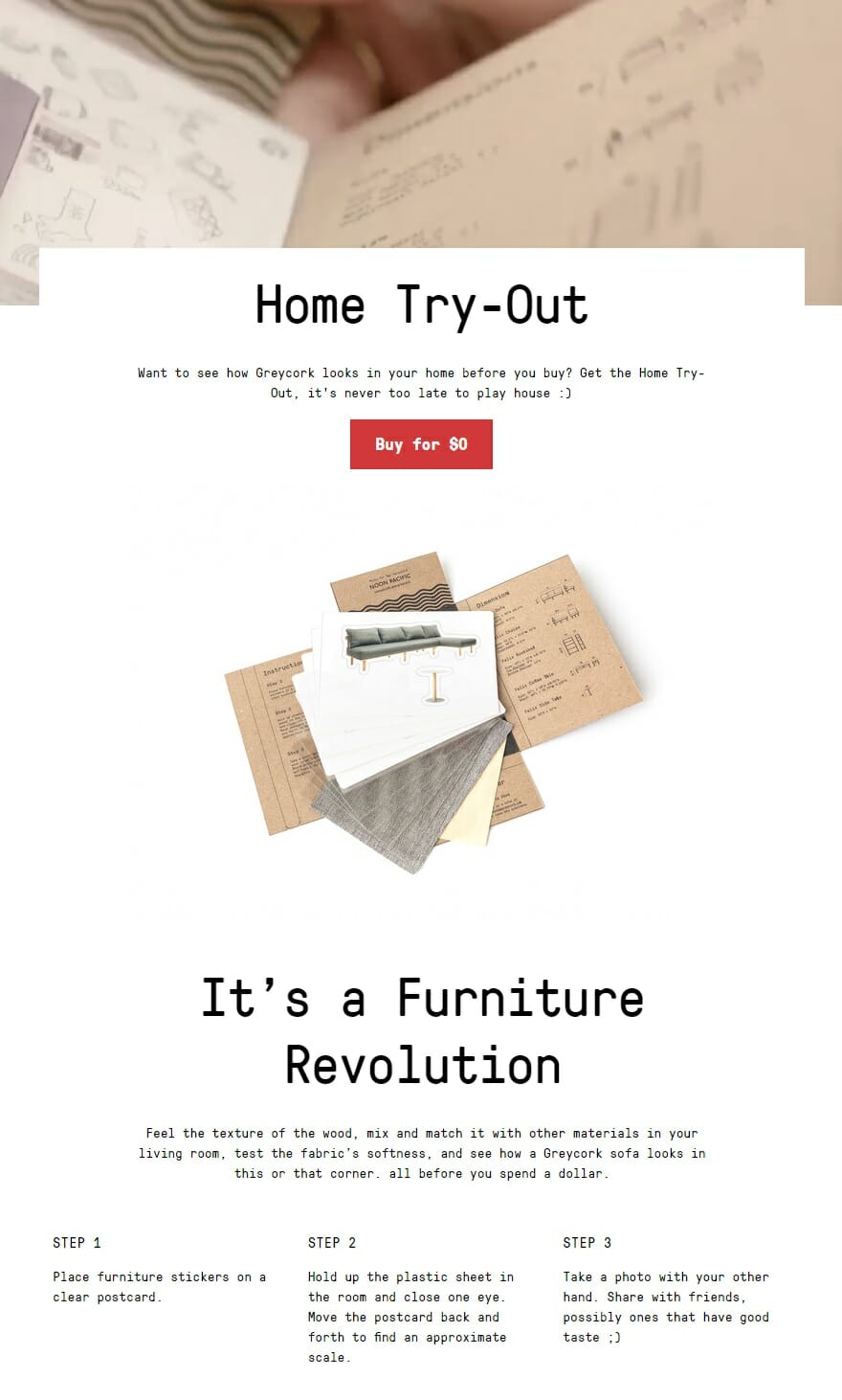
If a furniture retailer can find a way to make this conversion tactic work, you have no excuse.
Helpful Resources
- 4 Tech Solutions for Perfect Fit, Ecommerce Style – Kenzie Bryant for Racked
-
8 Startups Trying To Help You Find Clothing That Fits – Eliza Brooke for Fashionista
Add call-to-action buttons to helpful content at the end of your pages
The best ecommerce brands are like a good outfielder – they do everything possible to avoid a bounce.
You’ve invested so much time, money and heartache to attract a potential customer to your site. Whatever you do, don’t show them the virtual door.
Each of your site pages need to come packaged with a compelling reason for potential customers to stay on your site and continue to engage with your brand. Even your checkout confirmation page cannot be an exit turnstile. Continue to help, delight and entertain your customers until they need to force themselves to close their browser tab.
Your job is not done after your customer has purchased. Your brand needs to switch into post-purchase evaluation helpfulness. There are so many simple ways to keep improving your customer’s shopping experience:
- Serve up helpful content designed to show customers how best to prepare, assemble, use, maintain, clean or manage their purchase
- Create an incentive (a freebie, discount or coupon code) for customers to refer your brand to their friends
- Urge your customers to connect with your brand on other social media channels to further your chances of benefiting from user generated content
Ecommerce sites aren’t only guilty of accepting the bounce on checkout pages.
Many brands are complacent across their entire site, neglecting to consider any visitors other than those ready to buy. Take an each way bet! Help all of your potential customers – particularly those who need more information and assurance before making a purchase decision.
At the end of all your product and category pages, add some visual tiles linking the reader to related content that research – not sales focused. This gives you the chance to establish authority and build trust instead of increasing your bounce rate and losing a potential lifetime customer.
Sharing related blog articles, buying guides, supplier info or user generated content, gives you a second chance to keep in touch with your potential customers and urge them to subscribe for more.
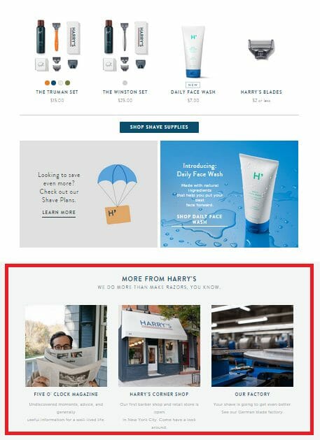
Harry’s are an online shaving goods retailer who understand the value of content marketing. The related content call-to-actions at the base of their landing pages are (true to form) beautifully designed, and powerful reducers of the dreaded bounce rate.
Helpful Resources
- Ecommerce blogging: five proven reasons why it should be part of your SEO strategy – Robert Mening for Search Engine Watch
- How to crush it with your ecommerce blog – Zach Miller for Contently
Optimise your platform’s ecommerce site search functionality
If you have relatively significant levels of site search traffic showing in your analytics, you’ll find a way to increase your conversions by improving your site search functionality.
Peep Laja and the team over at CXL provide some great resources on improving e-commerce site search.
They have loads of resources and articles on improving ecommerce sites, with articles choc full of relevant ecommerce examples to the subject of online store site search. If you manage your online store’s site search functionality, it’s worth the half hour of your time to go through each of their articles in detail.
Their articles will save you thousands of wasted dollars spent on consultants or new software, and earn you thousands of dollars in new conversions you would never have made without a few simple directives to optimise your site search functionality.
Generally – take site search seriously. Consider your approach as you would any other significant acquisition or conversion mechanism. Site search will be around for the life of your online store, so you need to regularly test and optimise. Linda from over at ecommerce illustrated explains perfectly:
“Fundamental site search problems are usually not symptoms of a bad search tool or lack of features, but of sub-optimal tuning of the core engine. Your site search will suck, in some way, for some (or most) queries, if you “set it and forget it.” The good news is… (most) site search optimization tactics can likely be implemented with the technology you currently use today.
Search tuning strategies are rarely mapped out and considered in the requirements stage of an implementation, and systems integrators typically won’t ask for them. This is why so many retailers scratch their heads about why site search sucks. Tuning site search can pay dividends, and it’s worthwhile to adopt an ongoing, iterative approach to site search optimization.”
If you don’t have the time to hustle through CXLs detailed site search CRO wisdom, here’s a few critical takeaways:
#1. Manually adjust your recall vs precision balance
Looking under the hood of your tool may reveal that default settings are returning results too high on recall or too tight on precision, and adjustments to search logic and index factors can improve your results.
#2. Use Boolean logic
Precision can also be influenced by using “and” logic, rather than “or.”
Take a search for ‘silver linen queen duvet cover’ made on a homewares ecommerce site as an example. will return vastly different results depending on your algorithm’s use of ‘and’ versus ‘or’. Silver’ and ‘linen’ and ‘queen’ and ‘duvet cover’ will offer a more precise, relevant collection than ‘silver’ or ‘linen’ or ‘queen’ or ‘duvet cover’.
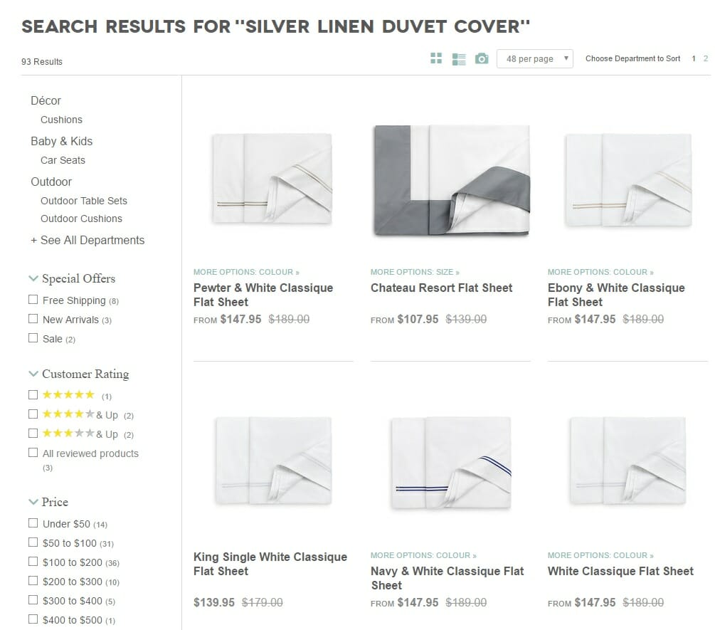
This one simple change can take you from infuriating your potential customers to converting them with ease.
#3. Cater for semantic search terms
This functionality helps you return results for variations of exact product and category keyphrases to make your search more relevant for users.
You need to add in all possible synonyms for your products to stop searchers from missing out on crucial results (and to stop you missing out on sales).
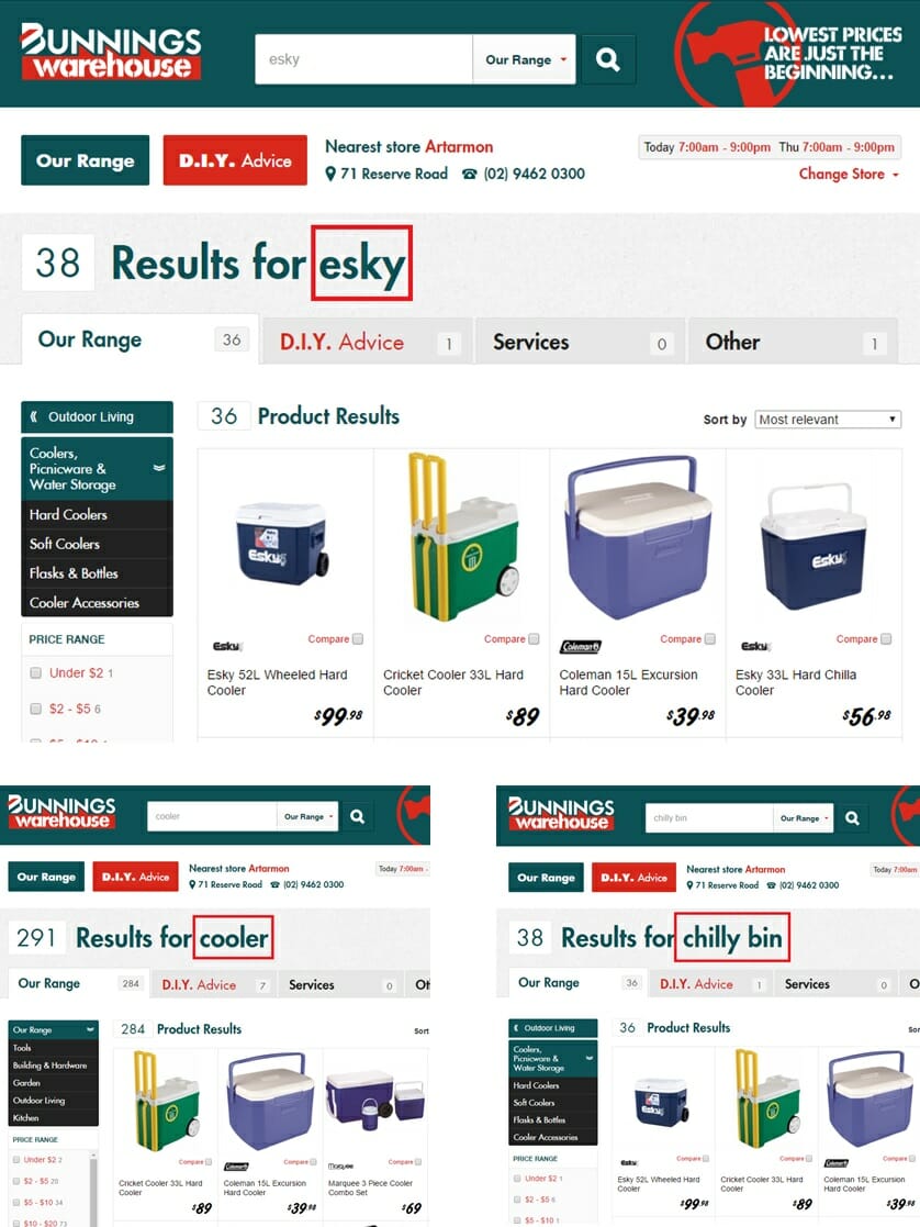
In this Bunnings example, their store nails semantic search, catering for the Australian, New Zealand, and US versions of esky/chilly bin/cooler.
#4. Offer autocomplete suggestions
While users are conducting a search, you should offer predictive ‘autocomplete scope suggestions’ to help refine before the results page.
By proactively offering a category, brand or product filter – you can reduce the number of clicks, and time spent by the user.
Research agency Baymard is the authority source on all things ecommerce user experience and Jamie Appleseed’s super specific article on 8 Design Patterns for Autocomplete Suggestions gives you everything you need to know and more.
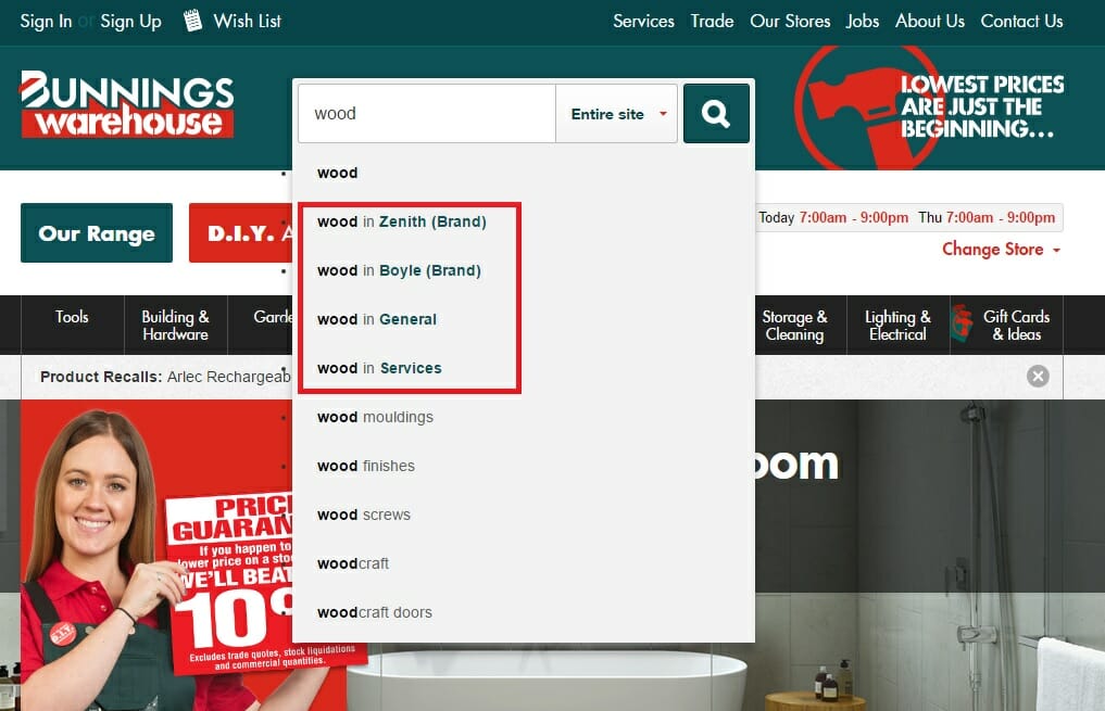
Once again, Bunnings gets a site search gold star.
A simplistic, broad search for ‘wood’ gives the user a helpful option to refine by brand or category, improving the customer experience and increasing the chances of conversion in the process.
#5. Test, test, test
After site search tuning has been implemented, it’s important to manually check results and validate that tuning tweaks are working. A/B testing may be involved if your technology supports it.
Helpful Resource
You can’t go past Peep Lajas advice on how to run A/B teests
Create a more prominent search box
Make your search function prominent and clear throughout your site. Allow your potential customers to find exactly what they want in the fastest way possible. Give your visitors the keys to your site and let them find their own way.
Sure, provide a structured journey to funnel browsers down a particular route. But don’t force it. Potential customers will become irritable and impatient if they can’t control their search.
Australian homewares retailer, Victoria’s Basement sell everything and anything you could ever squeeze into your kitchen. With so many products, categories and brands – the onsite search function is often the shopper’s first destination.
The site is designed accordingly, with a big, clear search box above the fold, closely followed by a visual navigation bar split by key categories:

Get that widget clearly displayed on your homepage, category pages, product pages, and your blog pages. Don’t miss out on a customer because of this one super-fixable detail!
Resources
- 5 Ways to Make Your Ecommerce Website Search Feature Convert – Sherice Jacob for Kissmetrics
- 7 Simple Tips for Improving Ecommerce Site Search – Mark Macdonald for Shopify
- The Current State Of Ecommerce Search – Christian Holst for Smashing Magazine
Create a needs-based search option
Your customers don’t jump online to search for a ‘product’ to buy. They’re searching for a solution to a problem. They’re searching for something they want or need. So it makes sense to allow your customers to filter their search based on their interests as well as their size or gender.
Most ecommerce sites are still digital catalogues.
We need to start creating an online shopping experience that allows our customers to search and browse – based on their needs – not on your products.
Bricks and mortar retailers get it. The best craft a servicescape deliberately designed to entertain and engage their in-store traffic.
Take inspiration from IKEA’s showroom concept, complete with themed and styled rooms to show customers their products in action. Don’t just build your site for transactions – build your site to serve your customer’s entertainment, browsing, and research needs.
If you’re an outdoors retailer, develop specific landing pages for common DIY projects to help customers build a deck, start a veggie patch, or rig up a tent. You can integrate links to relevant product pages throughout the helpful DIY content.
This way, you’re providing valuable expertise before customers buy – developing trust points that are easy to cash in for a sale.
If you’re a fashion retailer, create landing pages for different user occasions.
Create your own wedding, beach, camping, partying, workout and dinner-date pages.
I’m about to pump up menswear retailer/publisher Huckberry once more. These guys genuinely care about their customers’ shopping experience.
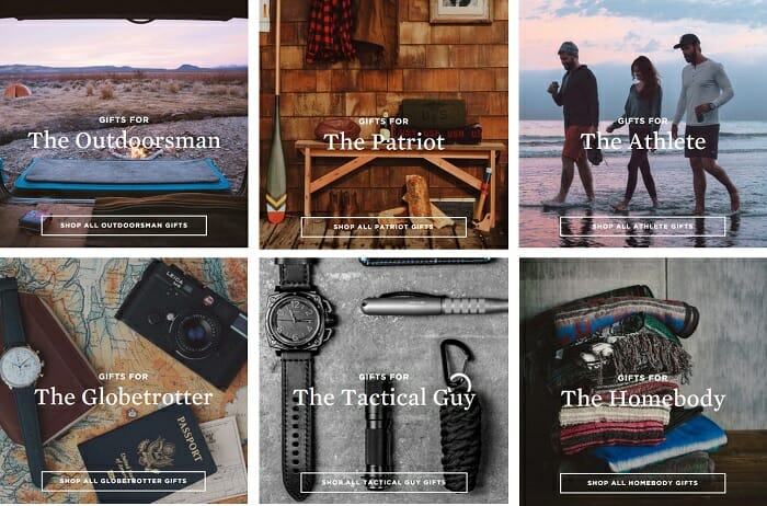
Huckberry understand their audience. Men like direction when clothes shopping. So Huckberry have developed landing pages with products curated based on different personality types and usage occasions (instead of just product types and categories) to make shopping easier for their browsers.
The image below shows you how Huckberry allow their customers to shop personality-based gift pages.
You should start integrating educational content into your online store to further help your customer.
Offer tips, advice, expert insights, demo’s, and instructions to prove your expertise, and add value to the shopping experience.
This level of service breeds loyal, repeat customers, and creates an advantage your competitors will find hard to replicate.
Think about the problems your customer is trying to solve, and the triggers that drive their research. Craft your user experience to make things easy for your customer, and they’ll keep coming back to you for help.
Helpful Resources
- You Say Tomato, I Say T-Shirt, and Needs-Based Browsing – both by Jack Aaronson for Click Z
- How to turn your online retail content marketing into a virtual shop assistant – from the Gorillas!
Create new categories based on your site search analytics
This one is a forehead-slapper.
Of course you should monitor your site search data, and of course you should update your store homepage to allow for easier access to popular search terms.
If the same searches keep cropping up, it’s a sure sign you need to offer a clearer path to purchase. Either add the popular site search term as a new category, or include provisions within your filtering options.
Pancham Prashar highlights this cheeky tactic in his truly epic 91 Point Conversion Optimization Checklist, published as a guest article on Moz. Here he explains the mechanics you need:
“Use Google Analytics to find-out what visitors are searching in your product search box.
Google Analytics > Account > Standard Reporting > Content > Site Search > Search Terms.
The keywords with top ‘total unique searches’ are the ones that people are searching for. You will find the top searched product and brand names here. These are obvious contenders to be placed at prominent places inside your navigation menu. A navigation based on users’ preferences and popularity of products rather than on conventional categorization can have a positive impact on the conversion rate.”
Helpful Resources
- Set up site search to see how users search your site – Google Analytics Help
- How to Use Google Analytics Site Search Reports – Anna Lewis for Search Engine Watch
Treat each product page as a landing page
Don’t just slap up a manufacturer’s generic one paragraph description with a couple of green screen stock shots. Your product pages are like a politician’s stump speech. You have a chance to convince people to vote for your brand, for your product – so you’d better make the most of it.
Don’t get complacent. Give your potential buyers the information they need to assure their purchase.
Communicate the key benefits your customer will get from buying your product. Explain relevant features within this context.
Don’t tell customers what they are buying – focus on telling them why they must buy it. You’ll struggle to do so without some element of comparison. Relate your product back to the rest of the market. Create an explicit reason why customers should choose your product from your site above all others.
Often, pureplay ecommerce retailers do this best. The likes of Casper, Bellroy and Myles have no physical stores, and no friendly customer service staff – they rely on their product pages to do the convincing and converting.
Winner of our 2015 ‘Bets Newcomer’ Ecommerce Award, Tracksmith provide a breathtakingly beautiful illustration of why you need to care more for your product pages. Tracksmith’s product landing pages are filled with stunning, contextual imagery or their products in action, and detailed quality, sizing and benefits-based information.

(Keep in mind, clean and clear design is still paramount. Instead of cluttering up the page with streams of content, just provide further consideration information below the scroll line. This way, you don’t ruin the experience for those ready to buy, and you’re still able to assure less certain browsers of their purchase.)
Helpful Resources
- 15 of the Best Product Page Design Examples We’ve Ever Seen – Lindsay Kolowich for Hubspot
- 10 inspiring examples of ecommerce product pages – Nikki Gilliland for Econsultancy
- How to create the perfect ecommerce product page – Lari Lehtonen for Nosto
Explain how best to use your product
Don’t assume your customers know how to maximise the value of your product. Use explanatory content (visual elements like video, imagery and illustrations work best) to re-assure browsers and demonstrate the unique benefits of your product.
This is particularly important for complex products like electronics, furniture, appliances or machinery. Often browsers may baulk at big-ticket, complicated purchases and opt to go in-store instead. Make assembly, usage, cleaning and maintenance requirements clear and simple.
You can clearly communicate the value, versatility, quality and simplicity of your products while helping your customers with a better shopping experience.
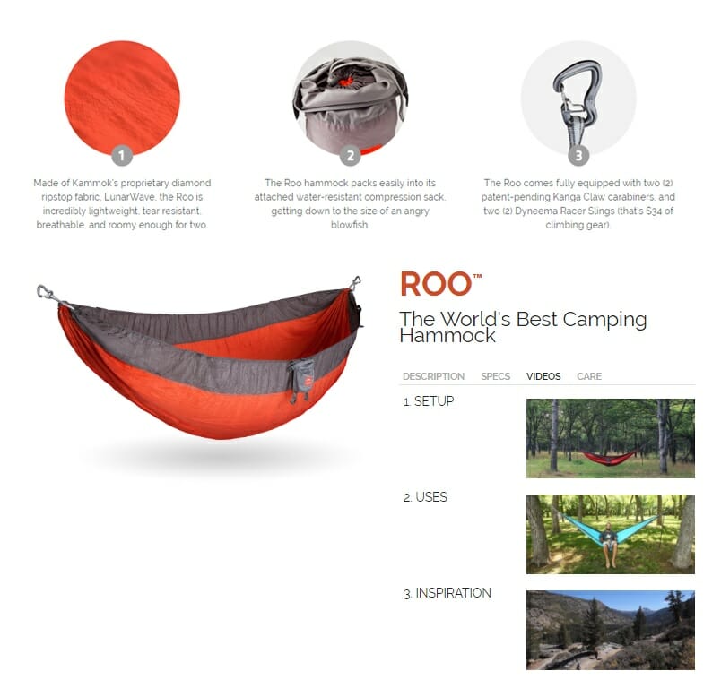
Kammok is an innovative online retailer nailing this content marketing helpfulness. Their product pages are super helpful, with 3 separate videos provided to help the buyer explain how best to use their hammocks.
Helpful Resources
-
Eight different ways of using product videos in ecommerce – David Moth for Econsultancy (David includes a fantastic example of an auto-parts retailer using instructional videos on product pages to help educate customers on DIY repairs)
Create detailed, original product descriptions
You need to treat each and every ecommerce customer like a new date.
This is the start of what you hope will be a lifetime relationship.
In this context – your product pages take on a whole new level of importance.
Your product images should be chosen and uploaded with the same intricate deliberation as the five Tinder profile pics you tentatively upload.
Your copy carries the same importance as your internet dating profile. It’s your last chance before decision time. It’s make or break. Do or die.
Don’t even dream of settling on a generic manufacturer’s bio.
No prospective partner is sold on the classic “I even walks on the beach, going to the cinema, and keeping fit.” That’s a straight up swipe-left.
You’re screaming boring, dull, predictable.
Instead – use your product page copy to seal the deal. Show your brand’s unique personality. Prove you’re the best option for your customer. Appeal to their emotions. Command their respect and explicitly state the benefits of your brand’s product they just cannot afford to go without.
Make em’ swipe right.
Look no further than the self-appointed bastions of shorting Americana (and our favourite ecommerce copywriter since old Chris Colombus sailed ashore), Chubbies.
Here’s an outrageously perfect example of product page copywriting that manages to arm-wrestle you into clicking that big old ‘buy now’ button.
Don’t just rely on incredible custom product images and quirky wisecracks.
It’s still important to communicate your product’s unique features and benefits. Just make sure you do it with a tone that resonates with your audience.
Remember – this is a potential lifetime relationship you’re trying to develop. You need to talk the same language as your potential partner. So state your case, convince your lover, and be true to your personality or you’ll bore your shopper into a close-browser click.
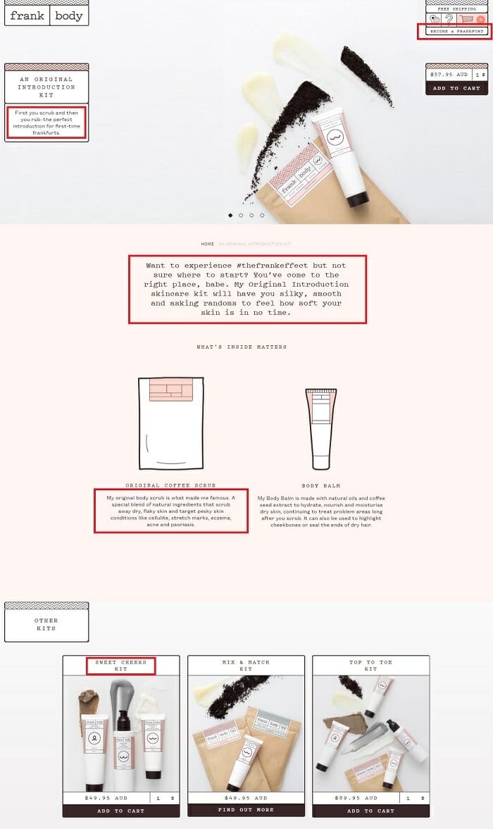
Another one of our ecommerce content marketing pin-up boys is an irresistible copywriting crush. Frank Body is a brand with a palpable personality. Their marketing is the combined voice of a character named Frank. You can’t help but fall in love. Frank’s product descriptions are no exception – dripping with charm and charisma.
One of our most popular articles of all-time exposed the playbook behind Frank’s customer-attracting A game that’s seen an Australia cosmetics startup amass over $20 million annual revenue and over 680,000 Instagram followers. You can read the full piece below.
“Meet Frank, the Ecommerce Content Marketing Casanova (and our favourite case study)”
Back to our copywriting coercion.
I want to be clear that all brands can use this product page conversion rate-booster.
Don’t let yourself off the hook here. Unique, descriptive copy is not reserved for the sexy, snazzy millennial-wooing brands. Even if your online store is not a social media darling – you still need to communicate your brand’s personality to let potential customers know you’re the right choice for an ongoing relationship.
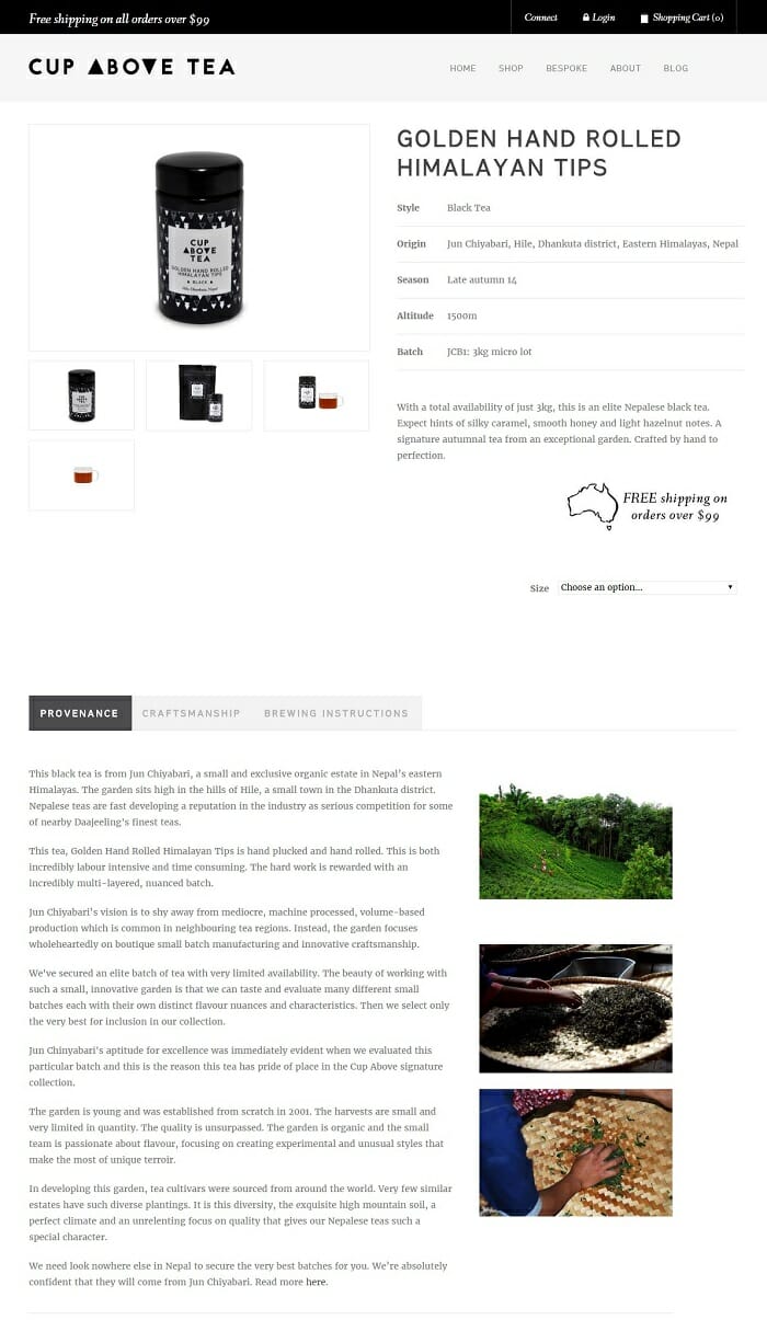
Luxury brands like Cup Above Tea still need to use their product copy to establish a value match with their audience.
This single origin tea e-retailer keeps product descriptions free of kitschy colloquialisms and edgy banter – instead using sophisticated language and emotive, aspirational language to lure in their target audience and reassure them Cup Above Tea belongs on their artisanal hand-crafted table.
Helpful Resources
- 7 Simple Steps to Writing Product Descriptions that Sell – Henneke Duistermaat for Kissmetrics
- Fantastic Copywriting Examples: 13 Companies With Truly Creative Copywriters – Lindsay Kolowich for Hubspot
- Boring Products? No Problem. How to Write Compelling Copy for Anything. – Laura Serino for Ecommerce Fuel
- Fashion copywriting: 13 tips for writing product descriptions that will get your customers to say “yes” – Pulkit Rastogi for I Love Fashion Retail
- How to write killer product descriptions – Adélaïde Ponce de Leon for Neto
Create a virtual try on experience
Some online retailers need to take the shopping experience to a level beyond the simple size guide.
Particularly complex or size-sensitive products like footwear, fridges, sunglasses or bras demand the perfect fit. A little bit of qualifying copy isn’t going to do the job. An online buyer needs more clarification to reach the conviction needed to purchase.
Take advantage of the advantages of the digital experience to make up for your online store’s lack of a fitting room/workshop floor.
If you don’t provide the best possible virtual testing experience, not only will you miss out on sales, but those you make will be plagued by costly returns.
Bras are the perfect example.
Of course, I’m not the industry’s foremost expert in this department – but it’s clear that an online bra purchase is tricky business.
Variations in sizing across manufacturers and brands leave women making calculated guesses – or worse – resolving only to buy in a physical store. Online retailers need to make an effort to substitute a virtual try-on for a physical one.
Berlei’s bra size calculator is simple, fast and interactive. Users can enter their measurements and instantly calculate the correct size to shop. A clear, colour contrast call-to-action button urges shoppers to transition to a landing page pre-filtered to match their size selection – a sure conversion winner.
Compare this customer helpfulness with Bendon’s more traditional attempt. A collection of catalogue style tables are arranged with small type and an absence of any supporting visual indicators.
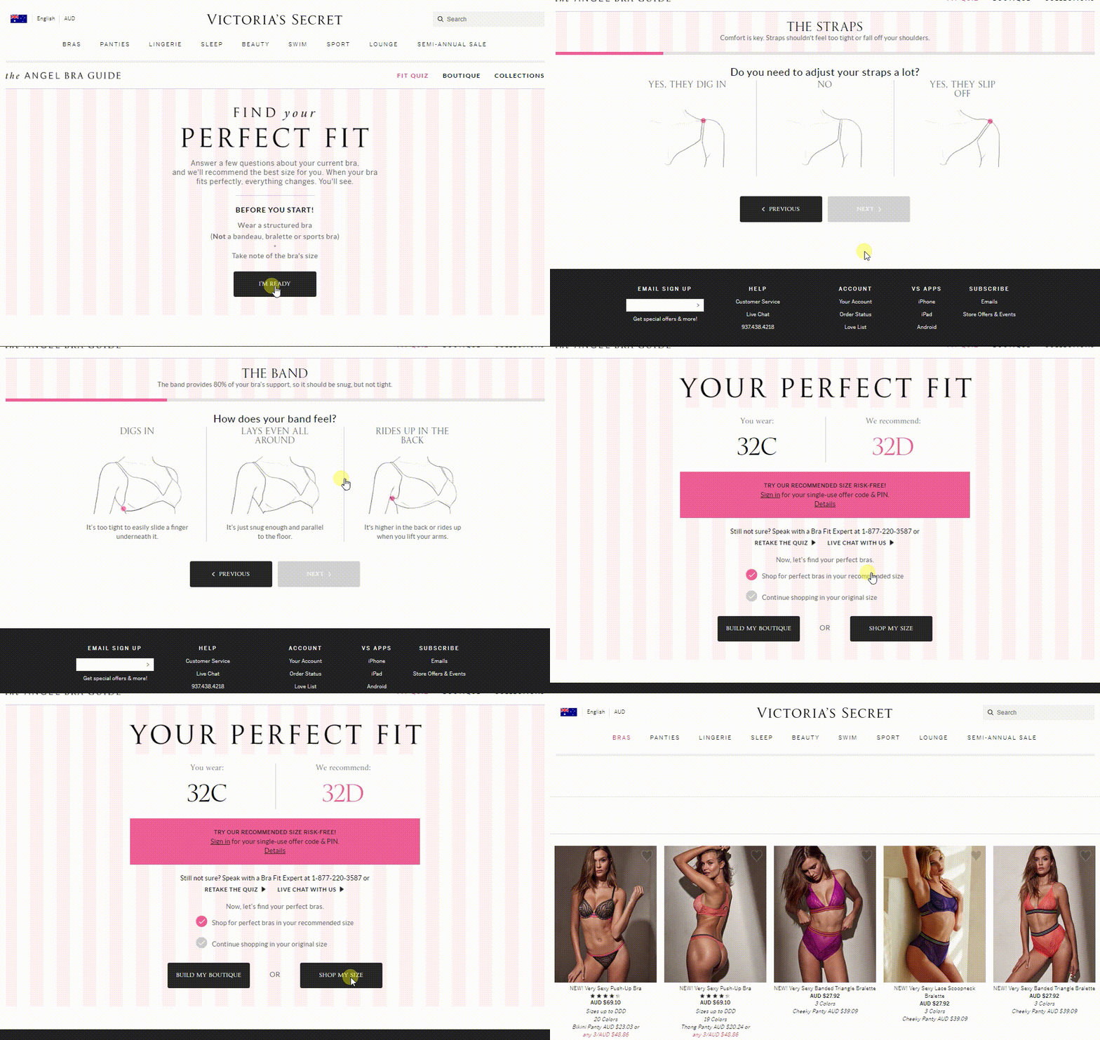
Victoria’s Secret take the customer helpfulness to the next level of sophistication.
The brand’s ‘Find Your Perfect Fit’ online store application allows the customer to personalise their shopping experience and assure themselves of the best possible fit. All that is left to worry about is the style and colour to purchase.
You can see the magic in action throughout the screen recording below (granted this is the first time I’ve shopped for a bra, but I know a good customer experience when I see one!):
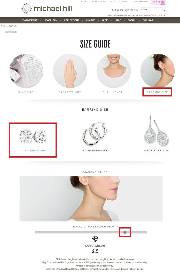
Outside of the lingerie industry, Michael Hill has one of the best virtual try-on experiences in the ecommerce business. Their size guide includes a downloadable, printable finger measurement PDF, as well as interactive on-page guides to help shoppers visualise differences in carat size, chain length and earring size:
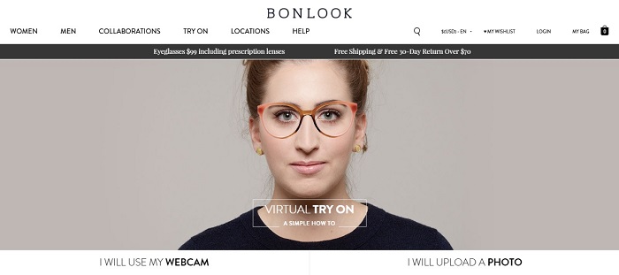
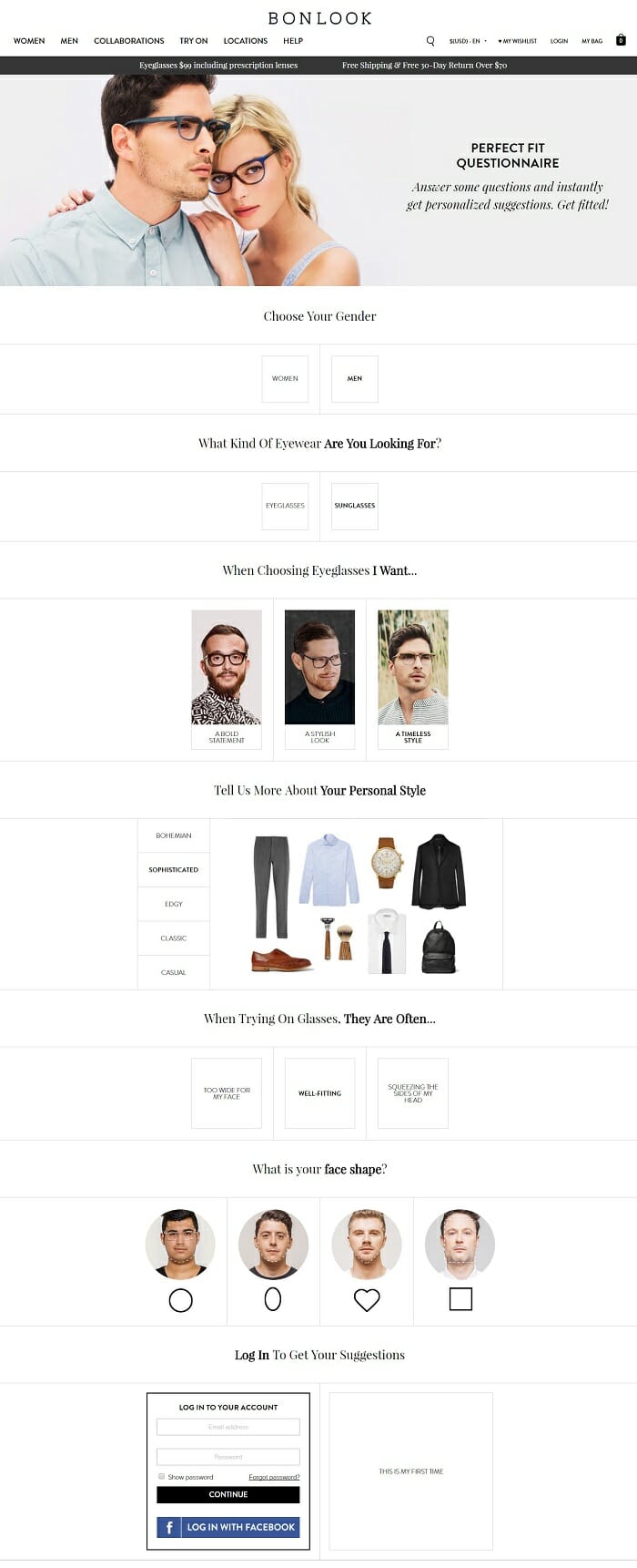
Bonlook are another online retailer pushing the boundaries of the digital shopping experience. Their ‘virtual try-on’ glasses/sunglasses experience gives customers the best possible chance to buy the perfect pair of frames without the need to physical test the product.
The three-pronged approach includes a simple visual widget:
A questionnaire designed to personalise your product search:
And lastly, an educational resource to help you understand the styles and products that will suit you best:
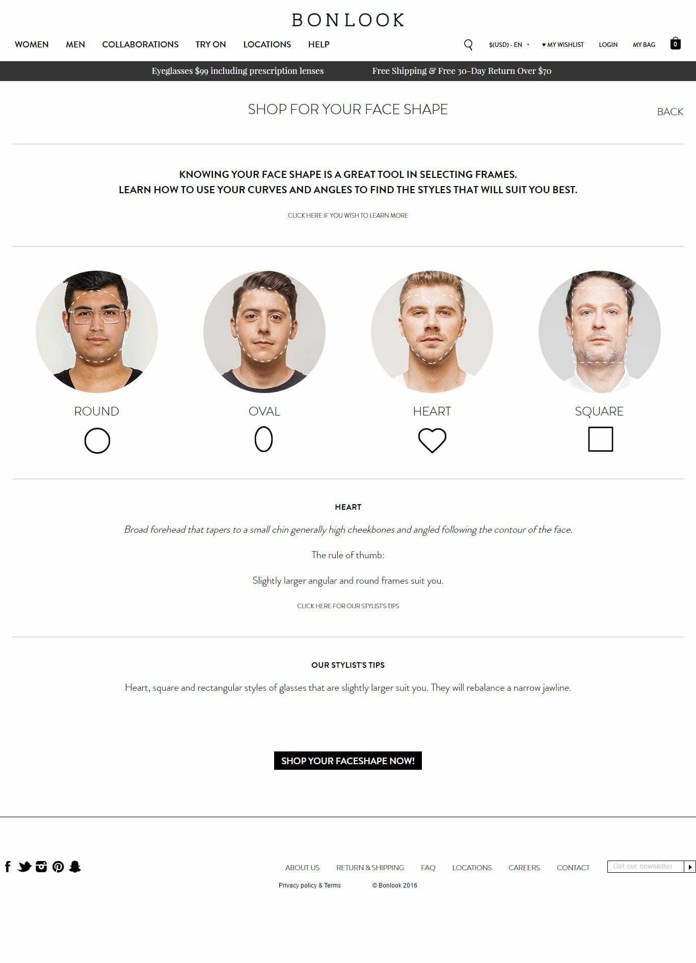
Whatever your product – find a way to replicate the sensations of a physical store browsing experience. Substitute visual tools, provide online guides and show your product in a real life context. You’ll kill two ecommerce birds with one stone – increased conversion rates and reduced costs of returns.
Helpful Resources
- Fashion ecommerce: are virtual fitting rooms the silver bullet? – Greg Randall for Econsultancy
- Four online retailers that offer try-before-you-buy fulfilment – David Moth also for Econsultancy
Incorporate demonstrations to prove your product works
Your ecommerce customers want to see your work in action to make sure it’s the real deal. If a browsing shopper is unfamiliar with your brand, the claims of your copy might not be enough to generate the conviction needed for an add-to-cart click.
Make the benefits of your product or service explicit:
- Show a demonstration video of your product in action like leathergoods e-retailer and content marketing extraordinaire, Bellroy:
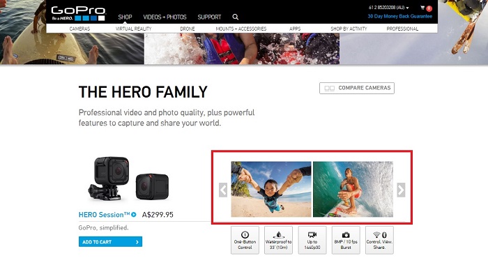
- Add user generated images or testimonials of customers enjoying your product or service like the UGC content marketing extremists, GoPro:
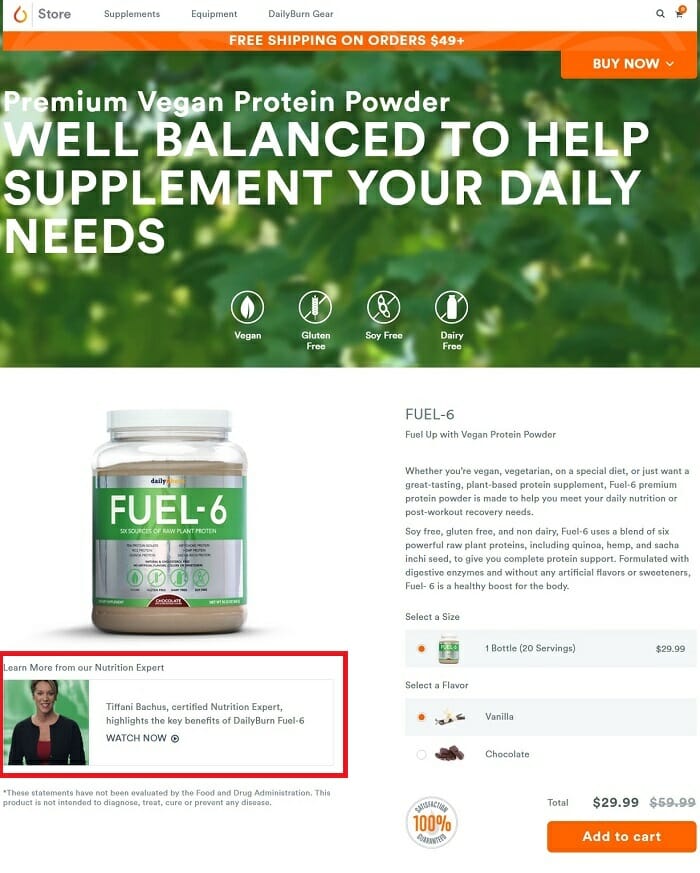
- Share any expert blogger reviews, or collaborate with influencers to add helpful content for your shoppers like supplement store Daily Burn does with their nutritionist collaborations:
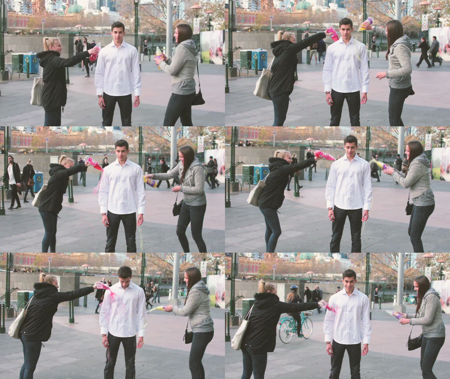
 Sometimes the claims and promises of unknown ecommerce startups can elicit an eye roll from sceptical shoppers, but a clear proof is hard to argue with. Awesome new apparel innovator, Threadsmiths have developed stain-free shirt technology that sounds too infomercial to be true.
Instead of relying on the Silicon-Valley-style list of benefits, with a bunch of perfectly styled stock shots – Threadsmiths has found a way to crush any shopper’s doubts.
The retailer infuses a series of looped GIF file clips into the background of their home and product pages, showing regular people, in regular situations demonstrating the outrageously effective stain-resistance of their product.
Here’s the clip:
And here’s the conversion-increasing magic in action:

Leave no doubt in each shopper’s mind.
Use your full digital toolkit to prove your brand’s claims.
Your conversion rate deserves it.
Helpful Resources
- 11 Reasons eCommerce Video Can Help Sell Online – Sharon Hurley Hall for DemoDuck
- 10 Compelling Product Video Examples – Armando Roggio for Practical Ecommerce
- Using User Generated Content to Increase Product Page Conversions – Janessa Lantz for RJ Metrics
Create urgency to turn browsers into buyers
Ecommerce brings more tyre kickers and perennial browsers than in-store retail.
For online shoppers, gifts are a difficult decision. When you’re not buying for yourself, you want to have a good look around.
So how do we make sure we convert as many of these maybe-I-will browsers into buyers before the dreaded close tab click?
Give em’ a deadline!
The indecisive gift-buying folks are the same ones up until 4am cramming for an exam
the next morning. Create urgency triggers that spark your potential customers into immediate action.
Include inventory level labels on product and category pages. Don’t just leave it at an automated countdown to zero. Offer a bunch of different updates to create a sense of urgency.
Where possible, include inventory level labels on product and category pages. You don’t have to build an automated countdown system. For a simple fix, offer a bunch of different updates to create a sense of urgency. “Running low”, “Last chance” and “Selling fast” help to draw out those uncertain conversions – even if you’re not down to your last three items. These urgency triggers will help force the click of those umm-ers and ahh-ers, without turning your site into a discounts bargain bin.
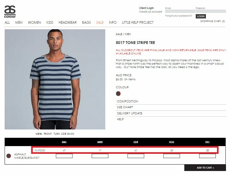
Australian e-retailer AS Colour is one of few retailers who visually display updated stock levels on product pages to encourage quick action from unswayed browsers.
But the finest urgency tactic exponents must be the booking sites of the travel and tourism ecommerce vertical.
The use of fluctuating pricing, infrequent special deals and scarce, unreplenishable products means online travel shoppers are particularly vulnerable to an urgency trigger.
Booking.com know how to increase conversions and force browsers into action.
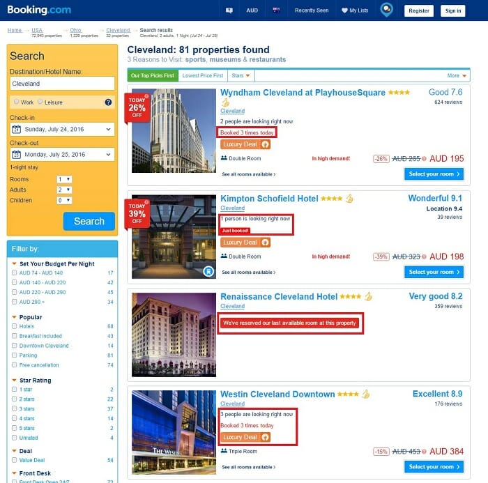
The highlighted elements all help to trigger urgency and turn browsers into buyers.
The ‘We’ve reserved our last available room at this property today’ is the tourism industry’s version of ‘sorry, you’re just too late – we’ve sold out’.
More ecommerce stores should actively display sold out products with a clear message to provide social proof to their customers, and indicate the popularity of their brand.
Allow shoppers to pre-order out of stock items
If you regularly find yourself with out of stock items – set up a CTA on your product page to allow shoppers to sign up for an email notification the moment the product comes back into stock.
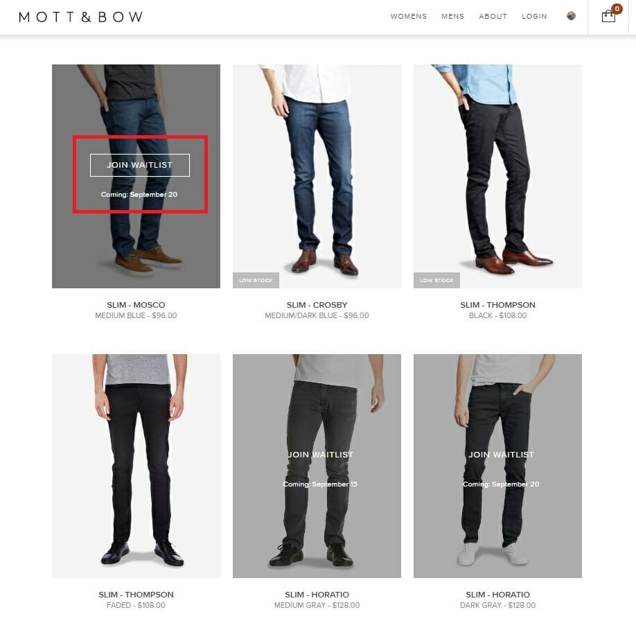
US denim apparel brand Mott & Bow strike up interest, increase sales, and demonstrate social proof with their ‘Join Waitlist’ option on sold out products. A specific date is included to reduce uncertainty with potential buyers.
Even better – give your shoppers an option to purchase the out of stock item right then and there. Set an expectation of the delivery time the customer can expect (a conservative estimate you can definitely meet). You might like to offer a little incentive to make up for the inconvenience caused by the wait. Throw in a little freebie, or pledge free shipping and returns for those customers willing to pre-order.
You may not get many takers for this option, but you’re more likely to pick up the sale when the customer is in buying mode. If you rely on an automated email triggered one week later when new stock arrives, the impulse to purchase has faded (and the customer might miss or delete the email).
Helpful Resources
There’s a bunch of other little tactics online retailers can use to emphasise scarcity and trigger urgency in their potential customers, but the resources below do a fantastic job of providing instructions and practical brand examples.
-
5 Top Urgency Tactics You Can Use to Boost ecommerce Conversions Today – Alex Birkett for Sellbrite
-
5 Ways of Using the Urgency Psychology Trigger to Drive More Ecommerce Sales – Kunle Campbell for 2x eCommerce
- Using Scarcity to Boost Sales in eCommerce! – Alex McEachern for Sweet Tooth Rewards
- How to Use Urgency to Hack Your Conversion Rate – Jonathan John for OptinMonster
Add clear shipping info onto your product pages
The internet is a retail global equaliser – allowing people from all over the world to find your ecommerce store and buy your stuff.
Unfortunately, where the internet obliterated age-old global retail barries, that little issue of fulfilment manages to build those barriers up to intimidating heights.
It still costs a big chunk of money to send your customers their stuff. Teleporting is not yet a thing. Jetpack couriers are still a ways off. You have to make do with expensive international, and some domestic shipping (unless you’re selling a service, or application – in which case you can move along to the next point with your shipping-free smugness).
Your potential customers are cautious of the delivery charge sting.
Allay their fears!
Make your shipping charges as clear as possible to reduce any uncertainties as quickly as possible.
According to a recent (March 2015) study completed by ComScore, 63% of online shoppers are at least ‘somewhat likely’ to cancel their order if free shipping is not offered, and 83% are willing to wait an additional two days if free shipping is available.
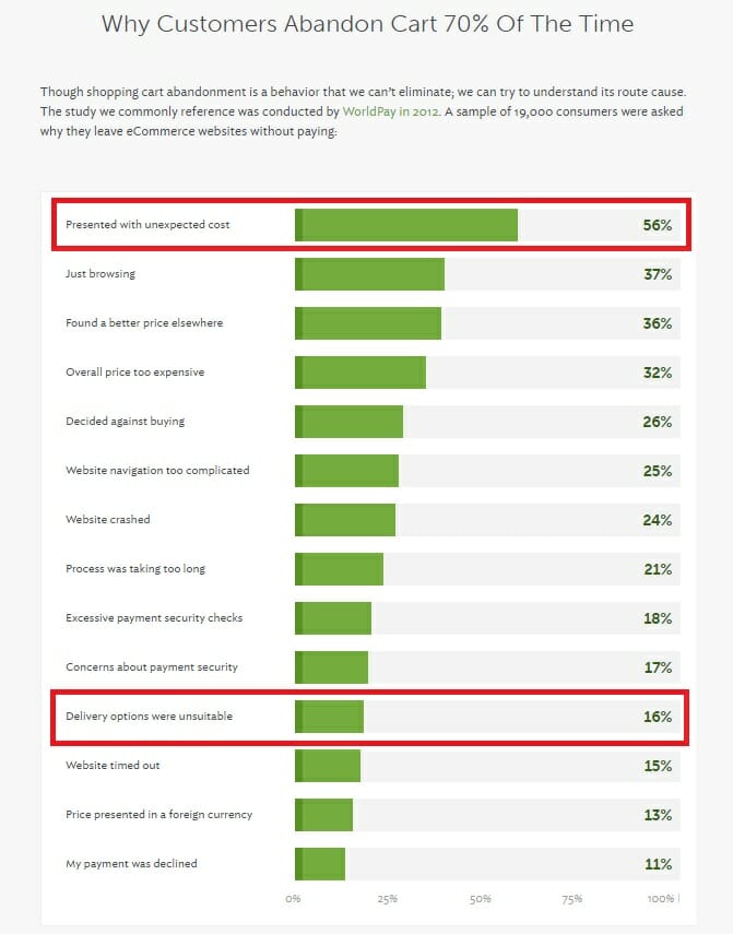
Rejoiner’s brilliant Guide to Abandoned Cart Email presents a telling visual graphic of the results from a Statista study on the reasons ecommerce customers site for emptying their baskets.
A staggering 56% cite unexpected costs as the conversion killer. Another 16% point to unsuitable delivery options.
It’s a simple fix:
- If you can offer free shipping, wear it as a badge of pride on your product page.
- If you offer free, reply-paid returns, let your store visitors know.
- If not, you should crunch the numbers and think about it.
Regardless of your delivery arrangements, make them known on your product pages.
Don’t force your customers to reach for their footer magnifying glass.
Most won’t bother. They’ll just bounce to a home country competitor they can count on.
Nordstrom know how important this shipping caper is to their shoppers. The brand uses geo-targeting technology to launch a popover for new browsers to explain the shipping specifications for the country of the shopper. Straight away questions are answered and the customers is more assured when purchasing.
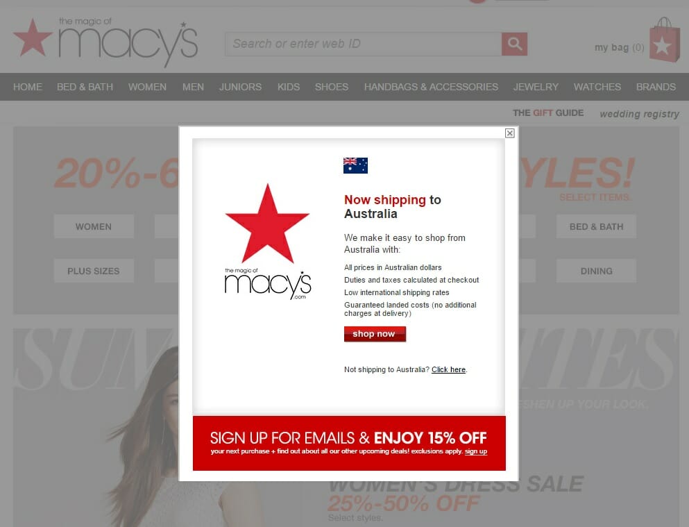
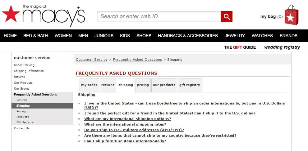
In addition, Nordstrom adds a prominent visual call-to-action within the top navigation menu, for shoppers to click through to a dedicated shipping FAQ page.

The shipping details landing page is full of helpful FAQ information, allowing shoppers to ease their uncertainties. Apart from reducing returns and increasing conversion rates – this landing page also reduces the time Nordstrom spend responding to customer enquiries.
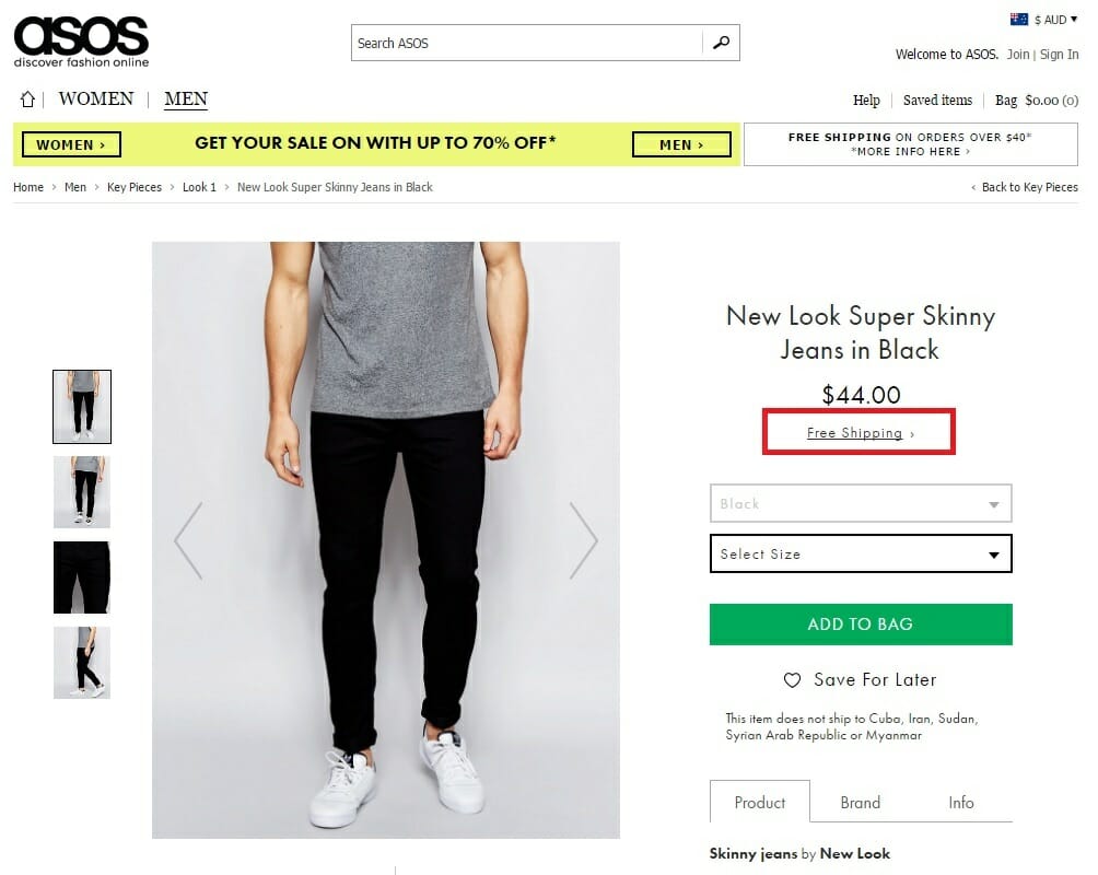
Asos is another poster child for ecommerce customer experience, and their product page shipping information is best-in-class.
Whenever a product qualifies the customer for free shipping, a clear and prominent “Free Shipping” assurance is provided just below the product’s price.
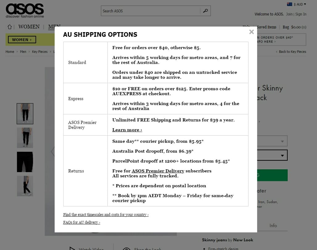
The call-to-action links through to a detailed explainer popup, with information about Asos’ delivery options.
This info reduces doubt and uncertainty, while improving the customer’s experience by offering alternate delivery options for different user needs.
Whatever your shipping arrangements – make them clear to the customer on your product page. You’ll increase conversions, reduce abandon carts, and save yourself a whole bunch of customer service responses.
Helpful Resources
- What Impact Does Free Shipping Have on Online Retail Sales? – Joe Putnam for Rejoiner
- The (Many) Benefits of Offering Free Shipping – Armando Roggio for Practical Ecommerce
- Top Ten Online Apparel Returns Myths Ripped Apart – for True Ship
Add trust signals to all store pages
You need to reassure online customers of your brand’s credibility.
The simple addition of a few key trust signals can have a marked impact on your conversion rates.
Always display a phone number and street address. These non-electronic contact details are important assurances for customers unfamiliar with your brand.
In the mind of most customer – real, trustworthy businesses have a number to call and a physical address to rely on. Your customers need the option to call and speak to a human. It’s a solid safety net to resolve problems quickly and effectively.
Other elements, like live chat, customer reviews, testimonials, dedicated customer service social media accounts, and clear warranties/returns information can also act as important trust signals for uninitiated shoppers.
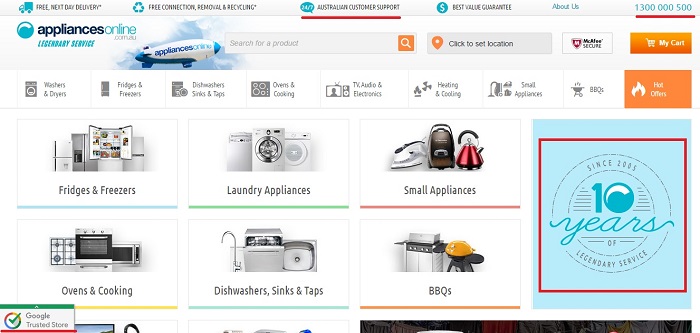
Australian pureplay retailer, Appliances Online understands the importance of trust signals to a brand without a physical store presence. In the screenshot below (underlined in red), you can see four different trust signals above the fold on the A.O. homepage:
Helpful Resources
- Does A Phone Number On Your Site Increase Conversions? – Sean Work for Kissmetrics
- 6 Essential Trust Signals For Your Website To Follow – Sally Newman for Koozai
Display total order costs before, during and after purchase
A fantastic study by Danish research body Baymard Institute based on the mobile sites of 50 major e-commerce sites found the average ecommerce checkout user experience to be ‘seriously flawed’. A whole stack of these usability problems were so significant, they prevent users from completing their orders.
The puzzling thing is this – most of these checkout issues are relatively easy to fix.
According to the Baymard Institute study, a third of ecommerce sites are making a cringingly rudimentary mistake.
33% of the sites surveyed failed to display the total order cost – at any point during the checkout process – before asking for credit card data.
Users couldn’t get an idea of the total cost before filling in 10 (or more in some cases) fields on their keyboard or mobile touchpad.
Come on guys. We gotta do better than that.
We can save our shoppers the annoyance of accidentally adding an item to cart twice because they thought the first click didn’t register.
We can save our shoppers the confusion of having to click through to a checkout page to work out their accumulated cart total, only to be forced to cycle back to your product pages to continue their shop.
We can save shoppers the time and frustration of entering their personal and credit card details only to find an exorbitant shipping cost they can’t justify paying.
How hard can it be to show our customers their total order cost before asking for their payment details?
Leading US sports apparel online retailer Finish Line provide a premier example.
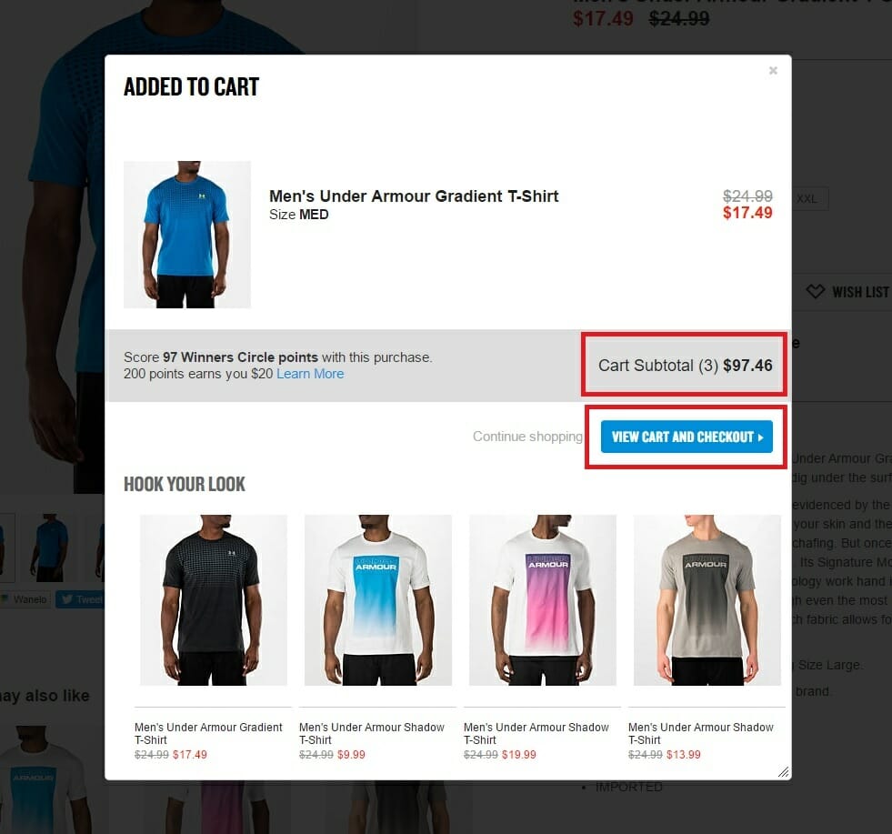
A simple popup launches each time you add a new product to your cart, with your accumulative cart total clearly displayed, alongside a contrast colour CTA button prompting you to check out.
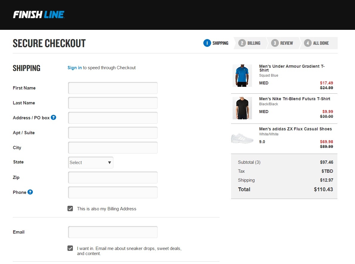
The Finish Line checkout page similarly updates with a clear total cost based on a flat shipping fee (which is updated depending on the address details entered by the shopper). This way, a customer is never met with the rude shock of an over-inflated basket price after slogging away to enter their credit card details.
UK menswear retailer Jack Wills achieve the same goal with another execution.
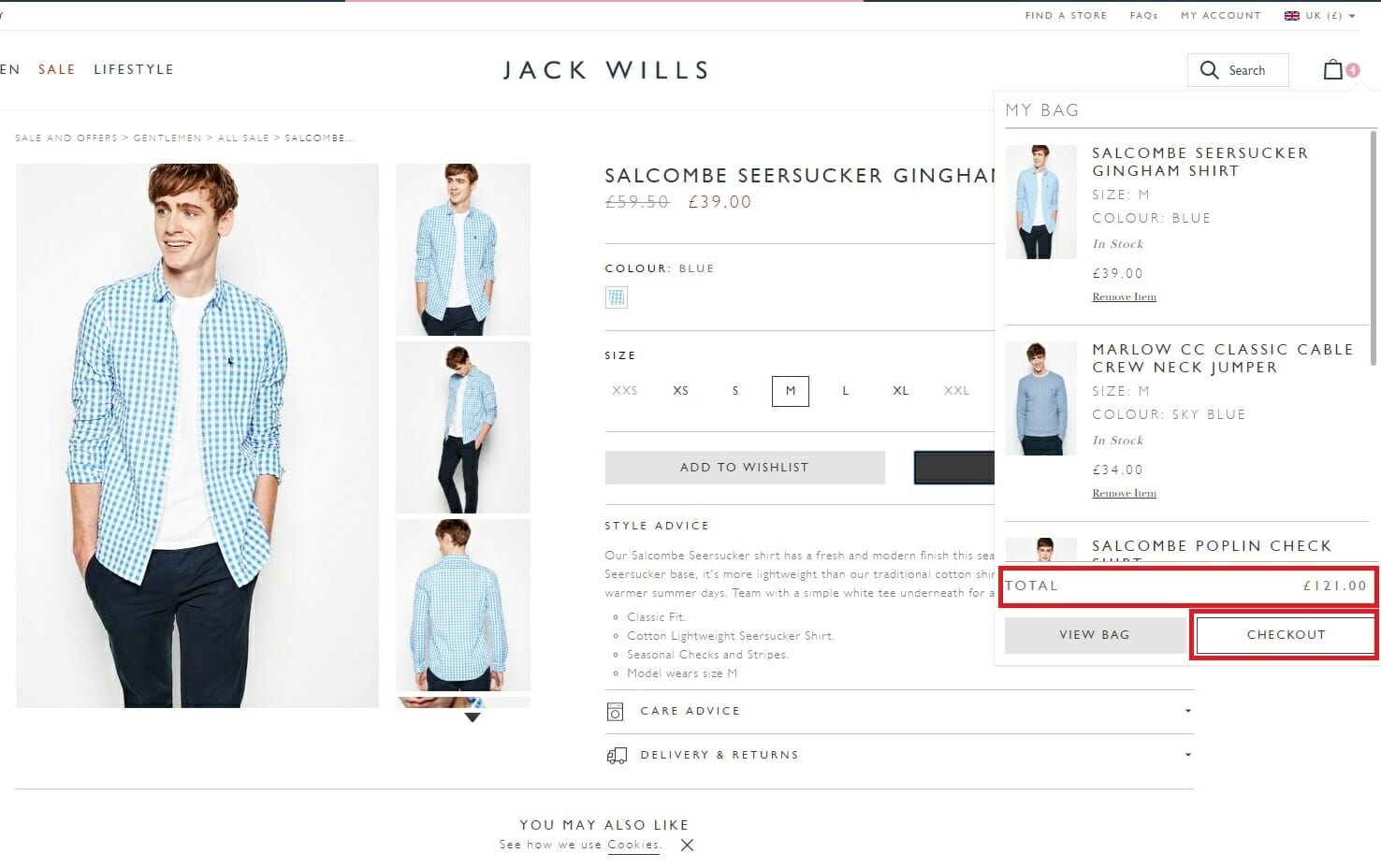
Instead of launching a popover, or sending the customer to a checkout page after adding a new item to cart, Jack Wills serves an accumulating drop down box beneath the checkout icon. The widget gives a clear visual of the product added, an updated summary total, and a clear call-to-action to checkout when desired.
Whichever option you choose, find a way to show your shoppers an updated cart total at all times.
Helpful Resources
-
How to Design an eCommerce Checkout Flow That Converts – Peep Laja for Conversion XL
-
Ecommerce checkout: Importance of order summary? – UX Stack Exchange thread
Remove the nav bar on checkout
Remove all possible distractions from your customer to streamline the checkout experience.
Don’t give the buyer an option to click away with their shopping cart left on the counter. You’re so close – don’t let it slip now.
For starter’s, remove the navigation bar at the top of your checkout page.
Of course, we don’t want to force our users into something they don’t want to complete. Add some specific help options instead, to compensate.
A live chat prompt, a tailored checkout FAQ section, and even a link to your shipping, returns and security policies could be useful at this point. Try to be helpful, but make sure you get your customer in and out of that checkout mighty quick.
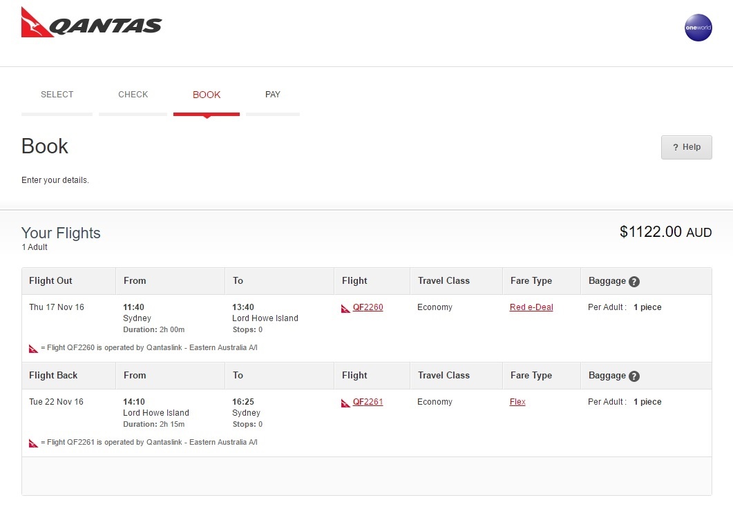
Airlines understand how important this tactic can be. Their checkouts are littered with browsing potential travellers abandoning their cart midway through the purchase process. Qantas’s checkout page design is first class, with the nav bar removed, a clear progress indicator and a prominently displayed ‘help’ icon.
Helpful Resources
- Should You Remove Navigation From Your Landing Pages? Data Reveals the Answer – Diana Urban for Hubspot
- Is it user-friendly to make the main navigation bar disappear when the user proceeds to checkout? – User Experience Stack Exchange forum thread
- Less is More: Maximize conversion by removing website distractions – Jesse Kraker for Marketing Experiments
Add a visual progress indicator to your checkout process
As mentioned, reducing frustration at payment time is critically linked to reduced abandonment rates. Adding a visual progress indicator is a minor development that can make a major difference.
When you’re finished shopping at the grocery store, you survey the queues at each checkout and select the line you think will be quickest. You can see the light at the end of the tunnel.
Much the same, when you’re waiting at a store to be served, your anxiety is appeased when a friendly store assistant thanks you for your patience and lets you know the wait should only be a couple of minutes longer.
The premise is the same for your online store. A visual indicator allows you to show the shopper how long they have left in the checkout process. There is a few ways you can do this, illustrated by the examples we’ve included of Nike, Target and Lowe’s.
After you’ve been to the trouble of stripping your checkout to its essentials, you need to communicate the speed of your process to each customer.
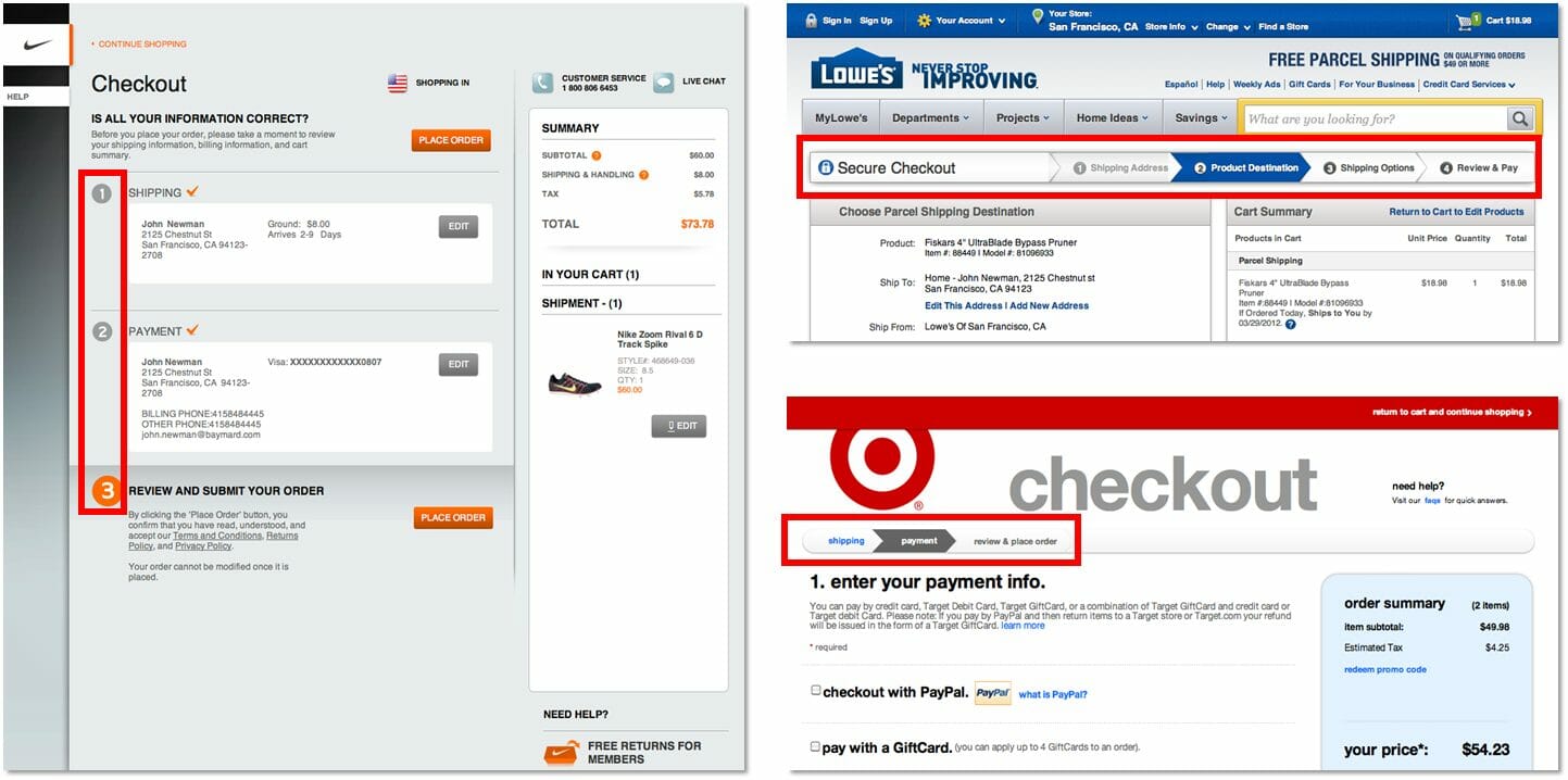
Helpful Resources
- Use Progress Indicators for a Standout, Multi-Page Checkout – Pete Prestipino for Website Magazine
- Ecommerce checkout progress indicators: essential, not optional – Jack Simpson for Econsultancy
- Progress Trackers in Web Design: Examples and Best Practices – Tom Kenny for Smashing Magazine
Add simple payment options
Give your customers a collection of payment options. VISA and MasterCard is table stakes. Data from comScore shows that 56% of respondents expect a variety of payment options on the checkout page.
It’s not necessary – or practical – to offer every payment method available. You won’t experience exponential growth by adding a Bitcoin payment option to your store. But you should spend some time analysing your audience, competitive sites and other industry stores with the same target, to determine any possible additional methods.
The prevalence of both PayPal and American Express accounts warrant close consideration. Newer options like Apple Pay, Google Wallet, Masterpass, Stripe and Square may interest larger ecommerce sites with a high volume of international sales.
Huge brands with high lifetime customer value rates and regular repeat customers might even consider establishing their own payment and rewards program.
Airlines, travel companies, grocery chains and big box retailers often develop their own currency, with branded payment cards allowing loyal customers to rack up benefits. Disney shows you how to incorporate a branded payment option for your customers.
Of course, you’ll need to weigh up the fees of new options against the potential benefits to your customer’s experience. But a small change here could pay big dividends.
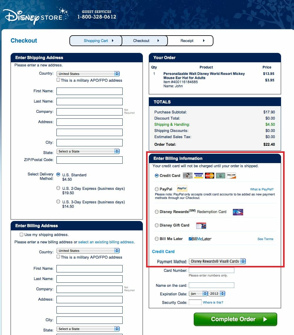
Helpful Resources
- Best Payment Gateways for 2016 Reviewed and Compared – Matt Collins for Ecommerce Platforms
- Your Ultimate Payment Gateway Comparison Guide – Allen Burt for Huffington Post
Give customers the option to use a simple third party login
We’ve all had the ‘mobile commerce will revolutionise online retail’ lecture from thousands of industry experts.
A one-click social login option is a mobile ecommerce masterstroke to streamline your customer’s online store experience. It reduces friction, clicks and time. Canadian menswear startup Frank + Oak have it nailed:
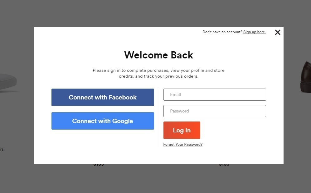
77% of users believe Social Login is a good registration solution, according to aggregated research published by WebHostingBuzz. The latest research from leading software providers Janrain and Gigya suggest that 64% of online shoppers prefer the Facebook login option over other alternatives:
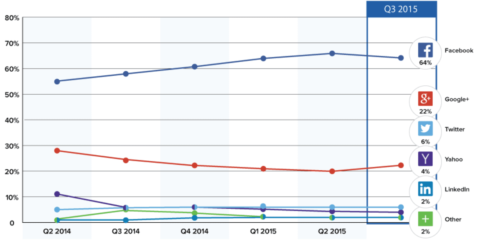
Your customer doesn’t need to enter their details, or remember another password.
Social login will help you streamline the purchase process for the customer, and give you access to precious data about your subscriber. Suddenly name, email, address, birthday, preferences are all at your fingertips.
You can use this information to help personalise your customer’s experience, predicting future purchase behaviour, and allowing you to offer targeted suggestions based on your user’s profile.
Social login also makes it easy for customers to share their purchase with their social followers, opening up the chance for you to develop a structured user generated content program.
Gigya and Janrain both provide effective excellent solutions, but many ecommerce CMS platforms offer a plugin that can make your development job a simple one.
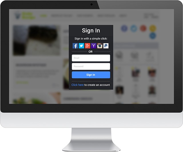
Always offer a guest login option for those without a social account or those who have privacy concerns.
Changes in the checkout experience may impact short term conversion rates, but the long-term pay off is likely to be worth the potential short-term impact.
(Oh, and make sure you build in the capability to remember details of returning customers and prefill all possible form fields!)
Helpful Resources
- Social Sign-on : the implications for Ecommerce sites – Dave Chaffey for Smart Insights
- 9 Things You Should Know About Social Login & CRO – Rakish Soni for Conversion XL
Simplify your checkout forms
Single page checkout is not the only way to improve the checkout experience and reduce friction from frustrated buyers.
Optimising the checkout process for speed and simplicity should be your objective. A single page checkout experience might improve your conversion rate – but it’s not necessarily the definitive best practice.
Christian Holst debunks the ‘single checkout is the best option’ myth in his article titled “One Page Checkouts – the Holy Grail of Checkout Usability?”, explaining that you just need to focus on creating the most user-friendly checkout experience. Safety, assurance, convenience, simplicity and speed can be achieved with a multi-page checkout or a single page option.
“During the research for our checkout usability report we found that users in general had relatively few problems navigating between multiple steps (as long as a few simple guidelines are adhered to) – the usability issues were primarily caused by what the customer had to do at each step.
When A/B testing a non-optimized multi-step checkout (being A) against a one page checkout (B), I’d say if a C version were introduced that took precisely the same form fields as the one page, but split it across two pages (address on page one, credit card details on page two) – there wouldn’t be much, if any, difference in abandonment/completion rates between B and C.”
So how do you go about achieving these objectives in practice?
Adding autofill capabilities to your checkout process will reduce the time involved with payment. New technologies allow for predictive search to complete forms in advance for users by dynamically updating the list of matching addresses as you type.
Some websites provide predictive autofill based on postcodes, allowing users to click “find address”, then select the address from the matching results.
Card prefixes can be used to determine card types, and past purchase data can be used to autofill forms with the details used by returning customers. This is particularly important for mobile sessions where long lists are irritating to complete manually. A poor user experience here can have a significant impact on cart abandonment rates.
The Baymard Institute Mobile Checkout Forms Study also flagged these other easy-to-fix issues which are robbing unsuspecting ecommerce brands of precious sales and repeat custom:
- 16% of sites, by default, show twice as many address fields as is necessary by showing all users two separate sets of address forms for billing and shipping
- 28% of sites ask for the same information twice, instead of pre-filling fields where possible
- 30% have an input for credit card type instead of auto-detecting it based on the typed card number
- 50% of sites ask for some form of repeat information
- 94% do not consistently indicate both required and optional fields, forcing users to guess which fields they have to fill or do extensive scrolling to reach prior fields
Home and hardware brand Grainger, has one of the lowest ranked checkout processes from Baymard’s 100 Ecommerce Checkouts analysis report. The screenshot below shows how crippling mandatory form fields can be to the speed of an online retail checkout process.
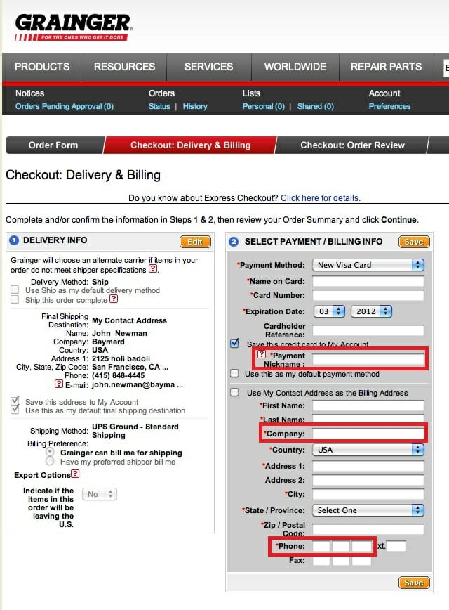
The fields highlighted in red need not be obligatory – particularly for customers using a mobile device.
Complete a simple cost versus benefit analysis to compare the potential increase in conversions resulting from this user experience improvement up against the additional cost of the technology you require to make changes. If you maintain a long term perspective, the former will usually win out.
Helpful Resources
- The Conversion Surgeon’s Guide to Conversion Rate Optimization – Jack Kinsella for jackkinsella.ie
- Ecommerce Checkout Tricks: Ask for Less and They’ll Buy More – Nirav Sheth for Kissmetrics
- How to Design an eCommerce Checkout Flow That Converts – Peep Laja for Conversion XL
- Simplifying the checkout process on your ecommerce site – Joanna Pietryka for FreshMail
- The State of Mobile Checkout & Form Usability – Jamie Appleseed for Baymard Institute
- The Checkout Debate: Multi-Step, One Step or Accordion – Ashley Kikut for Demac Media
Consider a single page checkout
People don’t enjoy paying for things. You don’t go to the mall to stand at a checkout.
Swathes of potential conversions break down after the add-to-cart moment. You need to strip down the purchase process to the absolute bare essentials to make things super easy for your customers.
A single-page checkout will help, as long as you can keep things clear and uncluttered. With a visual progress indicator, or simple concertina drop-downs (like those used by Victoria’s Secret), your customer can see the end in sight.
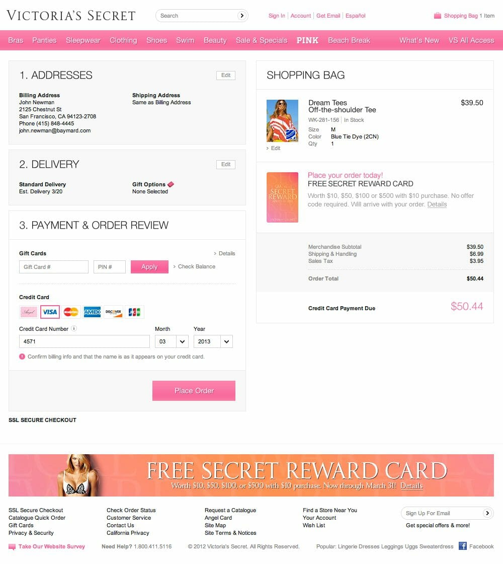
Beware of overloading that single page. It should still be usable and simple. Remember, multiple page checkouts can still optimise conversions as long as the experience is hassle free, as Lemon Stand’s Danny Halarewich explains:
“The number of pages that your checkout uses is not the most important factor. All you have to do is shop on a few different very successful online retailers to realize that there are no hard and fast rules.
What is important, is asking for just the right information, at the right time, in the right way. Just as important, you need to clearly provide the information that the customer needs to feel safe and comfortable purchasing from your online store. You can achieve those things on both a multi page and 1-page checkout.”
Even though you can make either solution work, the single page option can seem less intimidating to shoppers. It’s important to keep the end in sight if you want to reduce abandon cart friction.
Don’t just ask for credit card details and let shoppers be on their way. This checkout optimisation caper is a balancing act. You need to keep repeat customers in mind. It’s not all about the one-off sale. Consider the data you need to capture to make the customer’s future purchases quicker and easier.
Incorporate functionality that allows you to personalise and autofill the checkout process for returning customers. They’ll appreciate your efforts with repeat patronage.
Helpful Resources
- The Conversion Surgeon’s Guide to Conversion Rate Optimization – Jack Kinsella for jackkinsella.ie
-
One Page Checkouts: the Holy Grail of Checkout Usability? – Christian Holst for Baymard Institute
Spice up your abandoned cart email
We can’t always make the sale straight up. Play the long game and turn your cart abandonment emails into something your potential customer is actually interested in. None of this ‘oh-you-forgot-to-give-us-all-your-money-do-it-now!’ caper.
Entertain. Engage. Funny-bone-tickle.
Show the values of your brand and prove to your potential customer that you care about them, and not just their wallet. Have some fun with it and surprise your reader. It’s an easy way to be better than your lazy, complacent competitors.
Be more like Chubbies.
Their email marketing is a thing of ecommerce magic. This abandoned cart email doesn’t just remind you of your Chubbies’ shopping – it also makes you laugh audibly.
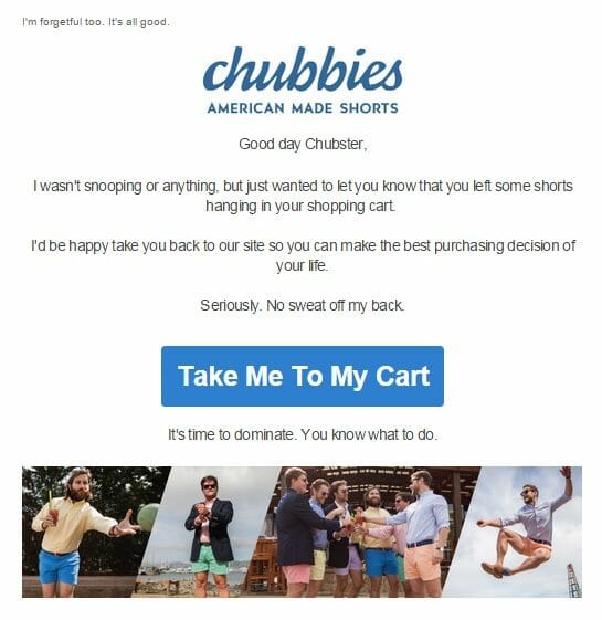
Helpful Resources
- The data-driven guide to abandoned cart email & cart abandonment remarketing -Thomas Krawiec for Rejoiner
- Ultimate Guide on Abandoned Cart Emails – Max Katsarelas for Remarkety
- The Anatomy of a Perfect Abandoned Cart Email – Joel Hauer for Thunder Metric
Prepare a delivery options landing page
Many unorganised (read: male) gift givers leave the whole present thing to the very last minute.
Be their online gift-shopping hero!
If you can swoop in on your white horse and save them, there’s a good chance you’ve earned yourself a loyal customer.
Make your delivery D-Day explicitly clear to ease the minds of uncertain customers
Create a delivery options landing page for customers who want more specific information. You can’t afford to miss out on a sale because of shipping date anxiety.
You also don’t want to find yourself in a situation where customers buy after your delivery deadline expecting to receive their gifts before the the day of gifting. Make things as clear as possible.
David Jones have developed a brilliant delivery options landing page for the December online shopping season. The only element missing is a giant big warning sign with key Christmas delivery deadlines.
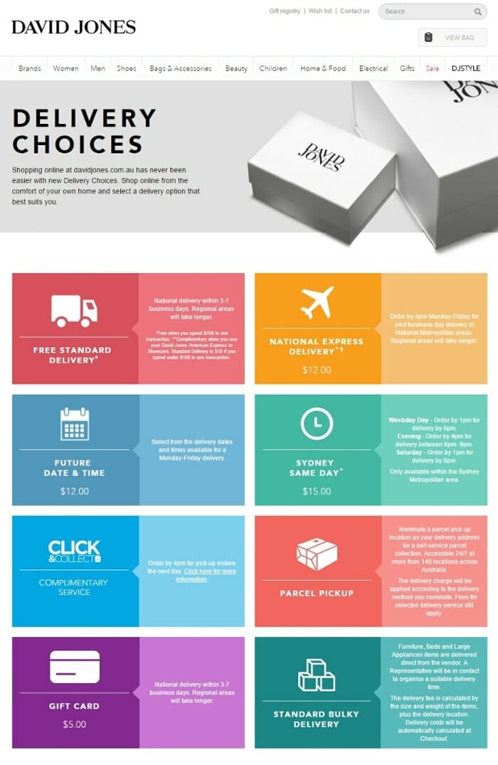
Econsultancy Editor Graham Charlton flags House of Fraser as the best-in-class example of an online retailer maximising conversions with multiply delivery options:
“In House of Fraser, I’ve found a retailer that covers all bases. Same day, nominated day, next day, collect in store, you name it. This should ensure that, if customers do abandon a purchase on the site, it won’t be due to lack of convenient delivery options.”
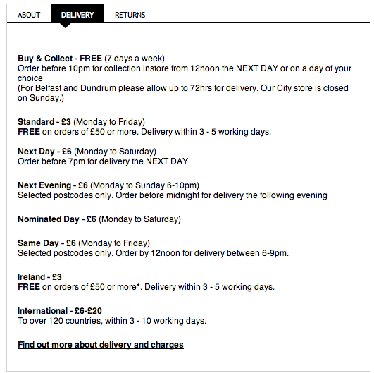
Remember, it’s not just Christmas gifting that demands punctuality. When December 25 comes and goes, you can turn the page generic to provide clarity for birthday gift givers all throughout the year. You might even like to add a Mother’s day and Father’s Day version for your online gift givers.
Helpful Resources
-
What do customers want from ecommerce delivery? – Graham Charlton for Click Z
-
Are Delivery Options Part of Your E-Commerce Strategy? – Tim Capper for Online Ownership
Use returns and guarantees info to reduce uncertainty
Buying online can be an uncertain process. You can’t touch, trial and test a product in person, so there’s always an element of hesitation – what happens if it’s not exactly what you expected?
You need to do whatever you can to allay these fears and ease the anxiety of your potential customers.
To reduce cart abandonment rates and convince visitors to purchase, add returns, guarantees or warranty information to your product pages. Assure the buyer. If at all possible, offer free returns and exchanges.
Your brand can turn the post-purchase process into an advantage by including a reply paid package with your product to complement a money-back trial period. Innovative retailers like Trunk Club and Casper have built this offering into their business model to make it easier to acquire and retain new customers.
Helpful Resources
- Why It’s Time for Retailers to Embrace Online Returns – Chris Dunn for Entrepreneur
- What Consumers Want From Ecommerce Returns – Michael Lazar for Trueship
- 5 Ways To Create An eCommerce Return Policy That Drives New Sales – Nick Maglosky for Capterra
Offer free shipping and free returns
Your profit margins might not like it, but free shipping and free returns are proven conversion rate heroes.
Consumers constantly cite shipping and returns costs as reasons for abandoning their online carts.
Free shipping is fast becoming ecommerce table stakes. Some consider this part of doing business in online retail.
Not only does free shipping increase conversion rates, but it also encourages 93% shoppers to buy more stuff, according to this study by Qualtrics.
Of the 5,118 U.S. consumers surveyed for a recent UPS/comScore study, 77% said that free shipping remains the most important option during checkout (the image below is taken directly from the report).
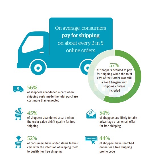
And it’s not just free shipping expectations bearing down on your online store. Your customers are beginning to cry out for smoother returning options as well.
The New York Times cited a recent Harris Poll that found Ninety-one percent of consumers interview see a store’s return policy as an important factor in a purchasing decision.
Head of Business Development for True Ship, Chris Dunn explains the importance of returns to the online shopper, in this article for Inc. Magazine:
“High return rates have long been the Achilles’ heel for the ecommerce industry, where one in three online purchases is returned. For online apparel purchases, the rate is closer to 40 percent. Why are these return rates so high? Because online shoppers do not have the sensory experience of seeing, touching and, most importantly, trying on an item before they buy.”
If you can afford to offer free shipping and returns – do so. And make it abundantly clear to your shoppers on all product, category and checkout pages.
If not, keep working towards a business model where free shipping and returns are possible without compromising your profitability.
Helpful Resources
- Free Delivery? Free Returns? A guide for online retailers as to what is important to Consumers – Stelios Pardalakis for Stellar Search
- The (Many) Benefits of Offering Free Shipping – Armando Roggio for Practical Ecommerce
- What Impact Does Free Shipping Have on Online Retail Sales? – Joe Putnam for Rejoiner
Add a freight-forwarding option for customers in countries you can’t service
Everlane offer a textbook example.
The brand is growing fast, and with increased interest comes more foreign traffic from markets Everlane can’t yet support.
You don’t have to turn customers away with a generic (and frustration-inducing) “Sorry, we currently don’t ship to your area” notification.
Instead, find a freight forwarding company you trust that can service the markets of your high-traffic international shoppers. Brands like Com Gateway exist to allow foreign shoppers to buy online from stores like yours that can’t afford to ship abroad.
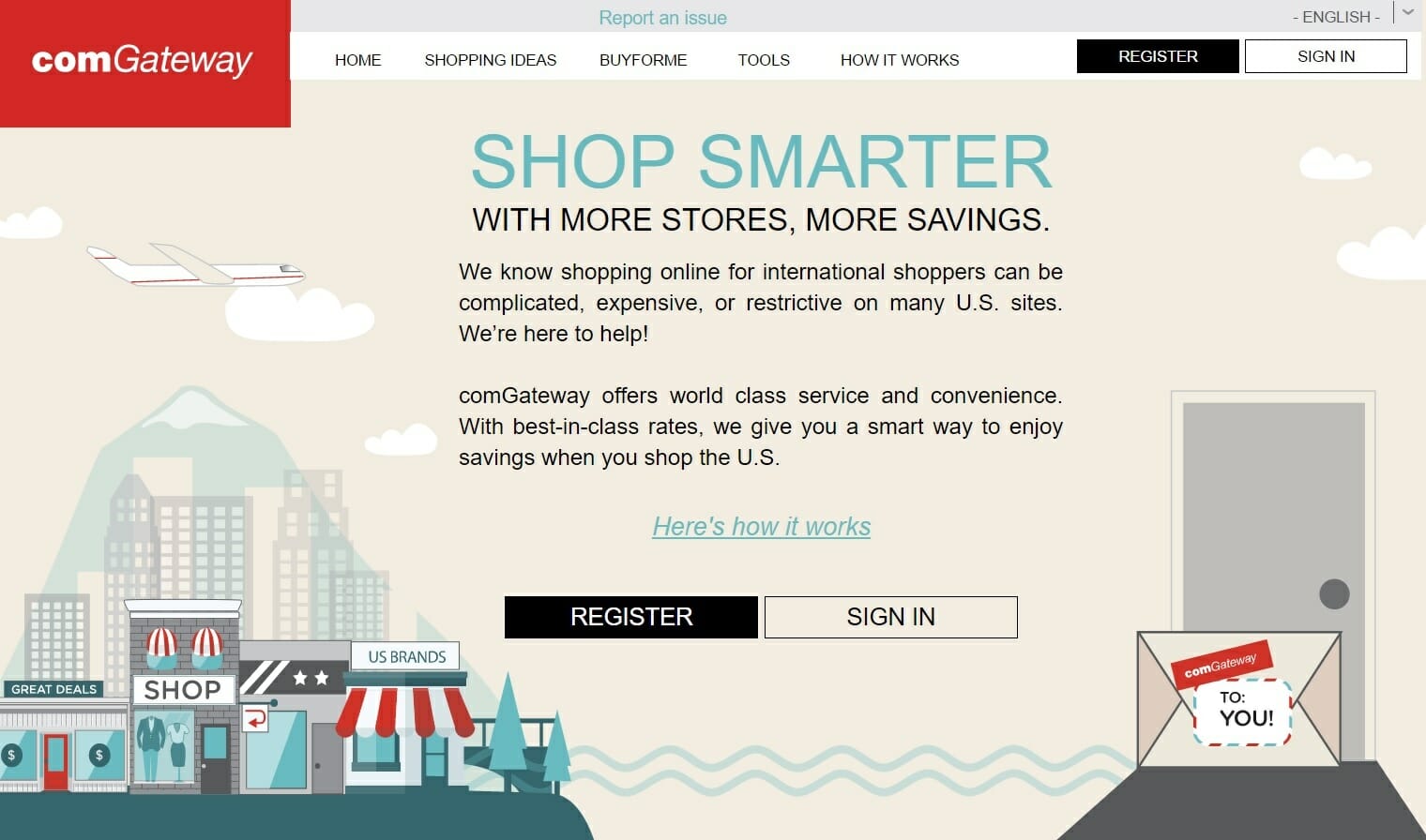
Create a dedicated landing page for international customers with detailed FAQ information on freight forwarding options, delivery time expectations, returns information and customer service/tracking options for the buyer. Everlane show us exactly how it’s done.
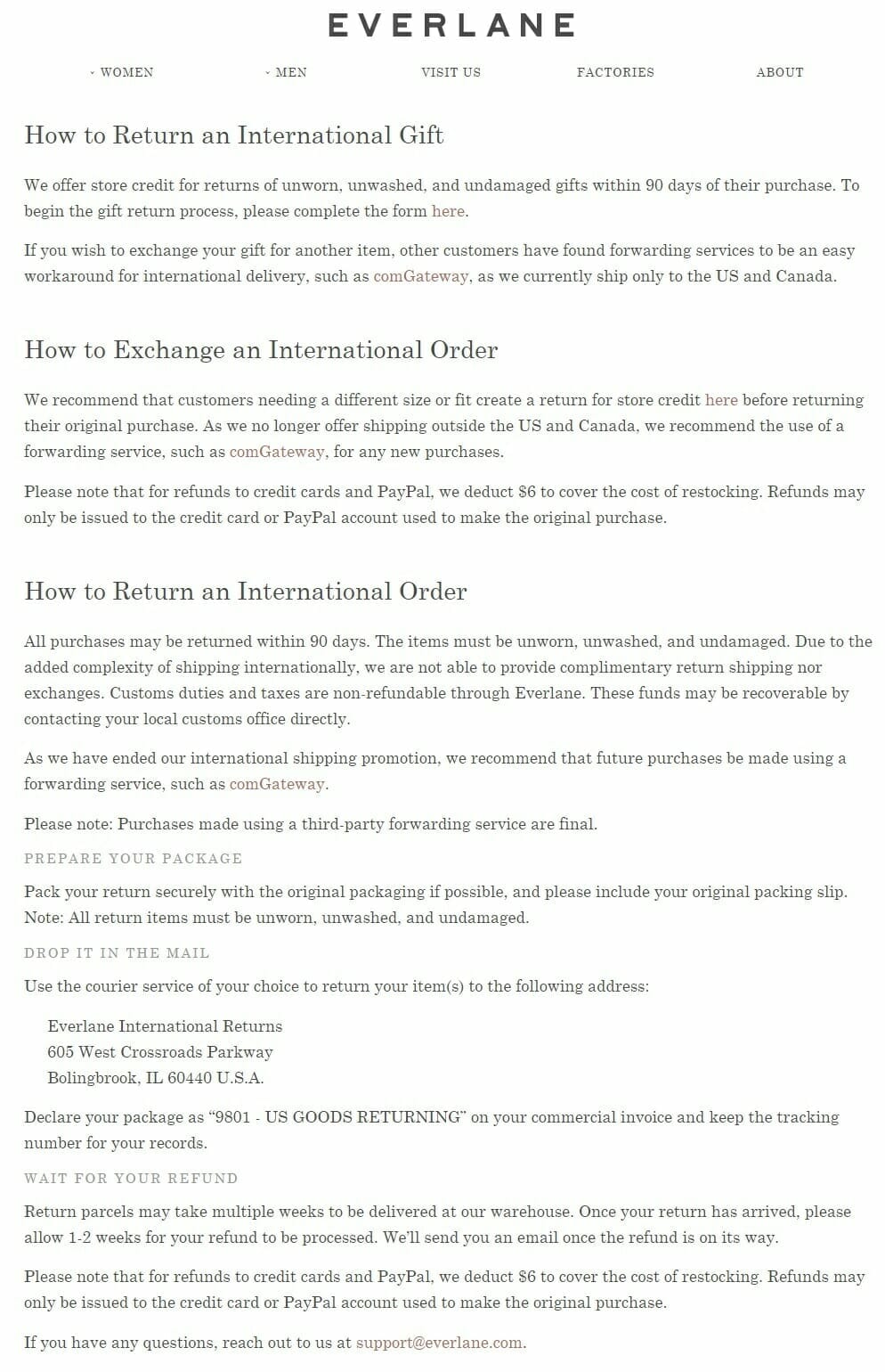
Helpful Resources
- What are your postage options when US retailers won’t ship your purchases to Australia? – Elisabeth Baulch for Choice
- What Does a Freight Forwarder Do & Do You Need One? – Raymond Rau for Universal Cargo
Encourage unboxing vids
Ecommerce expert Sid Bharath devoted an entire article on the Lemon Stand blog to this undervalued conversion tactic.
He explains why an unboxing video on your product page could be the most powerful assurance weapon to help you convince an uncertain potential customer.
“The thing about unboxing videos is that it taps into that childhood curiosity you had when you waited to open up those Christmas presents. If you’re interested in buying a product you want to know what that product looks like in real life, and how real people use it. You’re curious about the product and you want to get some sense of what it feels like to own it without actually owning it.
That’s why unboxing videos are so popular. Consumers know that they should take advertisements with a grain of salt. The burger you eat looks nothing like the one on TV. So they look to product videos made by other consumers like them – unboxing videos.”
Sid cites 4 key steps you need to set up a sustainable program to generate unboxing videos for your ecommerce store.
It’s a simple process that any online retailer can execute on almost any budget.
If you set up the right framework, Sid explains why this tactic can be the gift that keeps on giving:
“If you can get your customers to start creating unboxing videos, that will in turn attract other interested customers to your online store, which then generates more unboxing videos. It’s a virtuous cycle.”
Step 1 – Invest In Packaging
Make you post-purchase experience exciting. The unboxing needs to be entertaining if you’re going to convince customers to video it, then upload it on social media.
You don’t need endless resources to make it happen. A simple, personalised hand-written note will give your customer the warm and fuzzies. Get creative, quirky and thoughtful. Show your customers you care. Take the experience from sterile transaction to gift from a friend.
Step 2 – Create Your Own Video
Show your customer’s how it’s done. Get a bunch of your employees, friends and family to prop up their smartphone and record a quick clip.
Even better – bring your very best customers into the team huddle and send out a few freebies in exchange for a helpful unboxing vid. Give your power users a few pointers to explain what you’re looking for, and you’ll be amazed how effective this user generated content can be.
Armando Roggio, writing for Practical Ecommerce, explains the powerful social proof provided by customer videos:
“Honest testimonial videos are the best kind of customer reviews because shoppers get to see a person, not the store, tell them how well a product works or how good their shopping experience was.”
Step 3 – Recruit Influencers
Don’t stop with your established customers.
Show your audience you believe in your product.
Organise reviews with influencers and bloggers and exchange your product for an unboxing vid to be shared with their audience. This will help introduce you to new potential customers, and you can use the video on your relevant product page as a powerful trust signal for potential buyers.
Here’s a great example featuring one of our favourite ecommerce innovators, Trunk Club;
Step 4 – Encourage Future Customers
More unboxing vids means more social media shares and more potential subscribers/customers/advocates. Build unboxing incentives into your post-purchase experience. Create a dedicated hashtag to track and promote user generated unboxing clips across all of your social platforms. Add copy into your post-purchase receipts, tracking emails and packaging to remind users to film their own clip.
Create a competition calling for unboxing vids, with the best submission to be featured live on your product page, and rewarded with a cash prize, freebie or discount.
Helpful Resources
- How To Create a Memorable and Shareable Unboxing Experience for Your Brand – Richard Lazazzera for Shopify
- How to create great unboxing experience in ecommerce – Ksenia Dobreva for Amasty
- How important is packaging for your ecommerce business? – Catalin Zorzini for Ecommerce Platforms
Add reviews to product pages for social proof
We all understand the benefits of ‘social proof’. People trust the advice and recommendations of friends and family more than your brand. No matter how much money you spend on advertising and promotion, objective peer reviews hold more gravitas.
Give your customers the chance to help you out. Make it nice and easy for buyers to contribute a review. Either use your thank you page to ask your customer to review their purchase, or ask for a review with a post-purchase email with a prominent call to action.
While you’re at it – ask your customers to share a happy snap of their new product on social media with a pre-populated, customisable message (including a branded hashtag so you can keep track of the responses).
Be careful with this one, you don’t want to be that pushy, awkward, parentish social media brand nagging your customers to spam their followers. But for visually interesting or beautiful products (think travel, cosmetics, jewellery, fashion, food & bev etc.) it’s well worth giving your new customer a gentle nudge to hashtag their own selfie with your brand or products.
These simple additions can generate streams of invaluable user generated content to convince new browsers of the value of your products.
To make the most of your newly established social cred, add in a widget at the bottom of your product pages to display any relevant reviews or social media messages, to help assure new browsers of their purchase.
Crutchfield are one of our favourite little ecommerce sites that could. Swamped in size by monolithic big box retailers like Amazon, Costco, Walmart and Best Buy – Crutchfield make electronics online retail work with a first class user experience, and a super helpful content marketing program. Their customer review mechanism will give you a good example of how to make social proof work.
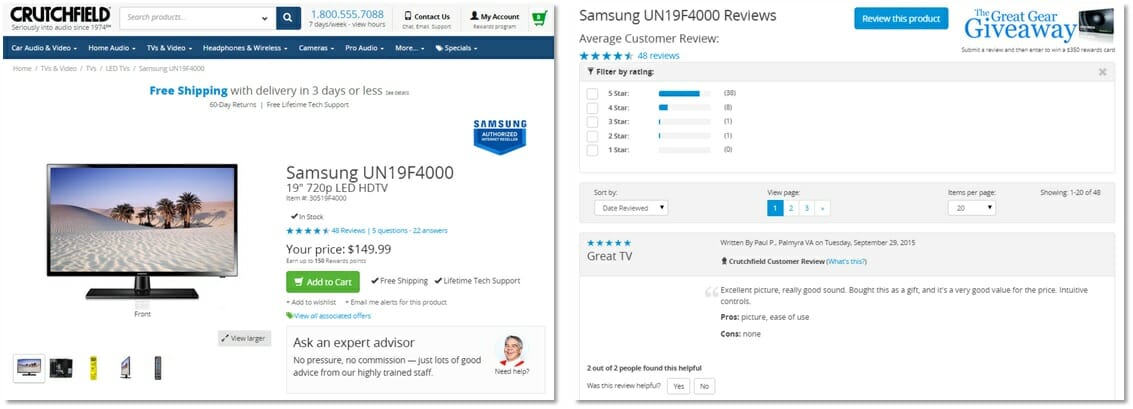
Helpful Resources
- Seven Dramatic Ways Ecommerce Reviews Have Transformed Consumer Shopping Habits – Stacy DeBroff for Marketing Profs
- How to Get More Customer Reviews: The Ultimate Guide – Aimee Millwood for Yotpo (one of the best ecommerce customer review software providers around)
Incorporate user generated content into your product pages
Let your brand fans work for you as a free content marketing advocate.
Encourage your customers to share their story. Make them the hero.
If you can get your fans involved in your brand, the benefits are endless. Your customers turn into repeat customers – so loyal that buying a competitor’s product would feel like adultery. They feel an emotional connection to the brand.
Your social following becomes a community, not just a bunch of strangers with the same interests.
Frank Body knows how to urge their customers to snap a post-purchase product selfie. Frank is a content marketing character. If you haven’t already, you need to check out our Frank case study. It’s one of our most popular articles of all-time.
Frank and his fans are not afraid of public displays of affection. He’ll show the world how much he loves you. Cheeky Frank.
By making his crush the hero, they fall in love all over again. And they tell all their friends how breathtakingly beautiful their boy Frank is.
Frank uses his community as unpaid brand ambassadors. Every time they share a photo of Frank with them in the shower, they are sharing their love with hundreds of others. Frank isn’t even doing the work. He just sits back and watches the magic in action.

If you want to learn how to encourage user generated selfies, look no further.
But once you’ve started a branded hashtag selfie-machine, you need to start incorporating these snaps into your product pages to help convert uncertain browsers into buyers.
Enter BlackMilk.
The Australian ecommerce success story doesn’t, hasn’t and might not ever advertise. The marketing team has never promoted a post, paid for a “like” or sullied the internet with a shamelessly promotional display ad.
Business of Fashion writer Madelin Newman interviewed former BlackMilk Marketing Director Cameron Parker to find the magic behind the Brisbane brand’s fanatically loyal repeat customers:
“The brand actually started out of social media, through a blog and a community around legwear and girls commenting and being very much part of the design process from the beginning. It’s why the community is such a big and powerful part of the business. It’s where we started.”
Instead, the brand relies on the content generated by its customers. Or more precisely, a core community of passionate BlackMilk brand fans. These guys have a name for themselves too – Sharkies, so called for their predatory love of BlackMilk tights (and no they don’t all wear knitted shark mittens).

Sharkies are constantly given opportunities to share ideas with BlackMilk designers on social media, at events, or via email. Product collections have been inspired by customer-generated themes like Game of Thrones, Harry Potter, Star Wars, or this new Space Invaders collection.
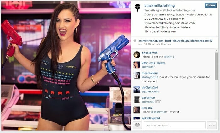
Of course, this crowd sourcing creates buzz, demand, social sharing and frenzied brand love. It also allows BlackMilk to generate a continual stream of user generated product selfies from their adoring fans.
The brand understands how important reimages are to potential leggings buyers. Professionally styled model shots are great – but women of all shapes, sizes and preferences are wondering just how BlackMilk’s products will look on real people in real life. To minimise these concerns, BlackMilk incorporates product selfies from other customers, creating some invaluable social proof.
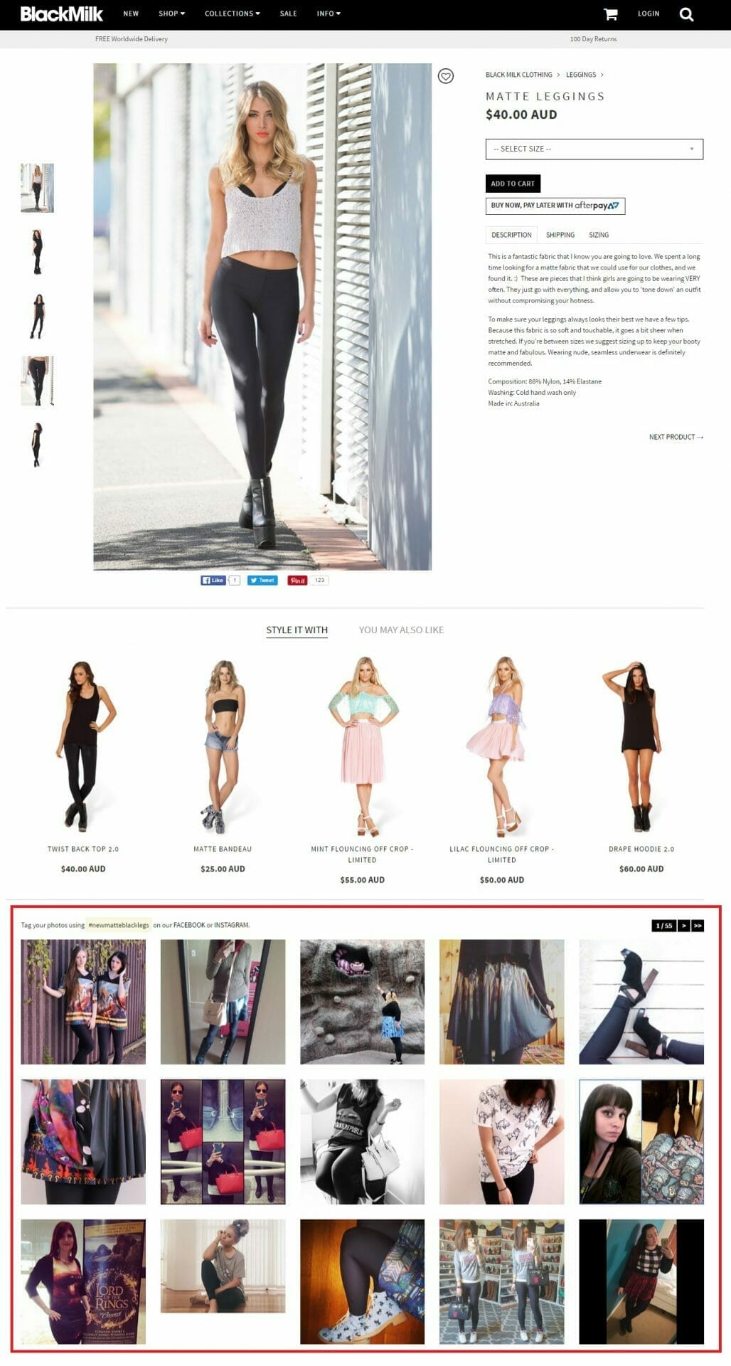
Madelin’s article explains why all this community engagement isn’t just a fun little sideshow for the brand.
“BlackMilk has since grown from five people huddled around a kitchen table to a company of over 200 people with offices in Brisbane and Los Angeles. Its monthly new releases often sell out immediately, sometimes within seconds, and the label’s Brisbane factory sews up to 2000 pairs of tights per day to keep up with demand.”
BlackMilk’s audience (and their user generated content) have become the asset at the core of genuine business success.
Start encouraging your community to get involved. When you make your customers the hero, you’re developing stronger relationships with your existing customers and helping to convert potential new ones.
Helpful Resources
- The Top 3 Ways to Use User-Generated Content in Ecommerce – Joanna Alter for Hubspot
- How user generated content can help online retailers beat the big guys – from The Gorillas!
Incentivise purchase with freebies or coupons – not discounts
Discounts de-value your brand.
Sustainable ecommerce success is much easier without a never-ending 20% off sale.
You determine your list prices for a reason. Margins build profit. If you keep eroding them, you set a dangerous expectation. Each discount makes it harder to convince any shopper to pay full price in the future.
We know we should be working hard to convince customers to buy our items at full price.
But instead we take the easy option, and offer a discount to generate quick sales.
We know it’s wrong to continually erode our brand’s value with gratuitous discounting – but it’s really difficult to avoid the quick reward that comes with regular mark-downs.
If you need a bump in revenue, don’t just default to something-percent-off. There’s a better way.
Use an additional freebie as a limited time offer to persuade customers to commit. You don’t erode the value of the full-priced item, but you’re still able to introduce scarcity and convince the customer they’re getting a good deal if they buy now.
Birchbox, One of our favourite ecommerce innovators, show you how it’s done.
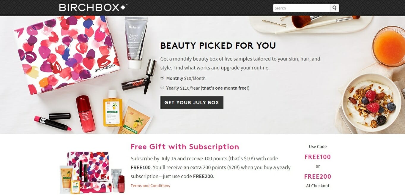
Consider any discount within a strategic context
Ask yourself why you aren’t offering your product or service at full price.
But don’t stop there.
Ask yourself if you can achieve your goal without discounting that devalues your product.
- If you want to sell excess/old stock fast – offer a freebie or 3-for-2 special deal to encourage users to stay in the habit of paying full price. The add-on is perceived as a reward.
- Run an unannouced sale for a limited period – exclusive to your most valued repeat customers. Promote the flash sale to your most valued customers with a personalised email and coupon code. This way you are rewarding the loyalty of those shoppers who have previously paid full price for your products on multiple occasions.
- Create a loyalty program to periodically reward repeat customers who pay full price for their items. A coffee card style program sends the right message to shoppers, incentivising more frequent purchases. From the brand’s perspective – more sales are made at higher margins. From the customer’s perspective – the more you buy the more you are rewarded.
One of our favourite marketing powerhouses (and the 2015 Gorilla Ecommerce Award Winner) Chubbies know the importance of encouraging customers to pay full price, while also incentivising loyalty with value-adds.
The innovative bro-brand runs unannounced, exclusive flash deals to previous customers, with email offers for additional freebies when a full price purchase is made.
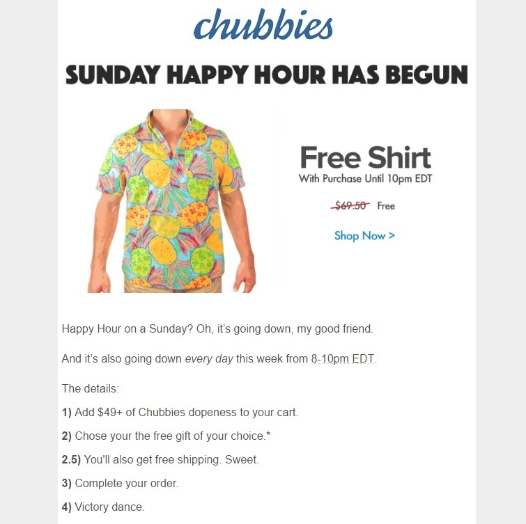
If you are going to persevere with discounting to boost your short-term revenue – make sure you’re doing so for the right reasons.
You must make sure you can turn any first-time buyer from a discounted item, into a loyal customer prepared to pay full price in the future.
Helpful Resources
- The radical retail pricing strategy to save your ecommerce profit margins – anti-discounting advice from The Gorillas!
- Does Anyone Expect to Pay Full Price Anymore? – Helena Pike for The Business of Fashion
- 6 Reasons Why Discounting is Destroying Your Sales (And What to do Instead) – Alyssa Rimmer for Hubspot
- How Discounting is Killing Your Pricing Strategy – Patrick Cambell for Price Intelligently
